Hi, I'm Yang, I am a UI/UX designer with a unique passion and love for design, I feel that design is my whole life, and I hope I can continue on this path. I started to study Graphic Design in Australia in 2018 and studied Interaction Design in Monash for a year and a half.
I have always believed that the core of design lies in continuous innovation and breakthrough. A good application experience is to solve the pain points of users and ensure the usability and efficiency of the product. As an interaction designer, I put user experience first and strive to create the ultimate experience for users.
Nayuki App
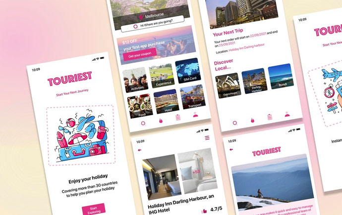
My app is about Nayuki's takeaway. My new design continues the previous design colors, but changes the layout design of the page and adopts a super homepage design. The homepage has a separate large card for each product and slides left and right. Select products in the form of an improved three-page design. Not as simple as the previous design, but more layered, each page belongs to the same frame, but is different and independent.
'VUI App'
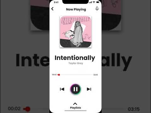
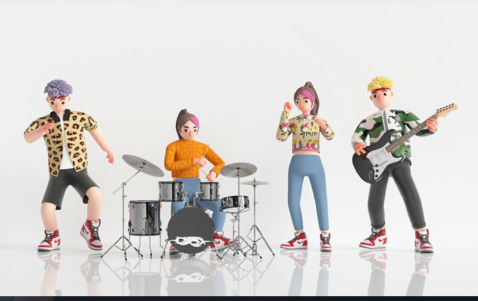
My project is a music player, when the user's hands are occupied and cannot be used, they can use the voice system to play songs or perform their desired actions in this music player.
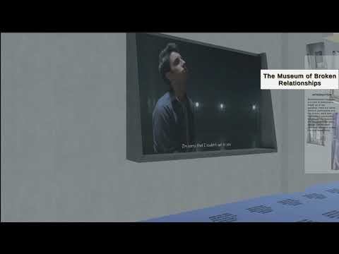
The name of this work is called the Virtual Broken Love Museum, where people can put their own love items in, and they can also visit other people's love stories.
It is a client based project of redesign Moodle LMS website. It's a group project with Kelly and Wendy including usability tests, interviews, data analysis, visualization and report design. According to the results of data analysis, we redesign Moodle Website. Main concept is user-friendly and design style is minimalism.
Moodle 4.0 Redesign mobile
The mobile version of the Moodle learning platform is designed according to user needs. From the data, we can get the priority functions for students to use on the mobile terminal, that is, to view courses, grades, schedules, and chat.
In the spirit of reconciliation Monash University acknowledges the Traditional Custodians of country throughout Australia and their connections to land, sea and community. We pay our respect to their elders past and present and extend that respect to all Aboriginal and Torres Strait Islander peoples today.