My name is Alyce and I am passionate about inclusivity and design that can be enjoyed by everyone. My designs must be environmentally friendly, I cannot be forward-thinking if there is no future for my work to exist in. I connect to the real world and learn from historical styles and methods to create variety. This helps to ground my work, in a content driven world.
My design practice focus is illustration, motion and promotion. I love combining digital and physical media to make projects unique and textural. I enjoy experimental publications and promotion of the arts. I hope to travel, taking my practice around the world, learning from local visual languages and designers there.
Finding Representation
Finding Representation' combats the lack of diversity in media, in particular I looked at television, video games and film. This deck of 52 cards presents 22 diversity facts. This work is a hard copy game which appeals to people who want to get away from the screen. The cards are all unique and use icons and characters I designed in my Finding Representation mystery game, 'The Vape Escape'.
Three Muses
The Three Muses is a humorous take on the Art Nouveau Illustration style. The elegant figures stare emotionless at their mobile phones whilst their so called shortcoming is bannered above them.
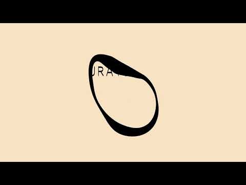
'Curated by TYO'
Curated by TYO is a hypothetical small vintage brand from Melbourne that focuses on Japanese minimalist fashion. The brand presents a mood of calm and tranquility with a handcrafted touch. The logo I have created uses the typeface ocr-pbi which is a handcrafted stencil looking typeface that is still modern and minimalist. The ‘o’ in my logo has been distorted to create a pearl like shape which reflects the rarity of vintage clothes.
This is a b5 book that is hand-bound with kettle stitch binding, it is printed on envirocare paper and contains acetate pages. This project involved linking concepts, items, people and locations that may not seem related at first. The overall theme became escapism, the things that help you to forget the everyday. The acetate pages throughout the book organise and emphasise certain points.
Melburbs - Dandenong
These banners are inspired by the vibrant food and culture of the Dandenong market. Having been to the market every week for most of my childhood I really wanted to capture this hub of the suburb.
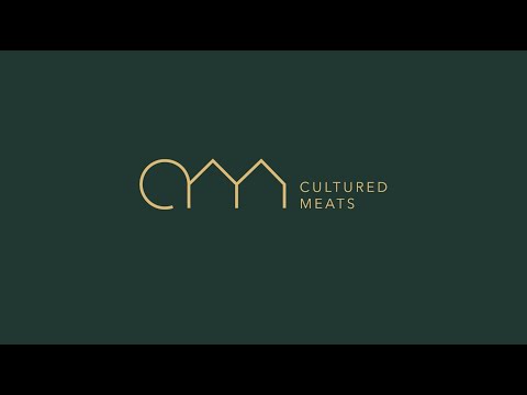
'Cultured Meats'
Cultured Meats' is a hypothetical brand which sells lab-grown meat. The approach that I took in creating the brands logo is one of luxury and reliability. The intended audience of wealthy food enthusiasts like the innovation of the brand and quality of the product whilst also being able to help the environment without compromise. The logo represents the “CM” acronym. The building shape of the “M” represents Cultured Meat’s labs. The overall shape is similar to that of an animal. The logo can also be made into a pattern that is cell like, based on the brand's process of producing meat and also the reliable replication in the product.
In the spirit of reconciliation Monash University acknowledges the Traditional Custodians of country throughout Australia and their connections to land, sea and community. We pay our respect to their elders past and present and extend that respect to all Aboriginal and Torres Strait Islander peoples today.