I am a Communication designer and a photographer. I completed my final semester through the Monash Study Abroad program as part of the Collaborative Design studio intensive in Prato, Italy. This is a selection of projects from my Communication Design Degree including but not limited to branding, publication, identity system and typography.
Sign Not In Use
Traveling to Italy and staying in Prato made me stumble upon many differences in the way people live their day-to-day life. I was reminded every day about how things are different in Prato compared to back in Melbourne and soon I realized that my classmates too were surprised by these changes. I decided to create a guide to facilitate the transition for international students into this new place and help them survive the unexpected but common incidents that could come their way during their time in Prato. The signs designed for this project are targeted toward foreigners who are new to Prato and they aim to assist in their assimilation into the new environment.
Sign Not In Use
The comedic and educational tone of the signs aims to inform viewers of location-specific local knowledge, warnings, advice and common habits in the area in a way that is accessible. The signs that are demonstrated here address the issues such as drivers not using indicators or driving carelessly, men catcalling girls and women and so on. Each of these signs focuses on an issue that I encountered during my first weeks in Prato and the idea was to help newcomers, specially future students, to become more aware and alert about the city that they will be living in.
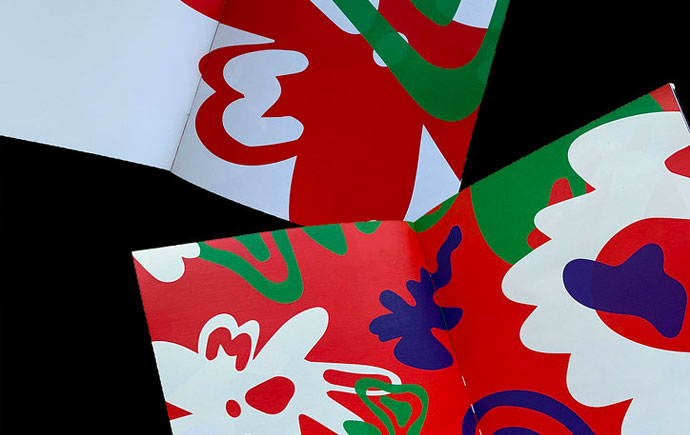
Bahar Cafe Branding
Bahar is a cafe specialising in drinks, smoothies and desserts made from herbs and floral water especially orange blossom water and rose water. The branding is inspired by my childhood memories and what I associate with home grown food. The herbal distillate is a common natural and healthy drink in Iran and the design of this brand is inspired by aesthetics of Iranian historical architecture. The illustrations are made by watercolour to preserve texture to demonstrate the natural, healthy and homemade essence of what this cafe serves.
Children’s Instruction Book
This project seeks to help kids from 3 to 6 improve their manners in a fun and interactive way. The book “Gurt doesn’t do this (anymore)” is about a character named Gurt and each page introduces different situations to show kids the appropriate behaviour. In most pages, the first illustrator that kids see shows Gurt doing something rude or not appropriate. Kids are encouraged to flip the little windows and see the illustration underneath which shows good manners. Doing so helps the kids remember the right manner in each scenario as they are participating in looking for the right answer instead of being passive onlookers.
Paper Architecture
This publication is an extension to the architectural design of the Rain Room. The building is 100 square meters of empty space in which it rains continuously. My design experiments with perspective and its impact on our experiences. This galley does not exhibit any artwork, instead, it offers a space for visitors to turn their experience into artwork. Seeing the spectrum of light is one of those experiences. The light is not visible to everyone as it depends heavily on peoples’ locations and points of view. I decided to use this concept and create my publication in a way that allows users to bring their own perspectives and create their unique artwork.
Sounding Type
Designing vinyl sleeve and Spotify thumbnail for the instrumental song “Pow R. Toc. H” by Pink Floyd. The manual process of designing the aesthetics represents the emotions that this instrumental song stimulates.
In the spirit of reconciliation Monash University acknowledges the Traditional Custodians of country throughout Australia and their connections to land, sea and community. We pay our respect to their elders past and present and extend that respect to all Aboriginal and Torres Strait Islander peoples today.