"Music has been the primary inspiration for my recent work. My exposure to diverse music genres in Australia expanded my understanding of music artists, their creative processes, and the profound impact of music on my life. It has been a source of solace during tough times and a catalyst for personal and creative growth for me. Exploring various musical genres has also taught me about the positive influence of music, particularly for students. As a designer, I'm motivated to incorporate this passion into my work, aiming to communicate powerful messages creatively and make a positive impact on my community."
Rep your favorite genre
This is one out of a series of many graphics I made for my branding campaign about 'Music for Mental Health' as a part of 'Healing with Harmony', an activation campaign for 'psychological effects of music in university students'.
MfMH logo
A real-life application of the lettermark for 'Music for Mental Health(MfMH)'. I chose green for the initials of "Mental Health" as it represents positivity.
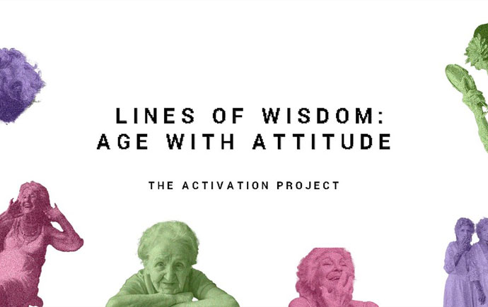
Healing with Harmony
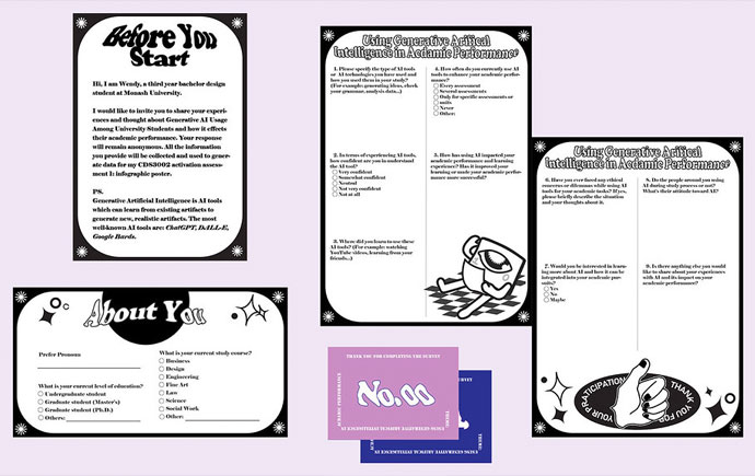
One of my most intricate works, is this Infographic about the impacts of music on university students and how music improves mental and physical health. The stats are based off a research I conducted among random students through a custom made design research kit.
Culture Sounds vinyl cover (net)
Another fun project I did, was for an exhibition for 'Chapter Music' a record-label company, which will be held in the State Library of Victoria. I always wanted to work on something retro and authentic, and something like a record player cover, I just knew this was the one. Chapter Music is an Australian-based company that majorly favors underground and indie pop artists of Melbourne, but also collab with international artists. I used typefaces and colors that represented the independent and robust culture of local Australian rock music.
World junk food day poster
I had to revisit this project I worked on last year since I thought I could make it better. Initially it lacked text and looked plain. Throughout my 3rd year I have learnt many valuable photo-editing techniques and hence I felt the need to improve it as the idea of food exploding in vibrant colors was still cool.
Two sides of Luxury
A warmup activity in class turned into an interesting idea for a poster. The activity was to bring a couple objects in class that mean something to us personally and using any objects in class, we had to make a B&W poster. The flashy punk doll(someone else's in class) is meant to represent the materialistic side of luxury in design but the duck on top is merely something that is simple-looking but close to my heart.
In the spirit of reconciliation Monash University acknowledges the Traditional Custodians of country throughout Australia and their connections to land, sea and community. We pay our respect to their elders past and present and extend that respect to all Aboriginal and Torres Strait Islander peoples today.