Monash University logo

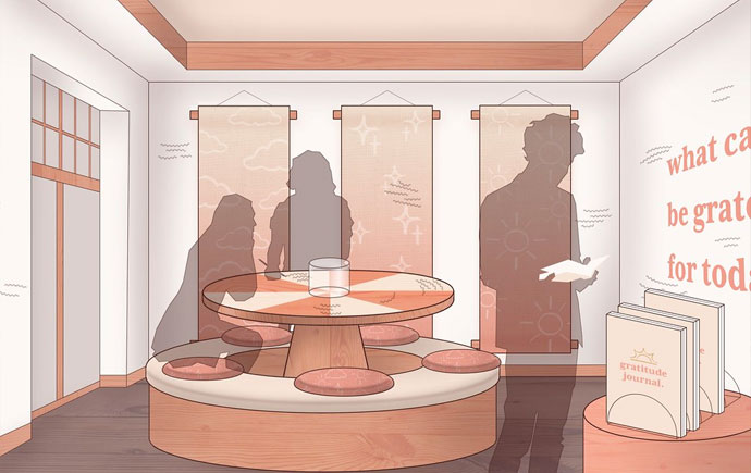
Monash Art, Design and Architecture Student Exhibition 2022

Kimteang Yin

Identity Vision 2023 Final Project - Sidney Nolan Exibition

This project was to design poster, invitation cards for one of the famous Australian
artist Sidney Nolan. The design used yellow colour to match with the painting
colour and I used Sidney Nolan painting to as a main attraction of the poster design.
The aim is to make the audience now what they will be seeing at the exhibition.

Identity - Not For Nothin' - Carers Victoria Brand Guide

This project is to redesign the already existed brand and learned how to create a brand guide for the client.
There are a number of process involved in the redesigning of the brand to ensure the logo has correct proportion, size, and match with the purpose of the brand goals and values.

Sounding Type - Record sleeve

For this brief I choose the track “It’s all downhill from here by Larry Poppinze” this song made me feel
depressed.” All misfortune, no matter how it arrives, is an attack. All fortune, however it comes, is bliss. Thus,
I decided to fiddle around and came up with something I liked. I sketch with the album cover design using the
illustrator. To emphasise the text, I use the end font for the typeface. This font looks great with this Concept,
because the typeface is frightening and broken line. This poster have a black and white as colour scheme.

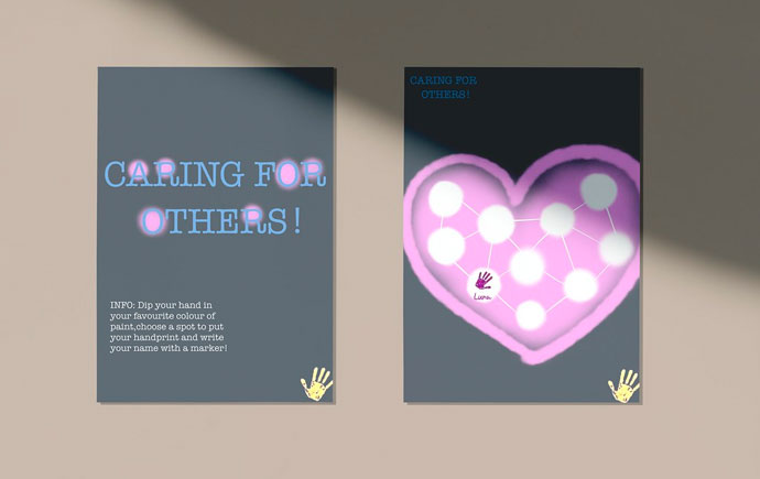
Activation - Mental health awareness posters

The posters are were designed for the mental health awareness campaign and the aim to educate people who has mental health related issues and general public to understand the important of mental health. The designs were created in the Adobe Illustrator and the poster were created with a simple and clean looks.

Observation - Dockland Poster

The poster is made with the illustration of many photos from different location in Docklands, which are the key location and the also the iconic of Docklands. This poster is for promoting the location to people who might want to visit Docklands or who have not heard about Docklands. By illustrating many photos from different location, the audience will have a general idea of what they will be seeing at Docklands. The colour chosen for this poster is for reflecting the urban lifestyle and the colour around Docklands, which has a lot of blue and grey from the surrounding building and from the water.

The Event Promotion - Fashion Poster

The poster is create to promote an fashion event. The aim of the posters are fashion people such as artists, fashion designers and general public. The poster is created by using pictures from existing fashion magazine to explore the different of the design and layout.

Explore more

View all

Other years

Back to top