Monash University logo

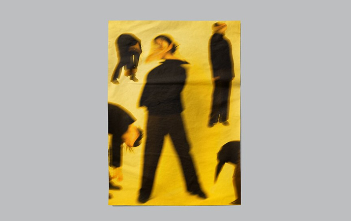
Monash Art, Design and Architecture Graduate Exhibition 2024

My name is Edmund Lee, a communication designer passionate about crafting visual experiences that tell meaningful stories and connect with diverse audiences. I believe design goes beyond aesthetics, focusing on clarity, engagement, and accessibility. I’m drawn to projects that emphasise social impact and inclusivity, using design as a tool for positive change. Whether through campaigns, branding, or educational materials, my goal is to bridge gaps between communities and advocate for greater awareness of social issues. I aspire to work in roles that foster understanding and inspire action, leveraging design to create work that resonates and contributes to a more compassionate society.

How to make an origami boat step by step.

The project offers primary school students a step-by-step guide to creating an origami boat, inspired by IKEA and playful Gatcha packaging. Using simple language and clear illustrations, it makes the paper-folding process accessible and engaging for young learners.The minimalist design and soft color palette ensure instructions are easy to follow, promoting creativity and independence. This infographic serves as a valuable tool for educators and parents, fostering hands-on learning and nurturing sequential thinking through enjoyable, interactive activities.

“Signs Do Speak” - Sign Language Awareness Campaign.

This public installation promotes sign language awareness by addressing the lack of visibility in public spaces. Featuring simple illustrations for words like "Hello," "Help," and "Thank You," the design invites passersby to learn basic signs in an engaging and interactive manner. Using a clean layout and soft colours, it captures attention and simplifies the learning experience. The project’s goal is to raise awareness and foster understanding between hearing and deaf communities, empowering people to bridge communication gaps effectively.

John Nixon, Exhibition For State Library Victoria.

This promotional wall display is part of the "Chromatic Balance" exhibition at the Victorian State Library, celebrating John Nixon’s minimalist and geometric abstraction. The design mirrors Nixon’s iconic visual style, using a bold orange and black palette that symbolises balance and precision. Key event details are prominently featured to guide the audience, while the vibrant colors capture the essence of Nixon’s mastery of form and colour, inviting the public to immerse themselves in his artistic vision.

Doxa Youth Foundation, Sub Brand - Doxa Education

This project showcases the rebranded visual identity of Doxa Education, a sub-brand of the
Doxa Youth Foundation, designed to suit the educational sector. With clean lines, minimalist typography, and a sophisticated blue color palette, the identity conveys trust and professionalism. The cohesive stationery set—including business cards, notebooks, and letterheads—underscores Doxa Education’s dedication to quality and academic excellence. The rebranding establishes Doxa Education as a credible, focused entity that aims to empower both students and educators.

Doxa Youth Foundation, Sub Brand - Doxa Camps

This project showcases Doxa Camps, a sub-brand of the Doxa Youth Foundation, dedicated to outdoor education and personal growth for children. Featuring vibrant, nature-inspired visuals and active children, the design emphasises the camp’s mission to help kids build confidence, overcome challenges, and have fun. Bold, playful typography reflects the spirit of adventure, promoting experiential learning and resilience. Through engaging activities, Doxa Camps fosters personal development, encouraging kids to explore, grow, and develop essential life skills.

Dogs Trust. An animal welfare for dogs.

This project for Dogs Trust rebranded their classic logo to a modern, vibrant design that highlights the organisation’s commitment to dog welfare. The updated logo retains the iconic heart and dog silhouette, refined for a cleaner look, while the familiar yellow symbolises warmth and visibility. The refreshed branding, showcased on tote bags, complements the tagline, “A dog is for life, not just for Christmas,” reinforcing their mission of responsible dog ownership and ensuring the brand resonates with a new generation of supporters.

Explore more


View all


Back to top