"Be silly" is a phrase I often tell myself when I create. Hello! I'm Hailey, an illustrator and graphic designer who enjoys infusing her work with a sense of childlike playfulness as seen in my featured projects. I am passionate about creating vibrant brand identities that reflect the core values of the people that I work with. I enjoy working across various forms of digital and print media like Branding, Animation and Publication, and can adapt these skills to suit projects with more serious concepts. Please visit my website to view more of my work!
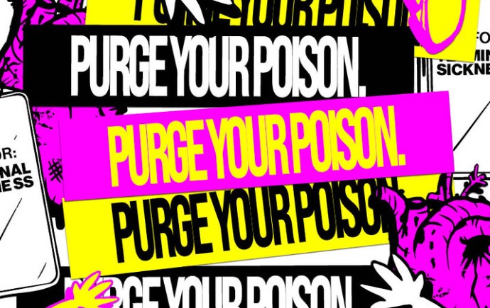
Through Your Eyes Poster Series
The Through Your Eyes poster series directly responds to the findings obtained from the Design Research Kit. It is designed to engage viewers by prompting them to write about their experiences on the posters. This is further supported by statistics obtained from the researh kit. By posing thought provoking questions and providing words of affirmation, the poster series aims to reassure people that they aren't alone in what they are feeling.
Through Your Eyes Mobile Game
The game "Through Your Eyes" is an outcome of the insights gained from the Design Research Kit. It is designed to foster a safe space for conversations around mental health, particularly focusing on first-year experiences. The game moves away from the conventional approach of reiterating mental health resources, common to most websites. The game offers glimpses of authentic, lived experiences of first year students' challenges and growth, reminding them that they aren't alone in their feelings.
My Design Research Kits explores challenges students faced during their first year of university and how they have changed since then. The kit includes interactive elements such as a customizable ID card, question cards with prompts, a mental wellbeing graph, a flyer encouraging students to write five things they would tell their younger self and a questionnaire in a mini zine format. Together, these elements provide a space for students to reflect on their university journey in a pressure-free way, ensuring that their responses are down-to-earth and meaningful.
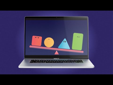
Equity, Diversity and Inclusion at Monash University
Description: The animated reel aims to promote Equity, Diversity and Inclusion (EDI) between students and staff at Monash University. It explains the concept of EDI in a simple, yet effective way through the use of vibrant colours and character designs, making the message accessible and engaging for a diverse audience.
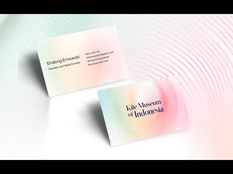
A rebranding project of one of my favorite childhood places in my hometown, Jakarta. As a child, I had very fond memories of flying kites or 'layang layang' in my grandma's backyard. My rebrand aims to capture the playful, childlike essence of flying a kite.
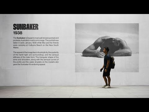
An identity design for an exhibition of Australian photographer, Max Dupain's works at the State Library of Victoria. The exhibition branding aims to immerse viewers in a visual journey through a bygone Australian era. The identity's scope includes print media such as post cards and merchandise and extends further to include wayfinding systems within the exhibition and a website, delivering essential information to potential visitors. Together, the exhibition branding acts as a way to complement Dupain's works and to honor his contributions to the field.
In the spirit of reconciliation Monash University acknowledges the Traditional Custodians of country throughout Australia and their connections to land, sea and community. We pay our respect to their elders past and present and extend that respect to all Aboriginal and Torres Strait Islander peoples today.