Monash Art, Design and Architecture Graduate Exhibition 2024
Monash Art, Design and Architecture Graduate Exhibition 2024
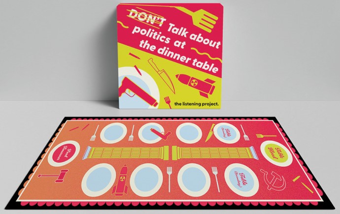
Purge Your Poison – Publication Front Page
Purge Your Poison – Campaign Stickers
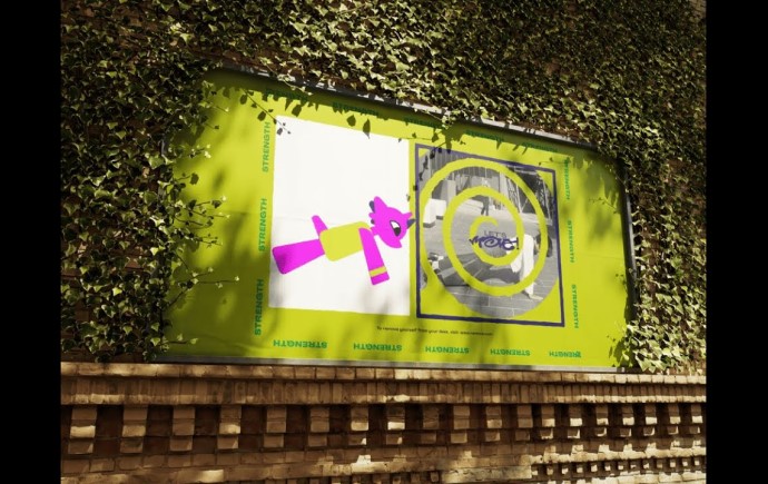
Purge Your Poison - Poster Series
Purge Your Poison - Poster Series
CYDA Brand Guidelines
CYDA Brand Collateral