My passion lies in transforming brands. I explore the unique character of a brand and find ways to share it’s essence with the world. Bringing brands to life through the curation of typography, illustration and colour to communicate playful, engaging and cohesive outcomes. Thoughout my work theres a sense of diveristy as I approach every project through a new lens, allowing each brand to feel true to its core values reaching its specific intended audience. I’m well-versed with adobe applications like illustrator, indesign and photoshop and continually explore new techniques and ways to experiment with these applications, pushing my creative boundaries.
Montress, State Library Exhibition folded A1 poster invitation
For this project, I was tasked with researching the body of work of a chosen subject and translating their ideas into a cohesive identity design for their exhibition at the State Library. Barbara Creed, is an author who explores the psychoanalysis of how women are portrayed in the horror genre, examining societal fears surrounding female power, independence, and sexuality. The image above showcases an A1 double-sided poster I designed to invite guests to the opening of her exhibition.
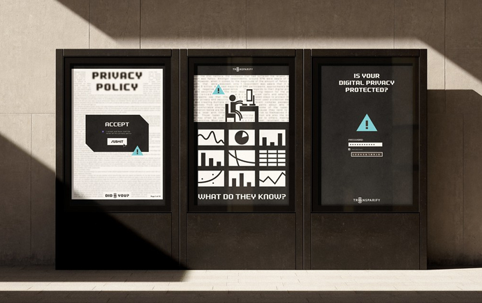
Hookt, Outdoor metrolite poster
These digital posters were created as part of an identity system for the new corporate identities project. Made for a start up dating app that focuses on inclusion, creating a safe space for all types of people. My identity system focuses on promising audiences a feeling of connection and unconditional belonging.
Pickings, Grocery store guide publication
This is a sneak peek into Pickings, a publication I designed to provide young Australians with weekly grocery lists under $50, along with a handful of healthy, satisfying recipes that utilise ingredients from the list, advising readers how to creatively and effectively use up their groceries. This project was developed in response to the rising cost of living in Australia, which has made it difficult for many young people to maintain a nutritious diet without the expense. It was essential to adopt a design approach that was both playful and trustworthy to effectively connect with the target audience.
Eat yo Greens, educational childrens book
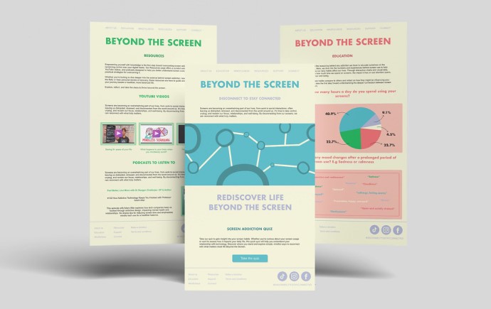
As a part of the instruction brief, I was asked to create an application that aims to teach. My project teaches an audience of children aged 4-8 the importance and benefits of eating the veggies they’re scared of, in this case, their greens. Illustration was a focus in this project as I understood that the children reading this book, would be more receptive to imagery rather than words.
HOOKT moving Logo
This motion graphic logo intends to communicate the different and exciting stages of forming a relationship. Its simplicity ensures maximum legibility while offering a sense of timelessness and versatility. The logo tells a story that aligns seamlessly with the brand's message and what it aims to offer its audience.
A stroll through Elwood, Poetry Publication
For the Observation project, I was tasked with creating a publication that captures the essence of a suburb. A Stroll Through Elwood combines poetry with corresponding imagery to evoke a sense of calm and tranquility, reflecting the feelings this suburb inspires in me. The design aims to mirror the peaceful atmosphere of Elwood, offering readers a moment of serenity in their stroll through Elwood.
In the spirit of reconciliation Monash University acknowledges the Traditional Custodians of country throughout Australia and their connections to land, sea and community. We pay our respect to their elders past and present and extend that respect to all Aboriginal and Torres Strait Islander peoples today.