Monash University logo

Monash Art, Design and Architecture Graduate Exhibition 2024
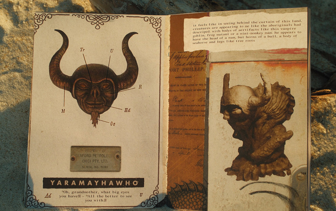
Hi, I’m Mia. I am completing my bachelor of design, majoring in communication design, and bachelor of business, majoring in marketing. My work is driven by a strong passion for brand identity and creating captivating digital and print applications. I am passionate about creating engaging designs that draw the attention of my target audiences through the use of bold colours and vibrant textures.

Game On! Australia

As part of my activation campaign, I created an organisation called Game On! Australia, which was dedicated to promoting physical activity through team sports for individuals transitioning from childhood to adolescence. The main outcome of the campaign was a poster series. The visual strategy for the campaign takes on a very bright and colourful approach, using strong typographic elements and imagery of young adolescents playing various sports. The stacked type helps to display the main titles to the viewer, and the gradient allows other text to be read, whilst also allowing the image to be displayed.

Game On! Australia

The first supporting outcome that was designed as part of the Game On! Australia campaign was a micro-website. The micro-website used similar elements that were visible in the posters such as the strong use of imagery and the bold use of colours. The website contains all the necessary information for an individual to find out more about the organisation, how to find a team near them and also the upcoming events that are being held by the organisation.

Game On! Australia

The second supporting outcome that was created as part of the Game On! Australia campaign was an invitation and ticket for the event. The invitation was to be sent out digitally to people who were to sign up for the Open Sports Day. The strong use of colour is fun and bold, and the stacked type reflects the typography elements seen within the poster series. The ticket also is very similar to the invitation, using the same colours and type elements ties them nicely together.

Dale Frank: Psychedelic Aquarium

The chosen artist for the exhibition at the State Library of Victoria is Dale Frank. The identity of the exhibition draws inspiration from Dale Frank's work. Frank is renowned for his vivid, glossy, abstract paintings and his highly experimental approach to artmaking. The vibrant colours and sense of movement in his paintings influenced the creation of the typefaces and elements used in the exhibition's identity. The central theme of the exhibition is encapsulated in the phrase "Psychedelic Aquarium," which also serves as the exhibition's title. This title reflects the essence of Dale Frank's work, which can be described as a psychedelic aquarium, frozen in time.

Fitted For Work

The new identity designed for Fitted for Work incorporates a refreshed logo, updated organisational colours, and new design elements that collectively form a vibrant and engaging brand. This identity embraces a fun and energetic approach, utilising a strong use of colour to create a dynamic visual presence that aligns with the organisation’s mission and values. The redesigned logo maintains a strong typographic approach, with a particular emphasis on the 'fitted' aspect. This redesign highlights that Fitted for Work is about more than just providing the right clothing for work; it embodies a comprehensive approach to empowering individuals.

Melbourne Cinémathèque

My concept for the 2025 Melbourne Cinematheque identity uses different colours, textures and shapes to create a unique identity seen across the screen, poster and calendar designs. I was drawn to the various textures created through using screen printing techniques. I was ultimately able to create a range of different prints which I digitally manipulated to create a range of different shapes that formed part of my identity seen within my designs. Vibrant pink and blue colours are seen within my identity and aim to attract attention from the audience and spark interest between the viewer and the design.

Explore more


View all


Back to top