Monash University logo

Monash Art, Design and Architecture Graduate Exhibition 2024

I've always had an instinctive desire to design, and despite all the twists and turns, I’ve always came back full circle: I wanted to design.

Hi there! My name's Michelle. I'm a communication designer who's main area of interest lies in UX/UI design, with a particular focus on user research, as I originally came from an industrial design background. I’m interested in branding and photography, too. Through my studies here at Monash, I've come to enjoy exploring design as a medium for discussion and critical thinking, and reflect this by going beyond visually aesthetic design to strive to create meaningful and evocative work, as seen through my projects below.

LT:NE - Newspaper Spread

This newspaper spread acts as an interactive activity where users are encouraged to look figuratively and literally deeper and past the large and loud text by using a magnifying glass to read the smaller text. The larger text highlights what the public and news often say about nuclear power, often painting it in a negative light. In comparison, the smaller text is reflective and comprises of factual information or educated comments. By taking this action, it reflects on how users have the power and can take action, educate themselves, and search for their own truth or interpretation of nuclear energy.

“Let’s talk: Nuclear Energy” (LT:NE)

“Nuclear energy is dangerous! It kills people!”. That was all I ever heard when people around me talked about nuclear energy. I never questioned their statements, but what if it wasn’t as bad as I had perceived?

“Let’s talk: Nuclear Energy” (LT:NE) is a campaign that focuses on educating and encouraging critical thinking on nuclear energy, with the goal of opening unbiased discussions about a future with nuclear energy. The project does not intend to influence people's biases, but rather to allow people to look at the facts and come to their own conclusions about nuclear energy themselves.

LT:NE - Mobile Website

Information is always at your fingertips, you just need to find the correct information.

This mobile website acts as a collective hub for articles and educational media on nuclear energy and other renewable energies, while also reflecting how nuclear power is negatively construed in the media. In defiance, this website provides a selection of curated articles and summaries with the help of experts’ opinions, allowing users to have the most accurate information possible, free of bias and as transparent as possible, by encouraging users to scroll past the imposing headlines and be open to other articles on the topic.

LT:NE - Flashcards

Designed to make nuclear energy-related education more engaging and approachable, these flashcards both promote the discussion and critical thinking on nuclear and the future of electricity while also answering commonly asked questions on nuclear energy, such as "What is nuclear energy?" in a digestible manner. These cards highlight how little people are knowledgeable about nuclear energy, often playing into the narrative that other renewables like solar and wind energy are the only way and nuclear energy has no space in our future.

LT:NE - Design Research Kit

This short research kit was implemented as a comparative investigation that questioned what the general public's baseline knowledge of nuclear energy was, what they've heard about the topic compared to the facts and gauged the participants' openness and knowledge of nuclear energy before the kit and after the completion of the test. Throughout the investigation, it was evident that the majority of participants knew little to none about nuclear energy and that the level of trust towards the energy source was generally quite low, yet, optimistically, all of these participants were open to learning more about the topic.

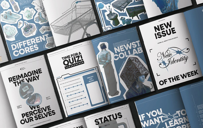
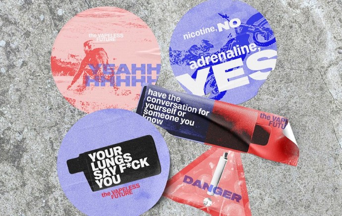
Become & Break the system - Bank of Melbourne

Become & Break reimagines 'Bank of Melbourne', an online banking app by addressing its major problem of being confusing to navigate and lack of consistency. The reimagined app solves these issues by transforming and simplifying the information architecture, allowing for a more intuitive experience between the screens, and implementing a new interface that aligns more closely with the bank's signature colour palette and adapting it for easier legibility and accessibility.

Explore more


View all


Back to top