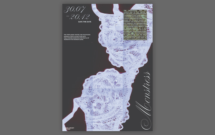
Monash Art, Design and Architecture Graduate Exhibition 2024
Monash Art, Design and Architecture Graduate Exhibition 2024
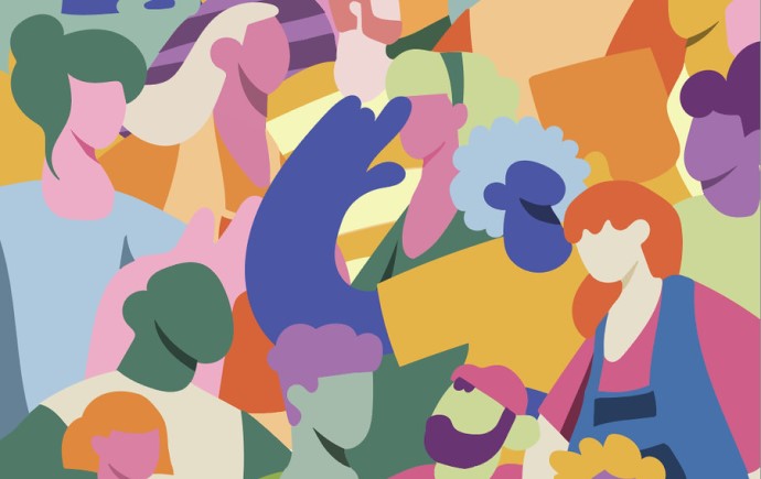
Test Your Pills Campaign
Test Your Pills Campaign
Test Your Pills Campaign
Symbols of Mimmo Cozzolino
Symbols of Mimmo Cozzolino
Symbols of Mimmo Cozzilino