Monash University logo

Monash Art, Design and Architecture Graduate Exhibition 2025

Hey there! I’m Sharlyn Gotama, a committed designer with a deep interest in branding, typography, and event-based design. I enjoy turning ideas into engaging experiences that can connect people. My work focuses on blending creativity with purpose, using design to inform, engage, and create positive change.

Through my projects, such as the Road Safety Identity and the “In the Moment” campaign, I explored how design can be a big influence and foster empathy. I aim to continue creating design that leaves a lasting impact and highlights the value of design.

Outstanding Project: Cullture Society & Identity

Campaign - In The Moment

In the Moment is an awareness campaign that encourages mindfulness and being present. The centrepiece is a mobile meditation truck that can be invited to various events, including universities, providing visitors with a guided meditation experience in a designated place. The campaign's identity creates a moment of peace amid daily busyness. To extend the message beyond the experience, merchandise such as tote bags and stickers is available, serving as gentle reminders to slow down, breathe, and live “in the moment.”

Brand Guideline - I'm not used to this

“I’m Not Used to This” is a campaign aimed at raising awareness about road safety in used cars. The project involved developing a refreshed brand identity that feels approachable yet responsible — combining bold typography, clear structure, and an eye-catching colour palette. The identity system aims to make road safety communication more relatable and engaging, encouraging drivers to stay mindful and be aware of the second-hand cars safety.

Prospectus - I'm not used to this

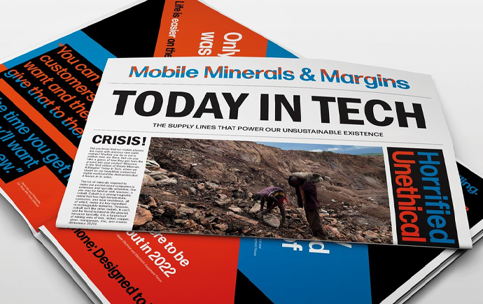
As a continuation of the “I’m Not Used to This” brand guideline, this prospectus serves as its main design application. It applies the established visual system — from typography and colour palette to layout principles — to create a cohesive and engaging publication. The prospectus highlights the campaign’s message on used car road safety through clear hierarchy, dynamic compositions, and balanced visuals, demonstrating how the brand identity can communicate effectively across print materials.

Marve

Marve is a type I created inspired by the architectural form of Melbourne’s Premier Tower. The typeface reflects the building’s flowing, curvilinear structure and dynamic rhythm. This type specimen booklet showcases the type through expressive layouts and compositions that echo the tower’s sculptural movement. It also shows form and contrast, which highlights the balance between fluidity and stability — capturing the essence of architectural motion through typography.

Publication - Ken Garland

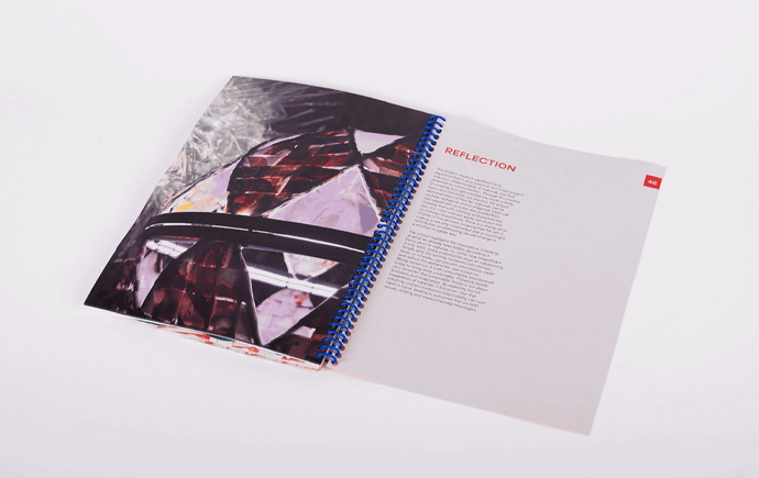
This publication explores the legacy of designer Ken Garland through the lens of writer Alice Rawsthorn. Designed and printed in a 140 x 200 mm spread, it pays tribute to Garland’s rational yet human-centered design philosophy. The layout, grid system, and typography are inspired by his signature modernist approach — bold, structured, and communicative. I tried capturing both the clarity and warmth that defined Garland’s work in this publication.

Identity - Kejutan

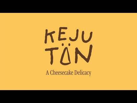
Kejutan is an identity design project for a cheesecake shop, inspired by my own love of cheesecake and the memories it holds. I used warm-toned colours, playful shapes, and a friendly typography to capture the joy of indulgence and surprise. Every element—from the logo to the packaging—aims to evoke warmth, delight, and nostalgia, inviting customers to experience the same happiness that cheesecake has always given me.

[View full video here]

Explore more


View all


Back to top