A communication design student passionate about exploring the dialogue between design and illustration.
Activation Project UI Exploration | Tagless
This project bridges poster design and web UI to explore how culture can be seen and felt from different angles. By highlighting overlooked hashtags on social media, it draws attention to the hidden cultural identities behind them. Viewers can scan QR codes from posters or small cards to join mini web activities about food, dance, graffiti, and music—transforming abstract “symbols” into tangible experiences. Hashtag Culture encourages people to rediscover culture as something alive, participatory, and deeply connected to emotion.
Activation Project | Takeaway Card
The interactive card serves as a physical entry point to the Hashtag Culture website. By scanning the QR code, audiences are invited to participate in online activities that transform passive viewing into active reflection. Designed to bridge print and digital media, the card encourages people to rethink culture beyond symbols—turning curiosity into interaction, and awareness into experience.
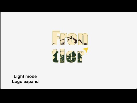
Motion Of Brand Part 2 | Frontier
This animation extends the project’s visual identity through the main color palette, deepening the expression of product personality with natural and adventurous elements. Under the brand name Frontier, which focuses on outdoor and survival products, I selected key visual motifs inspired by distinctive shapes of equipment and tools. The motion design brings the website concept to life, evoking exploration and the connection between culture, design, and experience.
Moon Explorer is a resource-collection and cooperative board game designed for children aged 7–9. At this stage, children begin to understand how the world works and show deep curiosity toward everything around them. The game uses simple language, bright visuals, and playful mechanics to engage young players in learning about space and the moon. Through teamwork and exploration, they collect resources, complete missions, and discover how lunar environments function. The aim is to transform scientific knowledge into a fun, hands-on experience that inspires imagination and a new understanding of our universe.
Package Design | Wine
WANE is a conceptual wine packaging project transformed from the word wine, created to warn people about the dangers of excessive drinking. Instead of celebrating luxury or indulgence, the design reflects the fading of awareness and control that alcohol can bring. The color palette—red, black, and yellow—creates a sharp visual tension reminiscent of caution and surveillance. The interior of the box is lined with old newspaper fragments, symbolizing the chaos, regret, and social consequences often hidden behind the glamour of drinking culture. WANE redefines packaging not as marketing, but as a message—an uneasy reminder of what excess can erase.
In the spirit of reconciliation Monash University acknowledges the Traditional Custodians of country throughout Australia and their connections to land, sea and community. We pay our respect to their elders past and present and extend that respect to all Aboriginal and Torres Strait Islander peoples today.