I am passionate about experimenting with colour, typography and photography throughout my design work. I like playing with different abstract materials outside of the screen to then bring into my work, creating design outcomes that are unique and conceptually rich. A majority of my work focuses on brand identity, publication and printed matter and I enjoy pushing myself creatively. I completed my final semester through the Monash Study Abroad program as part of the Collaborative Design studio intensive in Prato, Italy. This is a selection of projects from across my Communication Design degree.
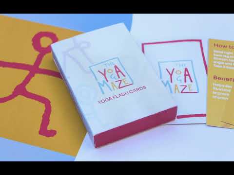
'The Yoga Maze'
‘The Yoga Maze’ is an interactive children’s game, aiming to help build mindfulness and yoga into the daily lives of kids in a fun and easy to understand way. This game takes its form as an interactive maze divided into three sections, ‘Move’, ‘Breathe’ and ‘Relax’, each containing a set of correlating exercises. The visual identity of ‘The Yoga Maze’ uses strong, bold colours, reminiscent of the concept of fire, water and earth. The main focus of this identity are the yoga figures which have been created out of pipe cleaners. The use of pipe cleaners gives the identity a playful yet refined look as the figurines have a low-fi, sketch-like character.
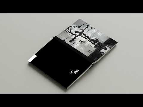
Detached' is a publication that explores the survival of religion amongst the younger generation as people choose to move away from organised religion. Through photographic and written representations, Detached looks closely at the juxtaposition of traditional religion against other phenomenons today, such as social media, gaming and partying, which arguably have formed religious followings in their own right. Formatted in a compact A6 size it's reminiscent of the size of a Bible, emulating the agency that they have when distributed across cities as a means of drawing people to faith yet this ironically seeks to do the opposite.
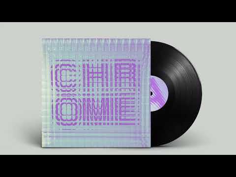
My record label cover for the song 'Chrome County' by Oneohtrix Point Never features typography that was placed behind two layers of ribbed glass to create an echo like illusion where the letters appear to be expanding and reverberating, reminiscent of the sound within the track. Whilst the front of the record sleeve is more bold and illusionistic, the back takes a more minimal and modern approach whilst still using the glass effect. Through the use of colour and type, the final design solution successfully captures the resounding and repetitive elements of the song whilst also evoking its psychedelic, hypnotic emotion.
In the spirit of reconciliation Monash University acknowledges the Traditional Custodians of country throughout Australia and their connections to land, sea and community. We pay our respect to their elders past and present and extend that respect to all Aboriginal and Torres Strait Islander peoples today.