
Monash Art, Design and Architecture Graduate Exhibition 2023

Lines of wisdom: Age with attitude

Lines of wisdom: Age with attitude
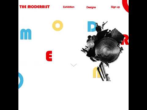

'The Modernist'
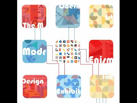
'The Modernist'
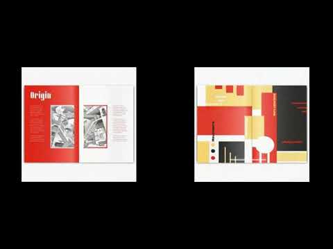
'Modernism publication'

Modernism publication
Nour Kandil, Lines of wisdom: Age with attitude
Nour Kandil, Lines of wisdom: Age with attitude
Nour Kandil, 'The Modernist'
Nour Kandil, 'The Modernist'
Nour Kandil, 'Modernism publication'
Nour Kandil, Modernism publication

In the spirit of reconciliation Monash University acknowledges the Traditional Custodians of country throughout Australia and their connections to land, sea and community. We pay our respect to their elders past and present and extend that respect to all Aboriginal and Torres Strait Islander peoples today.