I am a self-motivated and dedicated designer with professional experience in project management, customer service, and compliance. In my Bachelor of Design I specialised in communication design and have developed an appreciation of the power of advertising. I enjoy the challenge of creating campaigns that connect with people. My hands-on experience in communication together with the theoretical underpinnings of my degree have provided me with a solid foundation in design principles, creative problem-solving, and effective communication strategies. I intend to pursue a career in advertising.
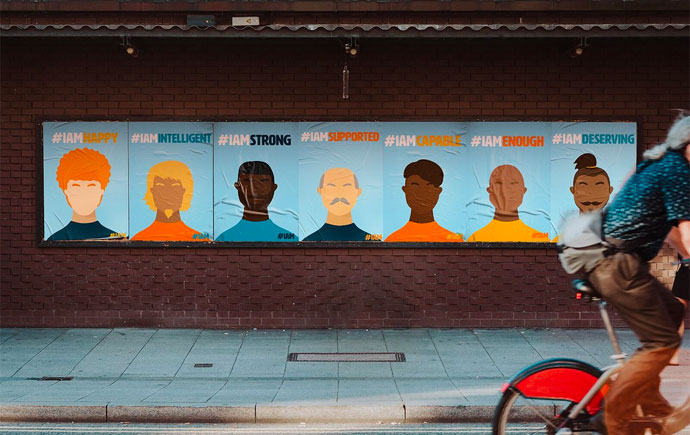
Activation-Posters
The two generations find a common ground poster series aims to showcase the humorous common grounds between Millennials and Generation-z, despite the evident conflicts. Portraying how different everyday phrases can connect both generations and celebrate their togetherness.
Activation Posters
From the poster series the individual signage can be utilised as banners allowing people to connect with the overall motive of the Activation project.Regardless if people pass by are on other modes of transport at one glance they can resonate with the catch phrases whether they are Millennials or Generations-z.
Activation Tote Bags
The design of the tote bag can be used for multiple purposes as it also equates to the campaign of Generation-z and Millennials finding a common ground. Tote bags are really popular amongst both generations; thus the text can easily be relatable.
Activation Website
With the current advancements in technology creating a website serves as an engaging platform where individuals have the opportunity to look at the individual posters, tote bags , information about the campaign and participate in an activity questionnaire on attempts to assist participants to identify the common ground they share with both Millennials and Generation Z, emphasising the unique characteristics of each generation and the opportunity for meaningful interactions.
Not For Nothing Brand Guidelines
The brand guidelines for Life Saving Victoria uplifts a new logo and branding image of the organisation.The guidelines is broken down into multiple sections better allowing the client to understand it's purpose and the other types of content created in relation of this project.
Not For Nothing Logo
The logo for this project has three main components lifebuoy, typography and colours.The lifebuoy represents safety at the beach and the swimming pool.The typography illustrated in bold highlights the name of the organisation and it's purpose, and the colour emphasises the overall agenda of life saving.
In the spirit of reconciliation Monash University acknowledges the Traditional Custodians of country throughout Australia and their connections to land, sea and community. We pay our respect to their elders past and present and extend that respect to all Aboriginal and Torres Strait Islander peoples today.