Monash University logo

Monash Art, Design and Architecture Graduate Exhibition 2024

Hi, I’m Dita, a communication designer focused on graphic design. Since the start of my journey, I’ve been drawn to brand identity. My style is clean and minimalistic, with emphasis on clear space and precise element placement. I strive to create designs that are visually pleasing and meaningful, enhancing brand messages and impacting viewers.

In my final ‘Activation’ project, I explored overthinking—its impact and coping strategies. My campaign, ‘Mind Your Mind,’ raises awareness and provides tools for managing overthinking. I also showcased projects on typographic identity, creating unique visual language, and cohesive brand identity for an exhibition.

Mind Your Mind - Self Reflection Book

This journaling book is the core of the campaign, designed to support individuals dealing with overthinking. Inside, you'll find practical tips, thought-provoking prompts, and positive reminders. It aims to empower people to manage their thoughts with mindfulness, helping them find calm in everyday life.

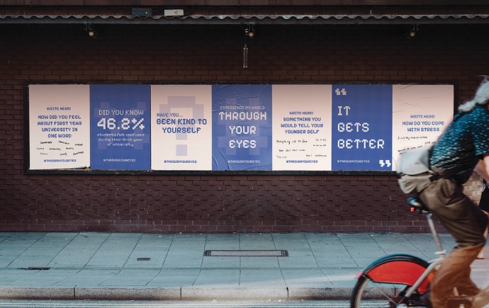
Mind Your Mind - Interactive Mural

Take and Share. This interactive mural pairs with the self-reflection book, which is available in an envelope on the wall. After taking a book, participants write a note—advice, experience, or thoughts—on the last page, tear it out, and place it back in the envelope. This action allows them to learn from each other's experiences and create a supportive community.

Mind Your Mind - Social Media

The social media posts for the Mind Your Mind campaign are designed with calming visuals. Using a soft colour palette and inspiring quotes, each post encourages followers to reflect on their thoughts, share experiences, and feel supported in managing overthinking in daily life.

Mind Your Mind - Merchandise

The Mind Your Mind merchandise features the brain mascot, and empowering quotes. Designed as daily reminders, these items encourage mindfulness and self-care, promoting the campaign’s message of mental clarity and support. Each piece connects the community, fostering awareness wherever they go.

Melbourne Recital Centre - Typographic Identity

I selected the Melbourne Recital Centre to create a typeface set inspired by its unique architecture. Drawing inspiration from its distinctive exterior shape, the bold typeface pairs well with supporting fonts. I applied the new typeface to various applications, including tickets, lanyards, booklets, and signage.

Deborah Halpern: Mosaic of Humanity

This exhibition design draws inspiration from Deborah Halpern’s iconic mosaic sculptures, capturing her unique, vibrant style. Asymmetrical coloured boxes represent the fragmented tiles from her works, with colours specifically selected from her celebrated piece Ophelia. This playful colour palette radiates energy and joy, reflecting the spirit of Halpern’s art.

Explore more


View all


Back to top