Hi, my name is Imogen and I'm a Communication Designer. I am drawn towards a colourful and vibrant design style, creating lively work with a strong personality. Most of my work focuses on building identity and branding for companies and campaigns. Once I have completed my degree, I hope to travel for a while to gain some experience and knowledge of the world and the design that encompasses it before I start working. Once I get back, I want to get involved in either the service design field or in branding and identity.
Common Cliche
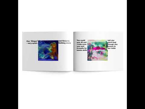
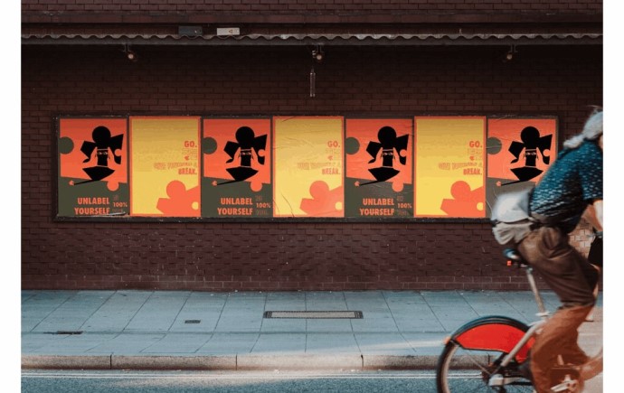
For my Activation project this semester, I focused my campaign on queer stereotypes. Throughout this process, I struggled with the direction of what I wanted my campaign to look like. Once I looked into past queer design, I decided to focus my campaign on a zine workshop, creating an event where queer lives are appreciated and not defined by their labels and stereotypes. My finished project consisted of ten zines I made and printed that were a representation of different queer individuals. Alongside the zines, I made an invite for the workshop that would have gone out beforehand. I also created secondary applications, including customisable buttons and an Instagram page.
Common Cliche
The focus of this campaign was to rewrite and break the stereotypes society holds against the LGBTQIA+ community. The idea behind the event was to create personal zines that meshed the participant’s perspective on their sexuality and the stereotypes they’ve heard, with other aspects of their life such as hobbies, likes and dislikes. Creating a work that combines these creates conversations about the importance of stereotypes in the queer community, and in combination with other stereotypes, do they even hold any importance anymore.
Common Cliche
The idea behind these buttons was something else people could create as a secondary physical memento from the event. They can use stereotypical labels combined with another random aspect of themselves. This is to further illustrate the breakdown of stereotypes in the queer community and normalise them in context of all stereotypes.
Common Cliche
Creating an account online helps to digitise the zines and event photography. It also helps to advertise and campaign the event by putting it online to expand an audience and more attendees, or to potentially inspire others to create their zine workshop. Each post has aspects of the event including people working on their zines, work-in-progress photography and completed pages. The posts are also edited to look collaged and similar to the zine compositions to further communicate the idea of what this campaign is doing, and keep a consistent style throughout the applications.
Dale Frank 'Vision 2025'
This project envisioned an art exhibition for artist Dale Frank. My design for this exhibition’s visuals took inspiration from Frank’s erratic and random titles for his artwork that he thinks of or ‘overhears’ in public. I took this concept and used it to create visuals from type where it becomes overlayered and blurred as a way to illustrate loud and growing voices. I also took the bright and vivid colours from the ones Frank uses in his work.
A publishing project I did last semester focused on the designer Harry Beck who created the London Underground railroad map. I took the line aspects from Beck’s work and illustrated them into the pages to create continuity and visually communicate his work. I additionally used photography from the London underground in the 1930s to further visualise the period that influenced Beck’s design decisions.
In the spirit of reconciliation Monash University acknowledges the Traditional Custodians of country throughout Australia and their connections to land, sea and community. We pay our respect to their elders past and present and extend that respect to all Aboriginal and Torres Strait Islander peoples today.