Designing the poster
Visual structure
Plan the visual structure of your poster before you make design choices for every small detail. Careful poster layout and spacing to create an appropriate visual structure will help to make your poster:
- more logically organised
- less 'busy' or confusing
- easier to read and navigate.


Design details
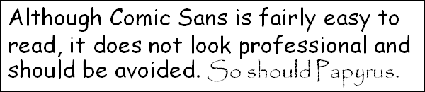
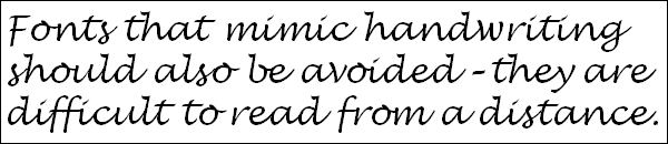
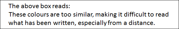
Every poster needs a way to catch the eye of its audience. Your design choices for each detail or part will help make your poster more:
- visually appealing
- readable
- engaging.
Following proven design principles will help you achieve this, but also use your own judgement. Stand back and look at your poster design and consider how well it inspires you to have a closer look.


Making the poster
Making the final version of your poster requires:
- a design tool. I.e. the software or production method you will use to create the poster
- time for reviewing, improving and finalising the poster.
Examples
Click on the links below to access digital copies of some posters designed by students at Monash University for their unit assessments.
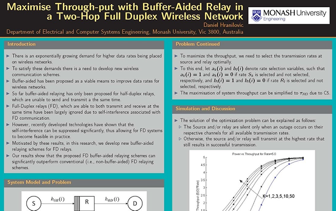

Try the below activity to analyse these posters and view feedback comments about them.
