Zhaoyun Shi
Behance: www.behance.net/zhaoyun
Email: Maggiestar0314@gmail.com

Zhaoyun Shi, Motion Graphic Animation – “Depression storm”
The theme of the work is about depression. This work is not to popularize what depression is, but to show an abstract process of emotional change of patients with depression. Depression is a complex emotion, sometimes it can be very calm, sometimes it will be outbreaks. The main expression of the work is a depression patient from depression to outbreak and then return to the process of calm, the purpose of the creation is to hope that people can more understand the emotional feelings of depression patients, give more understanding and care of them.
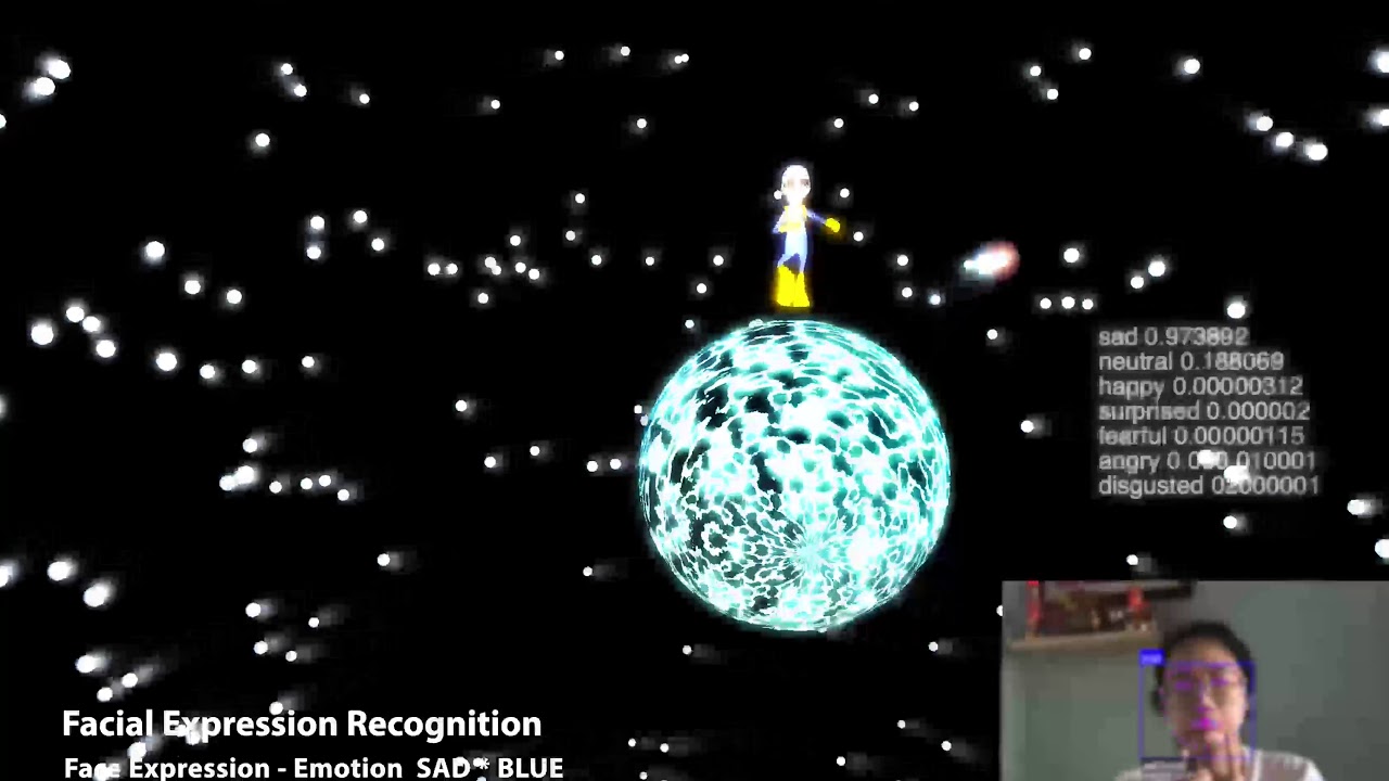
Zhaoyun Shi, Max/Msp Interactive design Project – “LonelyPlanet”
“LonelyPlanet” is an interactive design work, created by Max/Msp software. The theme is revolving around the Personal planet and the universe. The work itself is an experimental work. The content of the work is like a game. It needs people to trigger the conditions continuously to get the results. It can change colors, move and trigger black hole effects through finger control or facial expression recognition and. Monitoring the change of mood from face expression. For the people, in the space, we feel calm and lonely at the same time. People generally experience that the universe by watching documentaries, text materials or going to the planetarium. Therefore, the intention of creating this work is let people can stay at home and experience planets and the universe, break the boundaries between people’s bpdy and planets, explore new relationship between body and the world. Also shows what new interactive technology can do to people. And also designed the special ending of the black hole. Just want to warn people, if people over inquiry with the planet, it may lead to a bad result.

Zhaoyun Shi, LABEL DESIGN (C4D Poster) - Wine Branding“CHARDONNAY”
The work is aim to design a Brand identity for “CHARDONNAY” wine, the idea is approaching with – Scent. The beginning of a bottle of wine to be tasted is to feel its smell. The smell will express the ingredients of the wine to the customers, and I express it more intuitive through the visual language. Choose three kinds of fruit colors are used as the main color theme, because they are the ingredients of the wine itself, bright color represents youth and vitality, and create the element of ribbons to visualizes the theme of “Scent”.

Zhaoyun Shi, Motion Graphic Advertisement (C4D Animation) - Wine Branding“CHARDONNAY”
The advertisement keeps the design elements from the wine label design, uses fruits and ribbons and consistent with color theme for animation design, the floating ribbons focuses on expressing the smell of wine lingering in the air.

Zhaoyun Shi, AR Animation (Unity) - Wine Branding“CHARDONNAY”
The AR animation work shows the three fruits animation compositing with the type “CHARDONNAY”the name of the wine.

Zhaoyun Shi, Interaction Design – “Color, Scale, Movement”(Unity)
Three Unity work shows three different design principles-“Color,Scale,Movement”.
Color – Click any components to change the color,
Scale – Click “Heart “components to scale the elements.
Movement – Press the key “w”to active movement and click planet and gear active rotate state.