Bowen Guan
www.instagram.com/gn.bowen

Bowen Guan , 'Title Sequence - Shadows of the Straits '
This project is an opening title sequence for the fictional noir drama Shadows of the Straits, set in 1960s Singapore. Inspired by the political unrest and multicultural tensions of the era, it blends archival textures, layered symbolism, and rhythmic edits to evoke a sense of mystery, sensuality, and danger. Created using Adobe After Effects, the sequence juxtaposes neon lighting, abstract visual motifs, and glimpses of a city in transition — alluding to a world of corruption, lost identities, and underground glamour waiting in the shadows.

Bowen Guan , Branding - FlavorBurst
This project is a brand identity and packaging system for FlavorBurst, a travel-size personal care product line inspired by fruity flavours and playful energy. The design explores three core palettes — Blue Raspberry, Grape Soda, and Strawberry Lemonade — each expressed through custom illustrations, type pairing, and tactile product visuals. From tubes to posters, bags to app UI, the brand delivers a cohesive experience that is bold, joyful, and sensorial. The work integrates both static and motion elements to present a contemporary, youth-oriented lifestyle brand.
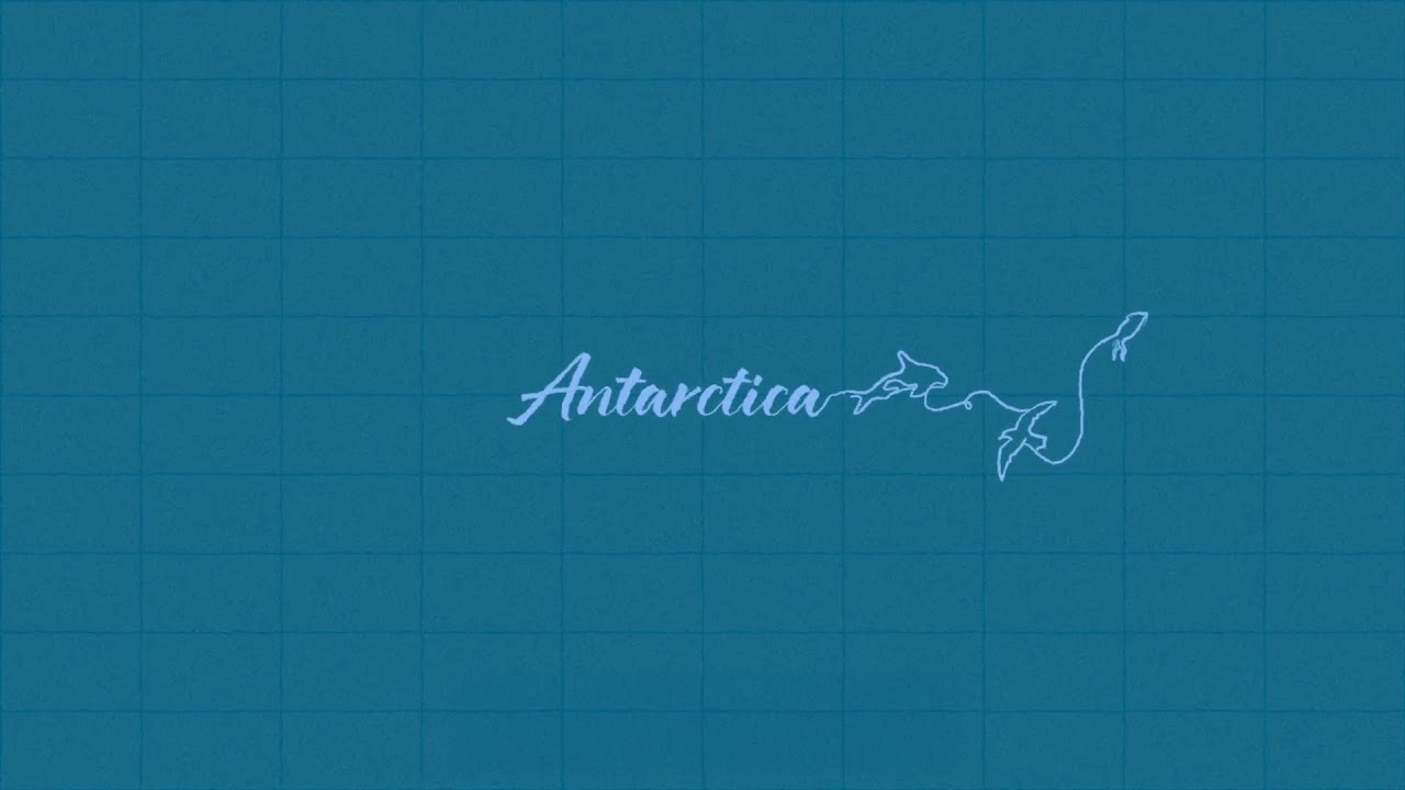
Bowen Guan, 'Art in Motion - Antarctica'
This project is a poetic motion piece inspired by the vastness and isolation of Antarctica. Through minimal line work, abstract movement, and a restrained palette, the animation explores themes of fragility, silence, and awe. Created using Adobe After Effects, this work blends motion design with atmospheric sound to create a contemplative, immersive experience.
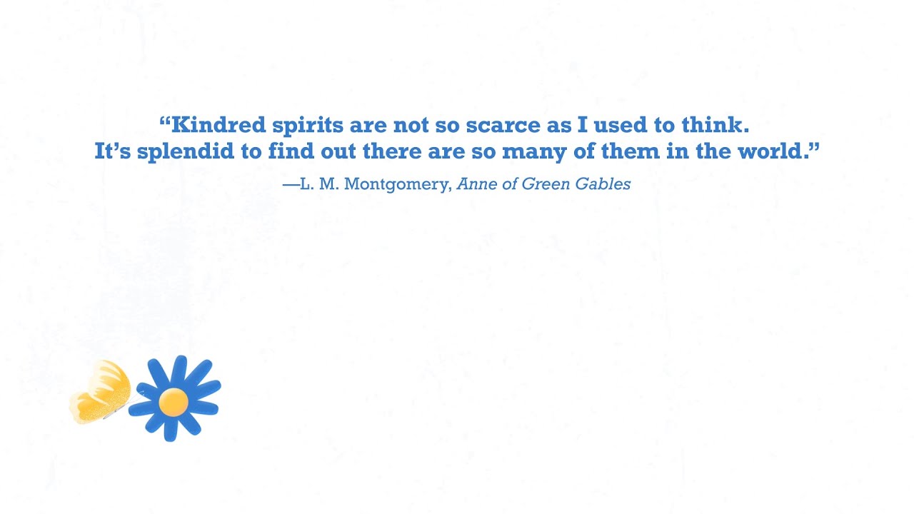
Bowen Guan, 'Kinetic Typography - Kindred Spirits'
This project is a kinetic typography animation created in response to a chosen quote. The piece explores how text in motion can act as both visual form and narrative voice, using timing, pacing, and typographic rhythm to express the emotional weight of the phrase. Created with Adobe After Effects, it applies key principles of animation — including anticipation, timing, and exaggeration — to transform static words into a moving, expressive experience. Sound design complements the visuals to deepen meaning and reinforce mood.

Bowen Guan , Campaign Design - Lawson Silver Circle
This project reimagines the branding and communication strategy of Lawson Japan to celebrate and empower its elderly workforce. Silver Circle is a human-centered campaign combining store visuals, character-led packaging, and community storytelling to shift public perceptions about aging and labor. This prototype visual shows in-store branding that positions older workers not just as staff, but as local icons. Through intergenerational narratives and inclusive design, the project aims to foster empathy, dignity, and social value in everyday retail spaces.

Bowen Guan , UX/UI Design - Silent Pharaoh
This project responds to the challenge of accessibility in cultural institutions by designing Silent Pharaoh — a multi-sensory mobile guide for NGV’s Egyptian exhibition. The app combines tactile mapping, visual overlays, haptic cues, and multilingual support to help D/deaf, hard of hearing, and neurodivergent visitors engage with the exhibition space. Informed by user-centred research and museum precedents, the prototype demonstrates how digital design can create inclusive cultural experiences that feel respectful, intuitive, and narratively rich.
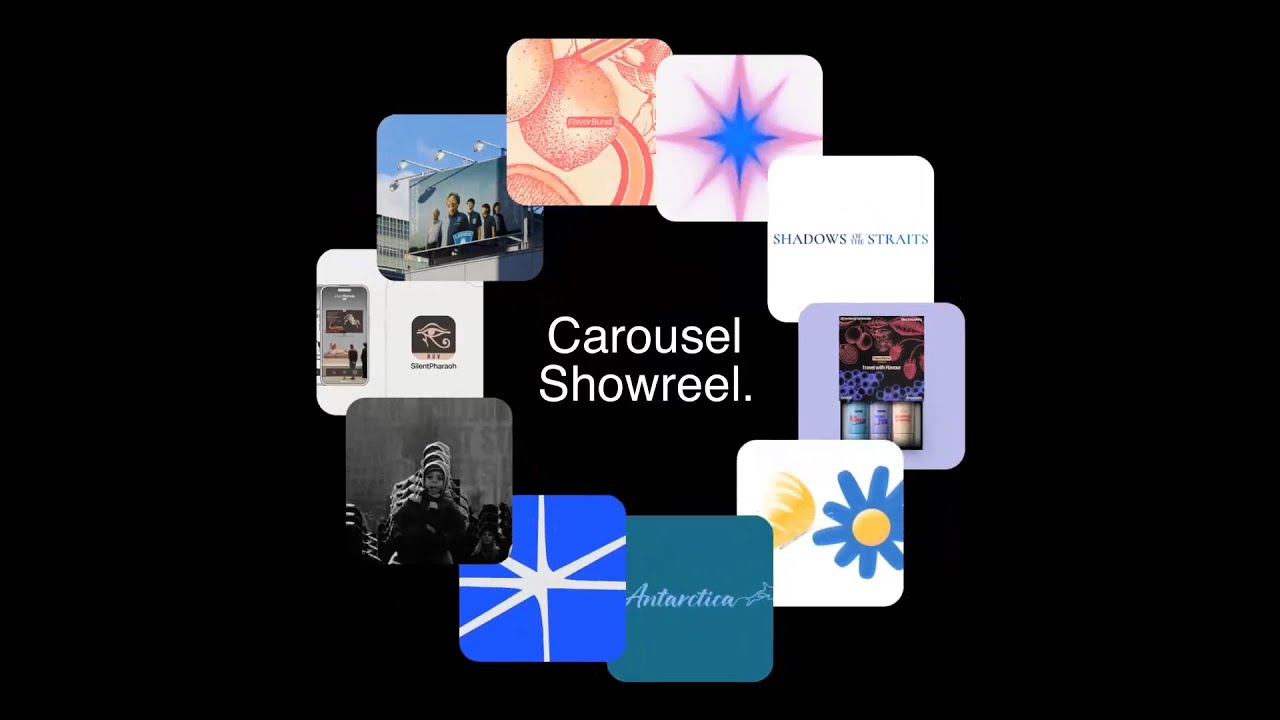
Bowen Guan, 'Design Showreel'
This showreel presents a curated selection of my Mutimedia Design work completed during the Master of Design at Monash University. It features animated title sequences, kinetic typography, branding visuals, and abstract animation — unified by a focus on storytelling, rhythm, and visual clarity. Created using Adobe After Effects, the reel showcases my ability to bring design to life through movement, composition, and pacing. It reflects my growth as a designer who uses motion as a language to evoke emotion, capture attention, and craft memorable experiences.