Nanthakan Puathaweepong (June)
www.linkedin.com/in/nanthakan-puathaweepong-65b08a285/
Junentk1997@gmail.com

Nanthakan Puathaweepong (June), 'between here and there'
I’ve come to call this project my personal visual diary, an abstract, poetic journey through motion graphics that captures fleeting moments, quiet emotions, unanswered questions and the passing of time. Over the past few years, life has shifted faster than I ever imagined. In that rush, I found myself wondering, Who am I? Where am I heading? What am I chasing? only to realise that I don’t need all the answers right now. At its heart, this project is about learning to pause for the small moments, to honour the present, and to hold gratitude for the past, even while moving into an uncertain future. It’s a space to feel, reflect, and maybe, to be at peace with not knowing everything just yet.
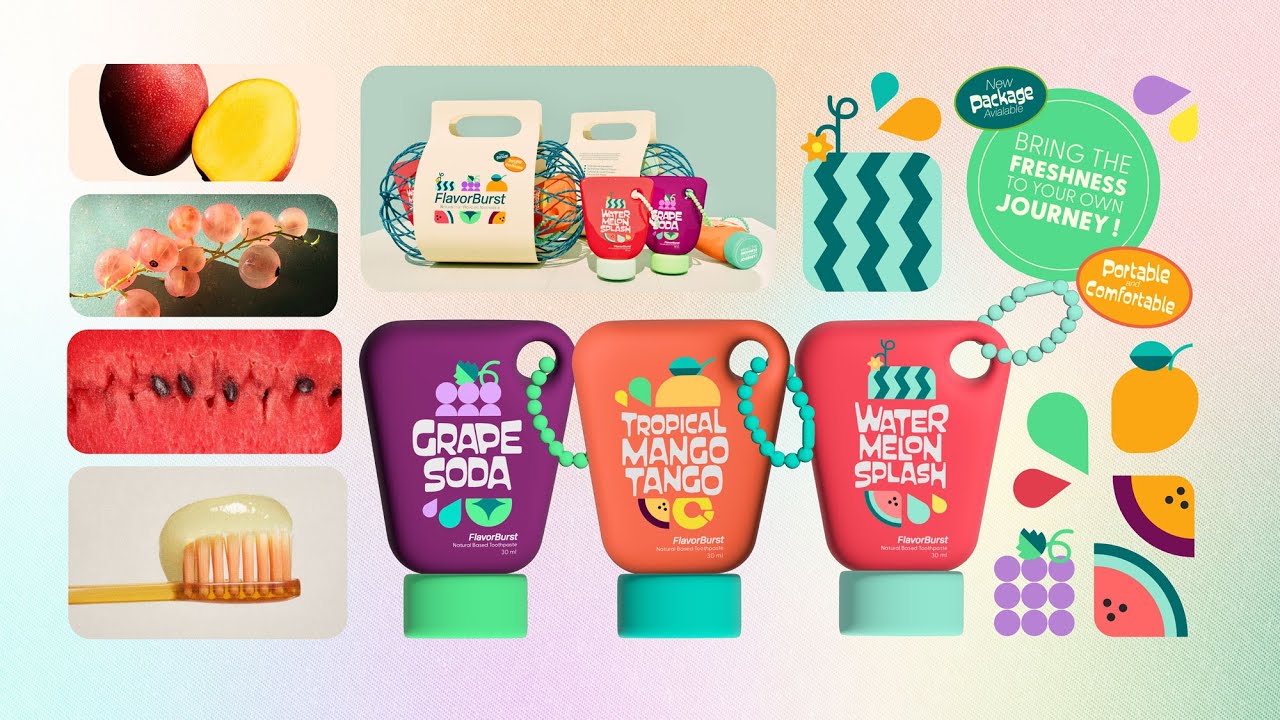
Nanthakan Puathaweepong (June), 'Brand Narrative and Advertisement Project for FlavorBurst'
This project reimagines toothpaste as a fun, functional travel essential. I see 'FlavorBurst' as a compact, fruity-fresh toothpaste designed for people on the go, whether catching a flight, hitting the road, or searching for the perfect little gift. The concept combines natural fruit flavour with a burst of freshness, delivered in a playful new form, a mini keychain-sized pack that’s easy to carry and hard to forget. To bring the brand to life, I created the full visual identity, packaging design, and style scape. The core story follows a traveler who, moments before landing, feels a bit off—until she pulls out her trusty FlavorBurst, instantly refreshed and ready to go.

Nanthakan Puathaweepong (June), 'Antarctica Project for SAEF'
This project was created in collaboration with SAEF to raise awareness about the environmental crisis in Antarctica. As someone who values storytelling, I wanted to move beyond the usual "go green" or "Informative" messages and instead connect with people emotionally. I developed a narrative built around a familiar metaphor: the world as our home. By framing the planet as something personal and close, like the house we live in. I aimed to create a sense of urgency, and responsibility. The story reminds us that environmental issues aren’t distant or abstract, they’re deeply connected to our everyday lives. This piece was later featured on the SAEF website as part of their official selection.

Nanthakan Puathaweepong (June), 'Title Sequence: Shadow of the Strait'
This title sequence introduces a noir-style TV series set in the1960s Singapore. The story follows a disillusioned detective, a missing person case, and a nightclub performer. In this project, I leaned into classic noir aesthetics, using shadows, silhouettes, and strong contrast to build the mood. I added texture and grain to give the scenes a gritty, atmospheric feel. I also played with camera angles to create tension and keep things visually dynamic. For the sound design, I layered different effects and ambient noises to bring the environment to life and subtly hint at the mystery behind the story.

Nanthakan Puathaweepong (June), Rainbow Spirit Festival — Rebranding Project
This project reimagines the identity of Rainbow Spirit Festival—an event rooted in creativity, connection, and community. Inspired by festivals like Burning Man and Laneway, I developed a new visual direction that reflects the festival’s spirit of self-expression and transformation.
The branding captures a journey through music, art, and shared experiences—where people can be free, embrace their individuality, and feel part of something larger. Vibrant characters and textured visuals reflect everything from camping under the stars to dancing to electronic beats. The result is a fresh identity that celebrates inclusivity, creativity, and the joy of being fully alive.