Welcome to Preston
He also designs his own fonts, which are licensed for a variety of uses by individuals or companies. To be successful in this obscure craft requires a mixture of creative ingenuity and mathematical precision, an unusual combination of skills that very few individuals possess.
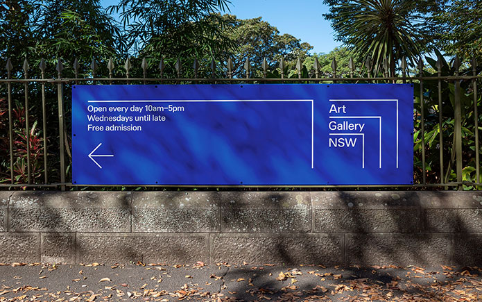
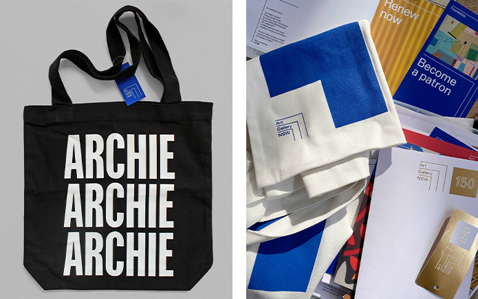
Like many in his profession, Vincent initially trained as a graphic designer. He was introduced to typography and type design at Monash University by long-time sessional teacher Dan Milne and, upon graduating in 2010, Vincent was employed at the renowned New York foundry Commercial Type under the tutelage of Christian Schwartz, Paul Barnes and Berton Hasebe. Vincent now operates his own typographic practice, Matter of Sorts, where he designs, teaches and runs occasional type design workshops. One of his recent commissions, a custom typeface for the Art Gallery of New South Wales (AGNSW), provides some valuable insights into his work.
Vincent and I have collaborated regularly over the years on a range of projects, from largescale commissions like a custom typeface for Australia Post, to personal projects including the Recollection fonts, which explored Australian design history. In 2020, an opportunity arose for us to partner once again, this time on a brief to redesign the Art Gallery of New South Wales' visual identity. Vincent joined our small team of graphic designers at Mucho and we began by investigating the rich history of one of Australia's most significant cultural institutions.
Research is a fundamental starting point for many graphic designers and type designers. Making decisions around referencing, reinventing or rejecting precedents can only be made with an informed understanding of historical context. This investigative phase is perfectly suited to Vincent's curiosity and insatiable thirst for knowledge. “I find visible language and typographic form captivating,” he explains. “The process of collecting and categorising and undoing and remaking is also a simple way for me to make sense of the world.”
This desire to innovate and explore new territories is tempered by a recognition that he is always working with an established set of parameters. “It is near impossible to truly invent something new in the world of letters. Almost everything is a form of reinvention or rediscovery,” says Vincent. “I think one can be innovative in combining unexpected forms or harnessing new technologies and perhaps this is the closest to the notion of invention, but my work is largely a conversation with letters already drawn."
Examples of Australian ‘letters already drawn’ as inspiration for the AGNSW project proved elusive. What we discovered in the extensive archive of catalogues, books and previous identities were fragments of an eclectic story rather than a singular narrative. So we embraced this lack of purity in the work, a sentiment we dubbed ‘mongrel modernism’. However, one specific typeface, Adrian Frutiger's iconic sans serif Univers, appeared regularly in the source material, and we decided this could be a key reference for Vincent’s work.
Alongside developing a primary typeface, Vincent also saw an opportunity to push the boundaries of technology. Calling upon his extensive network of colleagues for help, he created an online type generator, an app that could produce numerous fonts based upon a core typographic skeleton. The AGNSW has a vibrant exhibition program, and this tool would have allowed them to create ‘sub-identities’ for each new show. Although they chose not to pursue the idea, such research and development are integral to Vincent’s practice; a desire to evolve and progress reflects his commitment to continual professional growth.

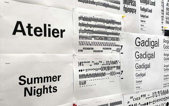
Throughout the conceptual phase, a constant dialogue was maintained between all members of the creative team. As Vincent developed his fonts, he shared prototypes in a gradual process of refinement. Seeing his letters in use provided invaluable insights, helping to shape the font’s weight, width and character. For Vincent, the ability to stand back and “shift from macro to micro” is an underrated skill for type designers, who are often lost in the work; “knowing how to navigate possible lines of inquiry and knowing when to pause, iterate, extend, and perhaps most importantly, stop”.
The final concept for the new typeface was delivered to the AGNSW as part of a coherent and harmonious identity system. Preparing and presenting a considered rationale plays an important role in gaining approval. Many clients are unfamiliar with type design, and through experience Vincent has perfected a unique combination of academic rigour and subtle showmanship when sharing his work.
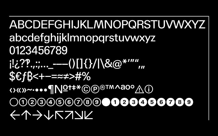
Neutral in tone, but with subtly subversive details that add distinction and personality, the family of fonts was named in honour of Sydney modernist, artist and designer Margaret Preston. The typeface was designed with an extended character set that includes diacritics (glyphs that indicate a difference in pronunciation) specifically to account for Aboriginal and Torres Strait Islander words.
Following acceptance of the visual identity concept, Preston was shared with the AGNSW’s in-house creative studio for further refinement and testing on real-world projects. After only relatively minor adjustments, a final family of three weights (light, regular and medium), Condensed and X-Condensed versions were ready for mastering, a rigorous process where the fonts are prepared for output. Reviewing seemingly endless proof sheets requires absolute focus and discipline, a prerequisite for which Vincent describes as “fundamental obsessiveness”.
Entrusting his fonts to others after countless hours of toil is a reality Vincent came to terms with long ago. “Generally, I’m not that precious about my letters,” he notes. “I’m aware that my typefaces play a role in someone else’s vision, that they’re a mere ingredient and people are free to do what they want with them.” The relative anonymity of type design is perfectly suited to Vincent’s understated and modest character. “There’s something satisfying about playing a fundamental role in someone’s communication without getting credit.
Vincent Chan is a Naarm/Melbourne based type designer who works under the moniker Matter of Sorts. He is currently a sessional lecturer at Monash Art, Design and Architecture, where he completed a Bachelor of Visual Communication (Honours) in 2010 and received his PhD in 2021.
Dominic Hofstede is a partner and Creative Director at Mucho. He has undertaken mentoring, lecturing and teaching roles with numerous educational institutions, and was an Adjunct Senior Research Fellow at Monash Art, Design and Architecture.