Colours
On this page:
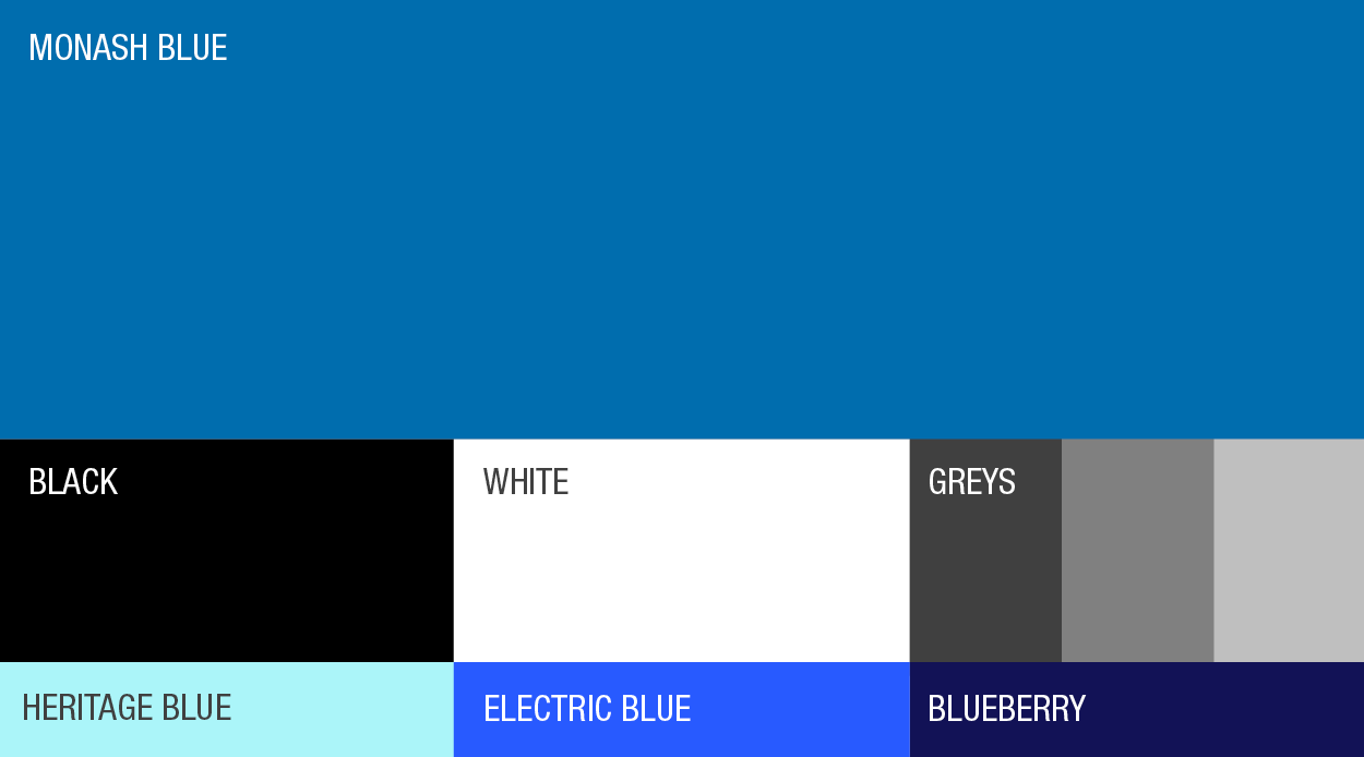
Primary colour
Monash blue is our only primary colour. It’s our core colour and is to be applied to ALL communications and design. By applying our primary colour consistently, we will increase brand attribution and equity. Monash blue is our first colour consideration and is to be highly visible on all communications. See proportions above.
| Monash blue |
|
C100 M50 Y5 K5 PMS 2945C R0 G109 B174 #006DAE |
Secondary colours
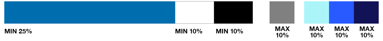
White, black and tones of grey are used in support of Monash blue as secondary colours across all communications. Proportions will vary depending on audience and communication needed. See proportions above.
| Black | White | Grey 1 | Grey 2 | Grey 3 |
C0 M0 Y0 K100 | C0 M0 Y0 K0 | C0 M0 Y0 K80 | C0 M0 Y0 K50 | C0 M0 Y0 K10 |
Tertiary blues
Heritage blue, Electric blue and Blueberry are used to support both the primary and secondary colours in applications to add vibrancy. They are to be used sparingly and should never visually overshadow the primary and secondary colours. See proportions above.
| Heritage blue | Electric blue | Blueberry |
C40 M0 Y14 K0 | C90 M64 Y0 K0 | C100 M97 Y0 K30 |
Accessibility
We aim to be compliant in accordance with the Level AA criteria of W3C Web Content Accessibility Guidelines (WCAG) 2.1. All colours have been tested and can be used on all digital platforms.
For maximum legibility, our colours were tested using the WCAG contrast ratio formula, ensuring a ratio of at least 3:1 for large text (24px) and 4.5:1 for normal text (16px).
The visual below demonstrates the recommended text and background colours based on WCAG guidelines.
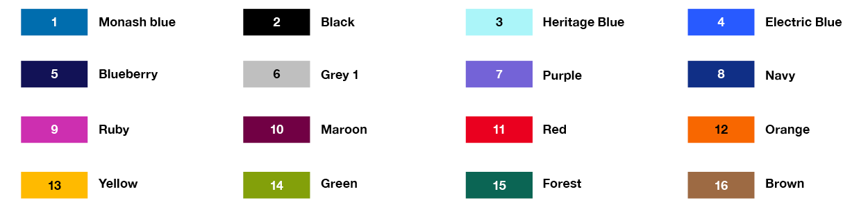
Utility colours
- Do not use utility colours in place of the primary, secondary or tertiary palette.
- Maintain consistent colour mapping across related visuals.
| Purple | Navy | Ruby | Maroon | Red |
|
C65 M61 Y0 K0 PMS: 2095 R116 G99 B215 #7463D7 |
C100 M67 Y0 K30 PMS: 294 R16 G47 B134 #102F86 |
C30 M85 Y0 K0 PMS: 241 R205 G47 B176 #CD2FB0 |
C23 M100 Y0 K45 PMS: 683 R113 G0 B68 #710044 |
C0 M100 Y86 K0 PMS: 199 R234 G0 B31 #EA001F |
| Orange | Yellow | Green | Forest | Brown |
|
C0 M64 Y94 K0 PMS: 2026 R248 G103 B0 #F86700 |
C0 M31 Y88 K0 PMS: 130 R255 G186 B0 #FFBA00 |
C56 M16 Y100 K0 PMS: 2276 R131 G160 B10 #83A00A |
C83 M0 Y58 K49 PMS: 3298 R11 G101 B84 #0B6554 |
C0 M41 Y63 K42 PMS: 4261 R157 G106 B67 #9D6A43 |
Colour order
Always apply colours in a defined sequence to maintain brand consistency and clarity:
- Use primary colours first
- Then secondary colours
- Then tertiary colours
- Introduce utility colours only if additional colours are required.
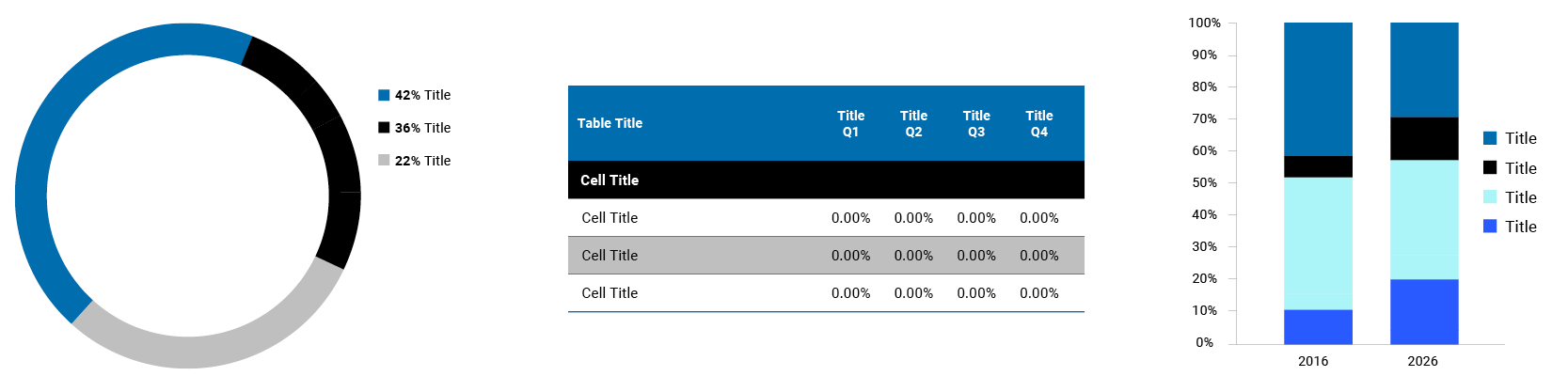
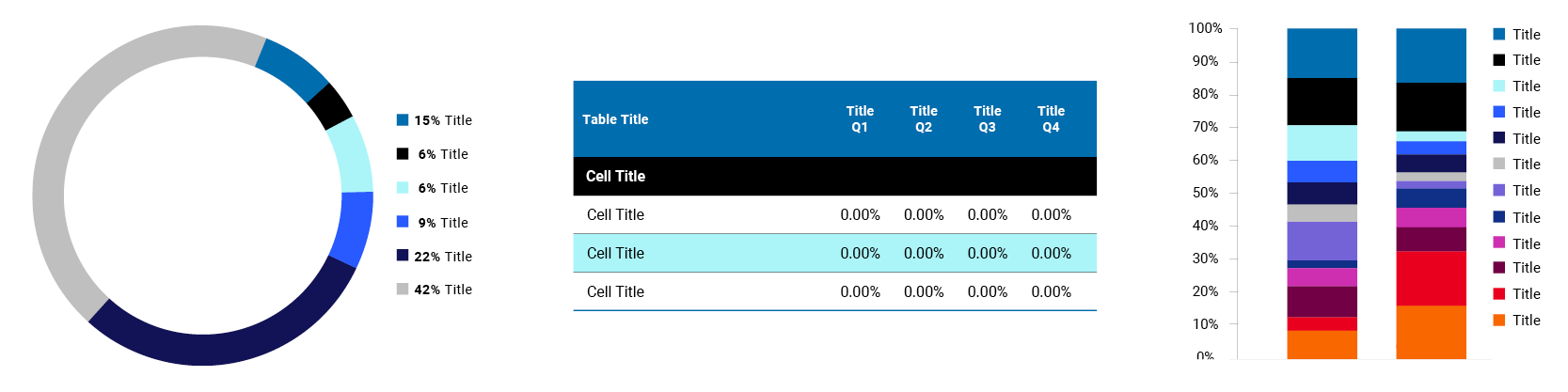
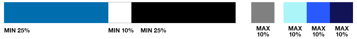
Proportions
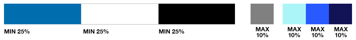
Colour use is proportioned slightly differently depending on audience type to reflect tone, purpose and level of formality. This guidance supports differentiation across communications and should be applied with consideration. The colour proportions shown are not mandated, but provide a helpful framework to apply colour correctly.
A minimum of 25% Monash blue must be present across all audiences. It’s the consistent anchor in every communication. There is a lot of creative flexibility – providing numerous colour options for designs.
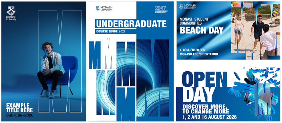
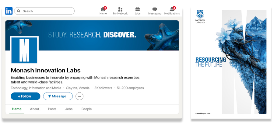
Applying colour to our audiences
Ways to add more Monash blue
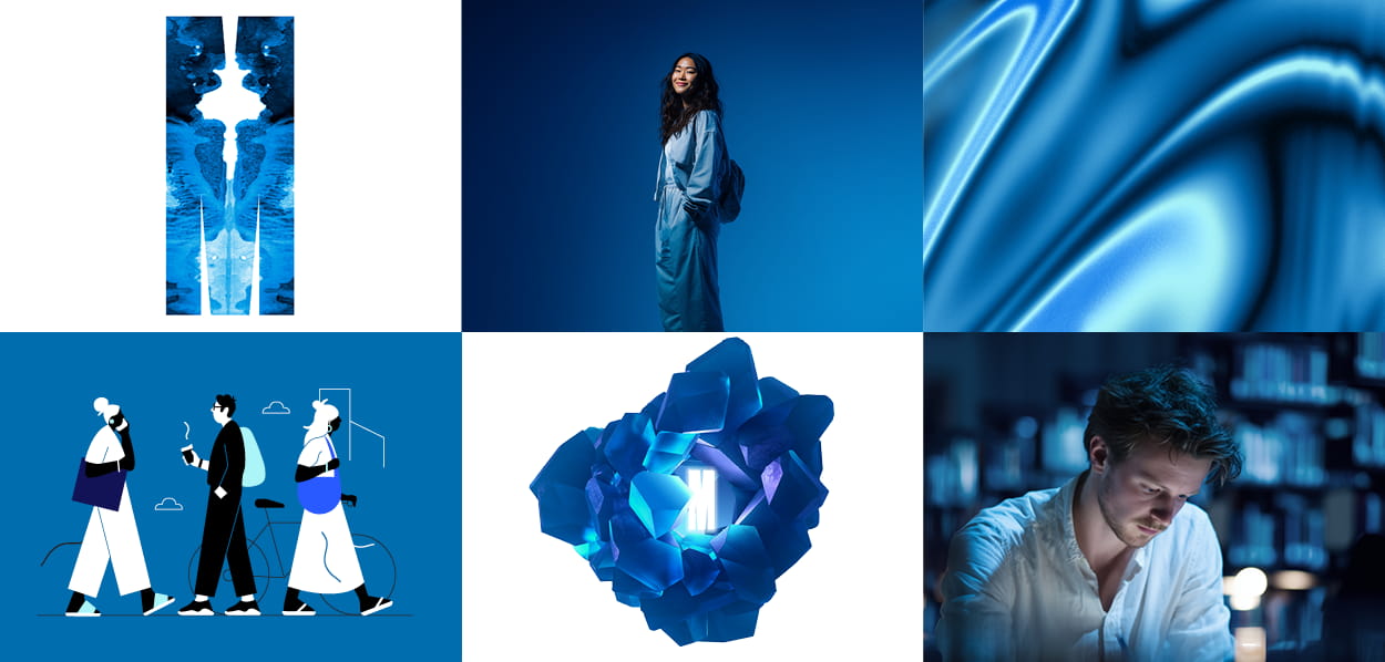
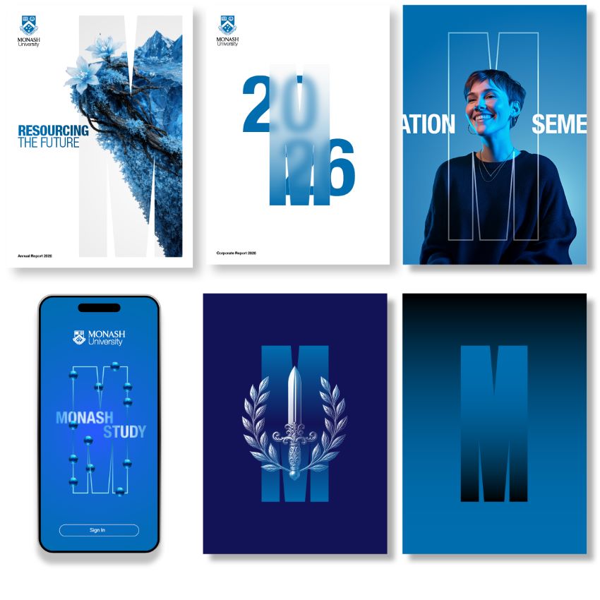
It’s important that Monash blue is highlighted as it’s our signature colour, representing youthfulness, possibility, and openness. It is a core element in our designs. Beyond text and large areas of flat colour, it can be incorporated into various treatments – such as call-to-action buttons, graphics, image overlays, props and styling.
With abstract imagery, Monash blue serves as the dominant base tone.
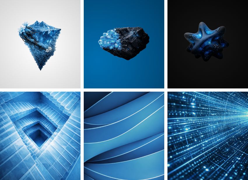
Note: Imagery is conceptual content – generated using AI and reference to style only.
Tertiary blues can be applied to imagery and illustration – influencing colour accents, image environments, overall tone, lighting and propping. Tertiary colours can be used to highlight and add emphasis to key copy, but should never dominate a design.
Note: Imagery is conceptual content – generated using AI and reference to style only.
Very minor inclusion (appx 5%) of another colour may be introduced to aid visual communication.
Note: Imagery is conceptual content – generated using AI and reference to style only.
Real images (excluding abstracts) can appear in either full colour for everyday use, or a blue gradient or a blue wash/treatment can be added. Beyond these simple methods of adding Monash blue, more detailed photoshop work and/or blue lighting and styling would be required to infuse blue into the everyday real image.
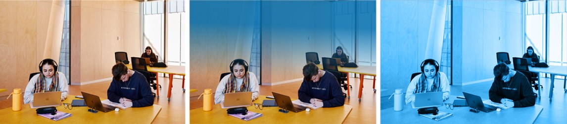
The midtones should approximate Monash blue, when selecting or treating ‘blue’ imagery.
 Left to right: highlights to shadows scale
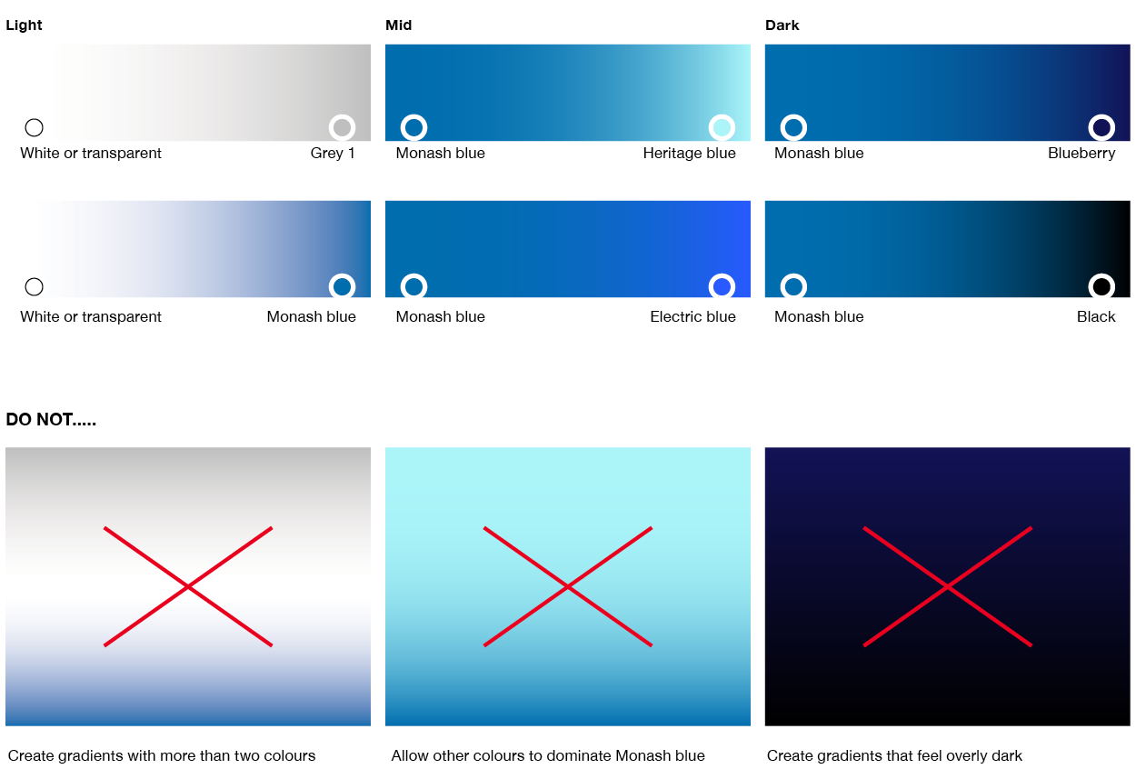
Gradients
Gradients are used to add depth and visual interest while staying true to our brand. Gradients add depth and interest but should be used thoughtfully.
- Three categories: light, mid, dark.
- Use Monash blue as the dominant proportion where applicable.
- Avoid overuse across communications.
Culture and diversity colour applications
While Monash has its distinctive colour palettes that are to be used consistently, we do offer the flexibility to incorporate broader palettes to authentically represent diverse cultures and communities. This approach allows for creative colour applications for specific cultural sensitivities, cultural events and moments of recognition while maintaining overall brand consistency. By blending additional colours with Monash colours, we ensure our communications are both inclusive and also align with our core identity.
The use of bespoke colours is subject to a strict approval process. Please submit colour requests via the Brand requests form.

Examples only. Note: Imagery is conceptual content – generated using AI and reference to style only.