Our logo
The Monash University logo is our primary visual anchor, representing our global impact and our academic and research excellence.
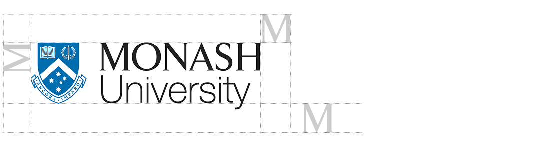
There are three approved logo formats – stacked, one-line, and vertical – providing flexibility across all formats and applications..
The stacked logo is the preferred format delivering the greatest impact in most cases. The stacked logo is to be used when adding either a typographic treatment, the International Campus Network device or the Monash Online stamp.
Blue crest logo
Used for all Monash University communications.
Shield: Monash blue
Wordmark: 100% black

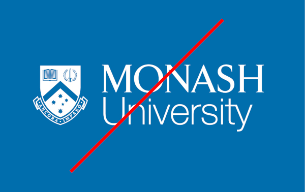
Reverse keyline
For use on dark or coloured backgrounds.
Shield (keyline): white
Wordmark: white
Black crest / Mono
Only applied when single colour is required or when external partners or suppliers require a mono logo.
Shield: 100% black
Wordmark: 100% black
Alternative logo formats
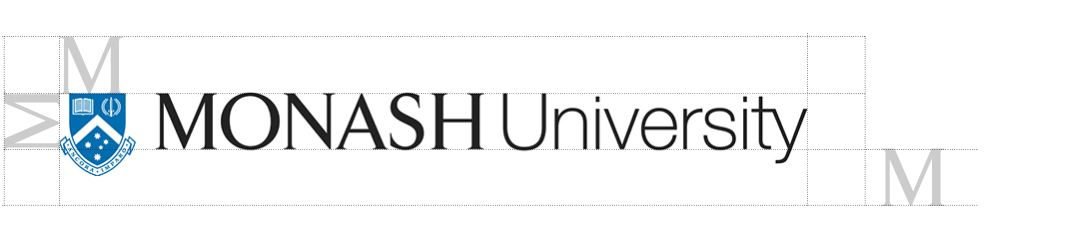
The stacked logo is the preferred version for all standard communications to ensure consistent brand recognition.
In instances where space is limited, use the one-line or vertical formats; these adaptations are designed to maintain high visual impact and legibility within constrained layouts.
Note: Both the one-line and vertical logo are NOT to be used when adding a typographic treatment, the International Campus Network device or the Monash Online stamp. The stacked logo must be used in these cases.
| The one-line logo can be used if there is not sufficient vertical space. | The vertical logo can be used if there is not sufficient horizontal space. It is also suitable for use on merchandise and apparel. |
Logo application and usage
There are set ways in which the logo must be applied in all creative applications.