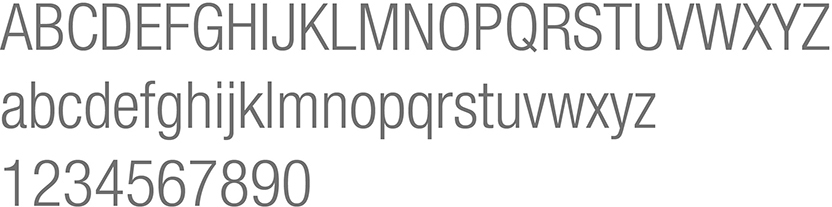
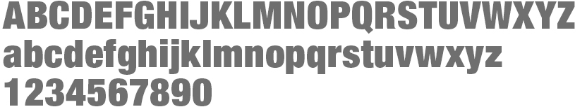
Fonts
When we talk on behalf of Monash University our messages should be consistent in look and feel. Monash typefaces should never be replaced by any other fonts. Care should be taken to change default fonts before finalising your work, presentation or communication.
- Our go-to font is Helvetica Neue and our web font is Roboto.
- Substitute fonts are available for use in situations where the primary fonts are not available.
- Variation in font weights can be used to achieve emphasis.
- Tracking is to be no more than 20 when using Adobe's Creative Cloud
- Notes, captions and footnotes for print should be a tint of your body copy colour, in a smaller point size.
We must ensure that as a University, we adhere to licensing requirements. We can be subject to fines if there is misuse. Fonts should not be shared or distributed without checking your licence agreement.
Brand-approved fonts
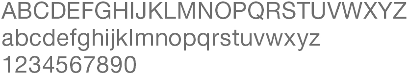
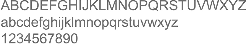
Helvetica Neue Family
View

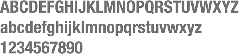
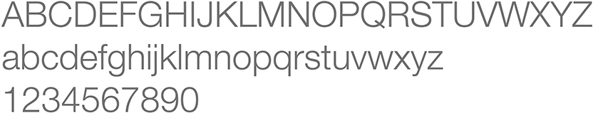
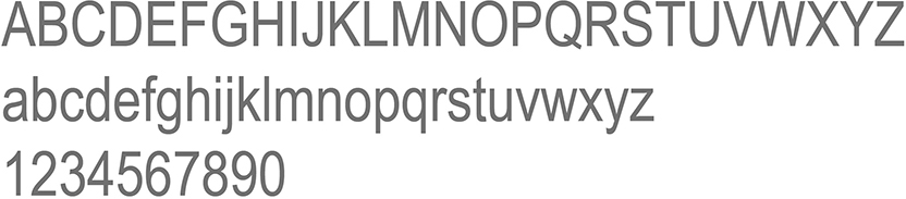
Web font
View
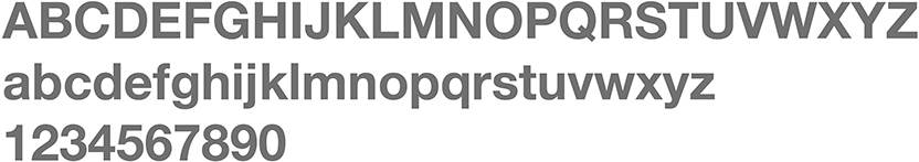
Substitute or System fonts
View
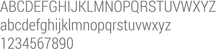
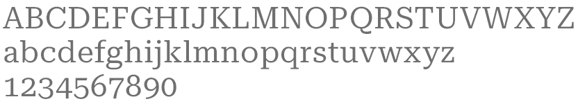
Font for magazine publications only
View
Typography
We have our font as our core element, but we can inject energy and personality into our communications by applying our type in a dynamic and interesting way.
- Different type treatments give flexibility and enhance the idea of being open to possibilities.
- Consistent use of font weights and colour palette acting as an anchor to unify them.
- Helps create interest, impact and a point of difference. This prevents everything looking exactly the same
- Play with type to create looks that suit the many different target audiences that Monash needs to communicate with.
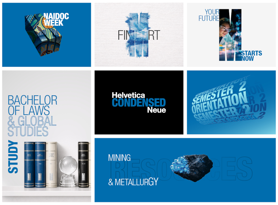
Application
- Alignment is flexible
- Type can be applied as a keyline to add emphasis to key words/statements
- Layering of text can add interest
- Variation in weights, size, rotation, colour and placement
- Type can be butted up to edges of images and/or borders
- Images can be placed into large headlines
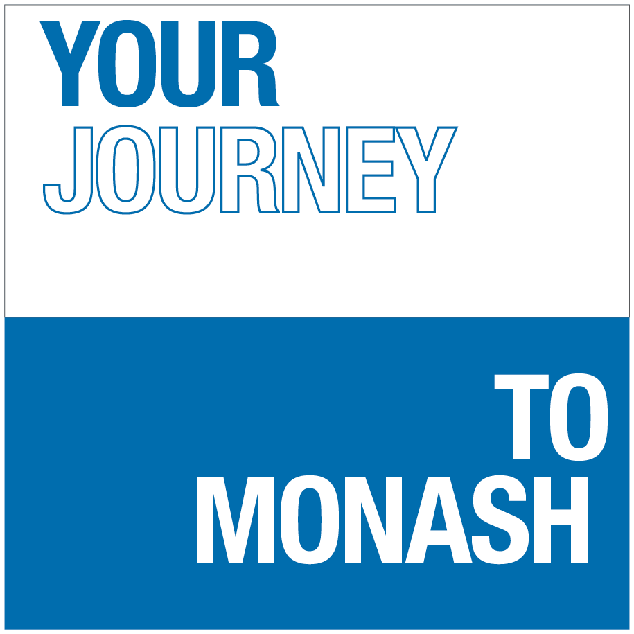
Use of keyline to highlight words/statements.

Layering of text for an added visual style. Recommended when imagery is not required or possible.
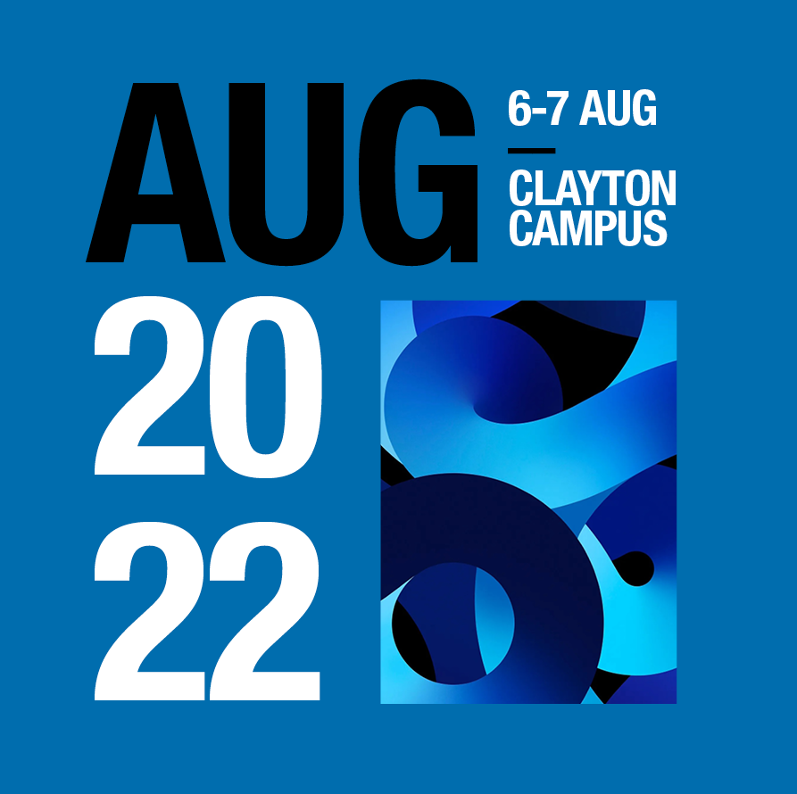
Stretch from formal to creative expressions can be achieved through the size, weight rotation, colour and placement of type.
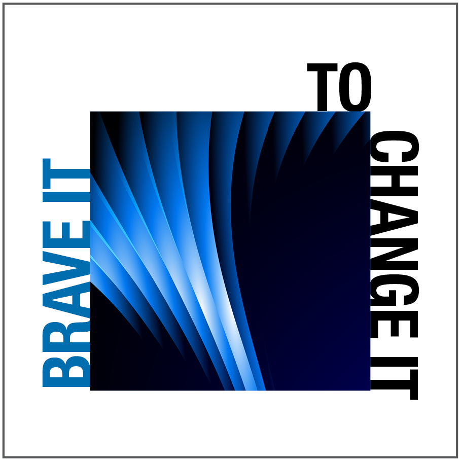
Anchoring of type to the edges of images or other graphic elements. Type can run vertically up sides of assets.

Use different weights to show visual hierarchy
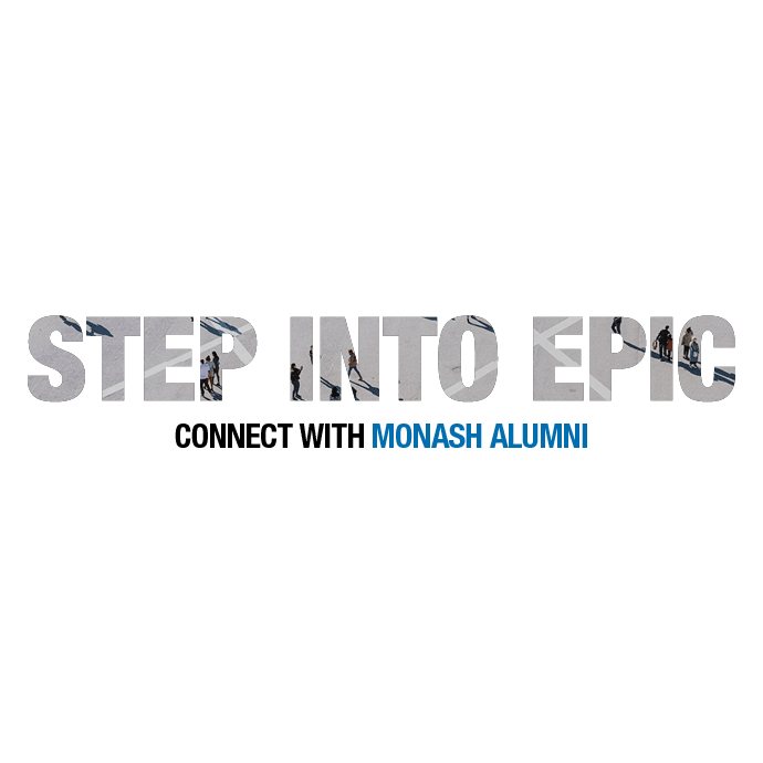
Images can be inserted into type. Please be aware not all images applied this way will be successful. Abstract imagery will work best with this treatment.
Typography in action