Typographic treatment
We’ve removed words such as ‘faculty of’ and ‘school of’ from our marketing communications, because we know that disciplines and subjects are more important to our audiences.
One Monash
All entities belonging to Monash or operating under the University are now represented in text as a typographic treatment. This highlights the relationship and maximises our ability to build a strong and international brand that will support all areas of the University. We are a monolithic brand and as such we only have one logo.
The Monash University logo is to appear on its own, and not as a lockup with a faculty or institute. The ONLY time we would ever lock up our logo with a Monash University entity (i.e. use a vertical line between the two) is when we are communicating a partnership/multiple business partner and/or a sponsorship. We don't place a vertical line between the logo and typographic treatments in regular Monash University communications.
Typographic treatments are not logos and should not be distributed as a logo.
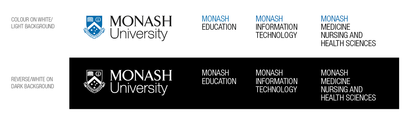
The typographic treatment appears in Helvetica Neue Condensed (or Arial Narrow) and in capital letters with the wording stacked rather than running horizontally. The word Monash appears in Monash Blue (see colour palettes) when on a white background (see examples). If the background colour is dark and requires the reverse white logo, all typographic treatment words are to appear white. Line spacing/leading should be the same as the point size of the type, for example 12pt with 12pt leading.
Along with the typographic treatment, the distinctiveness of a faculty, school or institute should be communicated in imagery, language or messaging, rather than a logo.
The vertical logo is never used with the typographic treatment.
Two-tier brand
We're a two-tier brand. The first tier is always Monash University (represented by the Monash University logo), the second tier is one Monash entity represented as the typographic treatment.
If there is more than one Monash entity needing to be highlighted, we use the Monash University logo only and the other entities are mentioned within content.
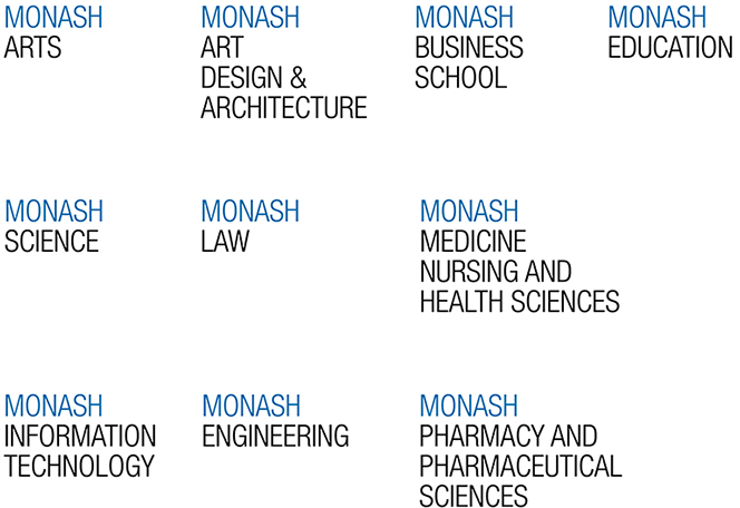
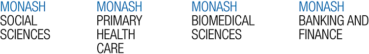
Examples of typographic treatments


No content
No content
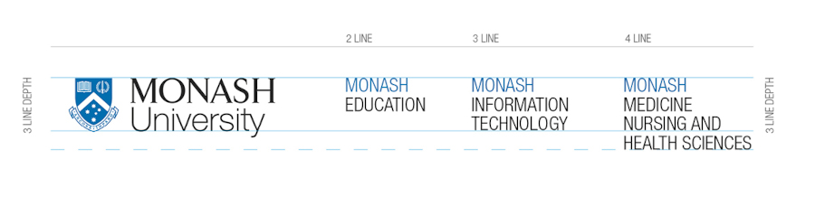
Scaling of typographic treatment
The Monash University logo takes a three-line depth. Therefore typographical treatments on two lines are less tall than the logo, and those on four lines are taller than the logo.
Please note, the Monash University logo should only appear alongside one other Monash entity represented as a typographic treatment.