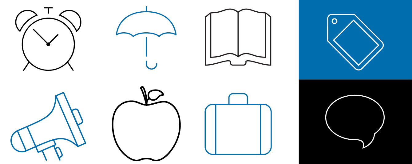
Icons
Icons replace words, so they need to be based on things people immediately recognise. They should communicate your message quickly and effectively.
Please source icons from our library first. If bespoke icons are required, please use the library as a starting point. If you do create new icons, please submit them to brand requests for approval and we can add these to our library. Buttons to our icon library are below.
Our iconography style uses clean and simple line work. In most situations our icons will work best in the Monash primary colours (blue, black and white). Line weight can be increased if needed, especially for digital channels.
We work on the principle that:
- icons are not used as logos or images
- less is more – overuse dilutes their effectiveness
- we use the existing icons provided
- we don’t use an icon and then explain it with words
- clip art is not an icon.
Clear space
We always ensure that icons with a background sit comfortably within the allocated space. Icons should make up 75% of the designated area.
Access icons
For icons that are optimised for Monash website template, please access the web toolkit.
For use across all other channels, eg. PowerPoint, EDMs and print, refer to the download buttons below:
If you have requirements for additional icons to be considered, please complete the Brand requests form.
Emojis
Before using an emoji consider your audience, keeping in mind cultural differences and the possibility of misinterpretation which may detract from the message you're trying to convey. Emojis may display differently, or not at all, depending on the device or platform.