Choosing the appropriate data display
Selecting the appropriate data display method is crucial for accurately representing and interpreting data. Different types of data—whether univariate, bivariate, categorical, or numerical—require specific display methods to reveal meaningful insights. Each method has its unique features that emphasise different aspects of the data. Key display methods, including bar charts, histograms, dot plots, stem-and-leaf plots, and box plots, and their statistical measure are explored to effectively interpret data.
Use this page to revise the following concepts within choosing the appropriate data display:
Bar Charts
A Bar chart is a graphical display of data using bars of different heights. Bar charts are specifically designed to display categorical data. In a bar chart, each bar’s height (or length) is directly proportional to the value it represents, allowing quick visual comparisons among categories.
A variation on the standard bar chart is the segmented bar chart. It is a compact display that is particularly useful when comparing two or more categorical variables. In a percentage segmented bar chart, the lengths of each segment in a bar are determined by the percentages, and the total height of the bar is 100%.
Bar charts are particularly useful for identifying the mode or modal category (the most frequently occurring value or category), which is shown as the tallest bar or the longest segment in a bar chart.
 Check your understanding
View
Check your understanding
View

Histogram
A histogram is a graphical representation of data using columns, where the height of each column indicates the frequency of data points within a specific range. Unlike bar charts, which display categorical data, histograms are used for numerical data. Histograms are particularly useful for identifying the most and least common values and analysing the shape of data distribution.
Mean
The mean is calculated by dividing the sum of all data values by the total number of data points. It represents the average value and helps summarise the overall centre of the data distribution.
In a histogram, the data is often grouped into intervals, covering a range of values. The frequency of exact values within each interval are not known, so the mean can often only be estimated approximately.
Median
The median in a histogram is the point that divides the histogram into two equal parts, with 50% of the data represented by the columns to the left and 50% to the right. Similar to the mean, median can often only be estimated approximately in a histogram.
Mode/Modal Interval
In a histogram with grouped continuous data, the tallest column represents the modal interval, indicating the most frequent range of values. To clearly define the distribution, the full range should be specified (e.g., 10–<15 rather than just the starting value).
In a histogram with ungrouped discrete data, the mode is the tallest column, showing the most frequently occurring value.
The mode (or modal interval) is useful for understanding central tendencies and identifying skewness in a distribution, helping to interpret patterns in the data.
Features of Data Distribution from Histograms
A histogram visually represents the distribution of numerical data, highlighting key features including shape and outliers. These features help understand patterns, identify trends, and draw meaningful conclusions from the data.
Shape
A histogram can be positively skewed, negatively skewed, or symmetric. Identifying its shape is essential for selecting appropriate summary statistics and understanding data distribution patterns.
- Positively skewed: the distribution has a short left tail and a long right tail, indicating that most values are clustered towards the left lower end, while a few larger values extend toward the positive side. This often causes the mean to be greater than the median or mode.
- Negatively skewed: the distribution has a short right tail and a long left tail, indicating that most values are higher, but a few smaller values extend toward the negative side. This often causes the mean to be less than the median or mode.
- Symmetric: the distribution appears balanced around the central vertical axis, forming a mirror image.
- In a single-peaked symmetric distribution, there is one clear peak, the mean, median, and mode are usually similar.
- In a bimodal symmetric distribution has two distinct peaks, each representing a mode, with the mean and median usually falling in between the two peaks.
- Positively Skewed Histogram
- Negatively Skewed Histogram
- Single-peaked Symmetric Distribution
- Bimodal Symmetric Distribution
Outliers
Outliers are data points that stand out from the main body of the data, appearing unusually high or low. Identifying and investigating outliers is important, as they may indicate rare occurrences, experimental anomalies, or potential errors in data collection.
Check your understanding
View
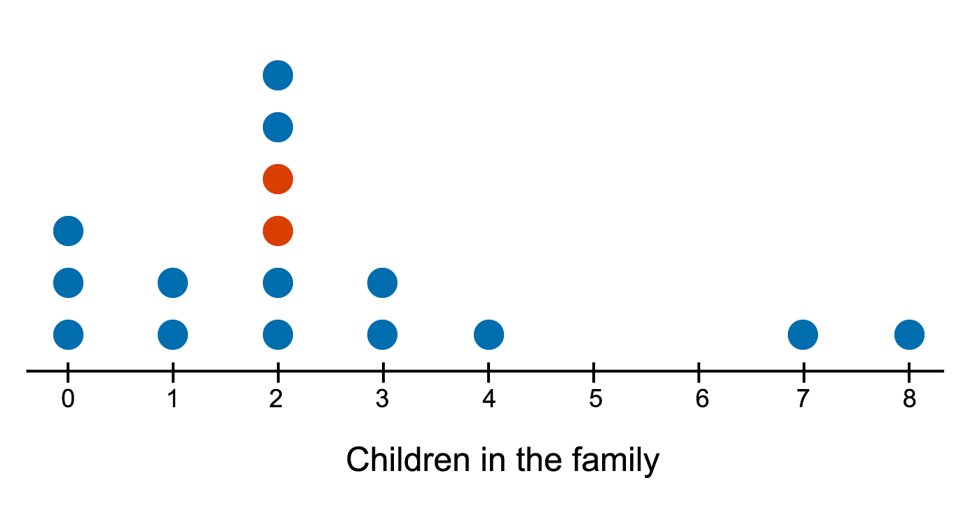
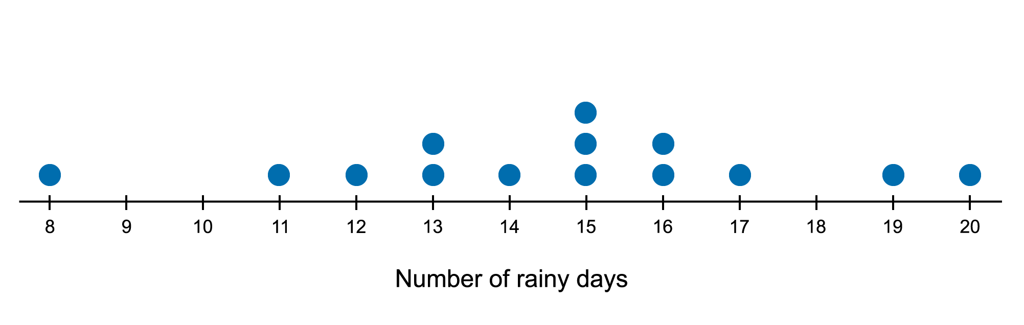
Dot Plot
A dot plot is a graphical representation to display discrete numerical data using a number line, with each data point represented by a dot. When multiple data points have the same value, the dots are stacked on top of each other. Dot plots are particularly useful for small data sets, providing a visualisation of the distribution and frequency of values.
In a dot plot, the mode, which is the value that appears most frequently, can be easily identified by the tallest stack of dots.
Shape and Outliers
The shape of a dot plot, like a histogram, shows the overall distribution of the data.
- Positively skewed: the dots are clustered on the left side, with a long tail extending to the right, indicating a few higher values.
- Negatively skewed: the dots are clustered on the right side, with a long tail extending to the left, indicating a few lower values.
- Symmetric: the left and right side of the dots are approximately distributed around a central peak, forming a mirror image of each other.
- Outliers: Individual dots that are stand-out from the main cluster of data points, indicating values that are significantly high or low.
Summary Table with Examples
| Positively skewed | Negatively skewed | Symmetric | Outliers |
|---|---|---|---|

| 
| 
| 
|
Measures of Centre
The mean and the median are both measures of the centre of a distribution.
When the distribution is symmetric and there are no outliers, either the mean or the median can be used to indicate the centre of the distribution. However, if the distribution is clearly skewed and/or there are outliers, the median is the preferred measure, as it is less affected by extreme values.

Measures of Spread
Measures of spread in a dot plot describe how the data is distributed around the centre. The range, interquartile range, and standard deviation are commonly used to measure spread.
- To measure the spread of a data distribution around the median, the interquartile range is used.
- To measure the spread of a data distribution about the mean, the standard deviation is used.


Check your understanding
View
Stem Plot
A stem plot (or stem-and-leaf plot), is a graphical representation of numerical data, which works best for small to medium-sized datasets (up to about 50 data values). Like dot plots, stem plots are designed as pen-and-paper techniques.
In a stem plot, each data value is divided into two parts: the leading digits form the ‘stem’, and the last digit is the ‘leaf’. A key (e.g., \(1|2=12\)) should always be included to clarify how the numbers in the plot should be interpreted.
Splitting the stems is particularly useful when there are few different values for the stem, and many data values share the same one or two leading digits. This technique helps to prevent overcrowding in the plot and allows for an interpretation of the underlying shape of the distribution.
Shape and Outliers
Stem plots, like histograms, show the overall distribution of data. To visualise the shape more easily, imagine rotating the stem plot 90 degrees counterclockwise, its shape now can be interpreted in the same way as for a histogram or dot plot - look for symmetry, peaks, or long tails to determine if the distribution is symmetric or skewed.
Outliers in a stem plot are data points that are separated from the main cluster of data, appearing as isolated stems with leaves.
Summary Table with Examples
| Positively skewed | Negatively skewed |
|---|---|

| 
|
| Symmetric | Outliers |
|---|---|

| 
|
Mode, Mean, and Median
The mode, mean, and median are key measures that provide valuable insights into the central tendency of the data. The methods for calculating these measures are similar to those used in dot plots.
Worked Example
The stem plot shows the duration of the calls that Lucy makes each day.

a) Find the most frequent call duration that Lucy makes each day.
In this stem plot, the number 6 with stem 2 and the number 1 with stem 3 both appear three times, making them the most frequent values. Therefore the modes of this dataset are 26 and 31.
Note that a dataset can have multiple modes if there are several values with the same highest frequency.
b) Find the mean duration of the calls Lucy makes each day, rounded to the nearest whole number.
\(\textrm{Mean}=\frac{2\times 2+3+5+10\times 2+11+12+13+26\times 3+30+31\times 3+32+33+62}{19}=20.8421\cdots\approx 21\)
c) Find the median call durations Lucy make each day.
The total number of data values is 19, so the median is located at the \(\frac{19+1}{2}=10\textrm{th}\) value, which is 26.
Measure of spread
The measure of spread including range, interquartile range, and standard deviation for a stem plot are similar to those used in a dot plot and provide insight into how the data is distributed around the centre.
Worked Example
The stem plot shows the average number of hours per week a group of 26 people spent on the internet.

a) Find the range of the average number of hours per week spent on the internet by this group.
\(R=93-14=79\)
b) Find the interquartile range of the average number of hours per week spent on the internet by this group.
There are 26 values in total. This means that there are 13 values in the lower ‘half’ and 13 values in the upper ‘half’.
Lower half: 14, 40, 40, 47, 52, 53, 54, 61, 61, 62, 63, 66, 72
Upper half: 72, 74, 77, 80, 81, 81, 82, 82, 83, 85, 85, 85, 93
\(Q_{1}\) is the \(\frac{13+1}{2}=7\textrm{th}\) value of the lower half, 54.
\(Q_{3}\) is also 7th value of the upper half, 82.
\(IQR=Q_{3}-Q{1}=82-54=28\).
c) A calculator is used to determine the standard deviation of this stem plot to be 18.42, rounded to two decimal places. Interpret this value in the context of the stem plot.
A standard deviation of 18.42 indicates that, on average, the data points are 18.42 units away from the mean. This suggests that the data is relatively spread out. However, since the stem plot is negatively skewed and includes a potential outlier of 14, it would be more appropriate to use the median and Interquartile range to measure the centre and spread, as these are less affected by extreme values.
Check your understanding
View
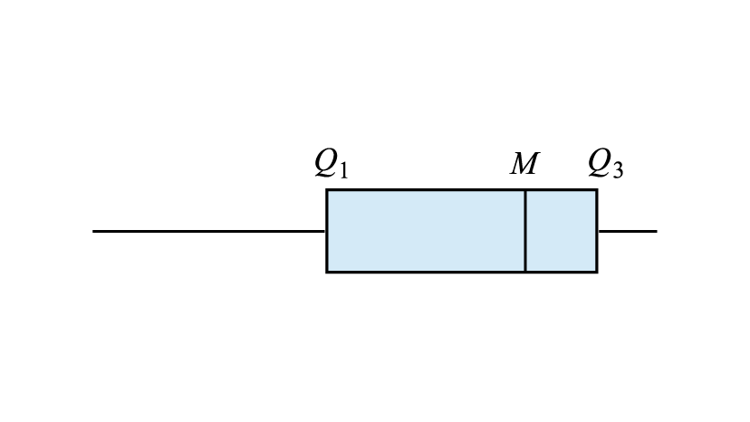
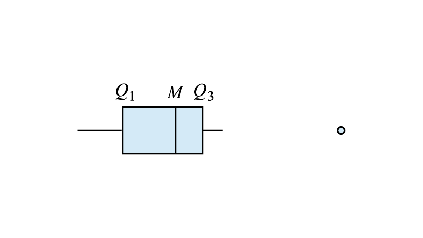
Box Plot
A box plot (or a box-and-whisker plot) is a graphical representation of numerical data that visually displays the five-number summary, which consists of:
- Minimum - the smallest value in the dataset
- Lower quartile \(Q_{1}\) - the median of the lower half of the data (25th percentile)
- Median \(Q_{2}\) - the middle value of the dataset (50th percentile)
- Upper quartile \(Q_{3}\) - the median of the upper half of the data (75th percentile)
- Maximum - the largest value in the dataset
An outlier is a data point that lies more than 1.5 times the interquartile range (IQR) beyond the quartiles. The boundaries for identifying outliers are:
- Upper fence: \(Q_{3}+1.5\times IQR\)
- Lower fence: \(Q_{1}-1.5\times IQR\)
Data values outside these fences are classified as possible outliers and are plotted separately. However, if a data point lies exactly on an upper or lower fence, it is not considered an outlier.
Box plots are extremely useful for summarising large datasets in concise plots. Box plots provide a visual summary of key statistical measures, making it easier to identify patterns and potential outliers.
Check your understanding
View
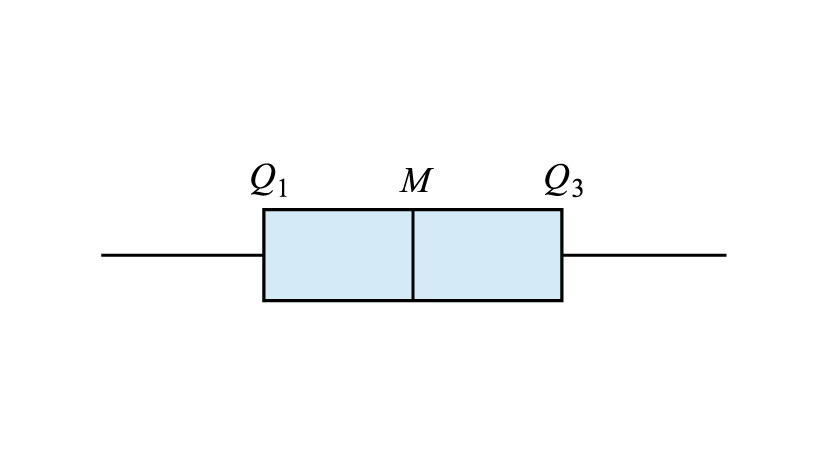
Distributions of Box plots
Box plots provide a concise and effective graphical representation for describing and comparing the shape, centre, spread, and outliers of a distribution.
Shape and Outliers
The shape of the distribution can be identified by the position and length of the whiskers, as well as the location of the median.
- Symmetric distribution: The median is located near the middle of the box, and the whiskers are approximately equal in length. In this case, the mean and median are usually similar.
- Positively skewed distribution: The median is off-centre towards the left hand side of the box, and the right whisker is longer than the left. This often causes the mean to be greater than the median.
- Negatively skewed distribution: The median is off-centre towards the right hand side of the box, and the left whisker is longer than the right. This often causes the mean to be less than the median.
- Distribution with outliers: The box plot with outliers usually has large gaps between the main body and the data values in the tails, with outliers represented as dots separate from the box and whiskers.
Centre
The centre of the distribution in a box plot is indicated by the position of the median.
Spread
The spread refers to the variability of the distribution, it reflects how spread out the data values are within the set. The spread can be measured using the IQR or range in a box plot. However, IQR is less affected by outliers.
Summary Table with Examples
| Positively skewed | Negatively skewed |
|---|---|

| 
|
| Symmetric | Distribution with outliers |
|---|---|
| 
|
Worked Example
Describe the distribution represented by the boxplot in terms of shape and outliers, centre and spread. Give appropriate values.

The distribution is positively skewed with outliers. The distribution is centred at 20, the median value. The spread of the distribution, as measured by the IQR, is 15, as measured by the range, 45. There are two outliers: 5 and 50.