Time series
Understanding time series data and plots is important for analysing how the response variable changes over time. It involves identifying patterns such as trends, seasonality, structural change, possible outliers, and irregular fluctuations. By applying smoothing techniques, the effects of fluctuations can be minimised. Seasonal indices are also used to remove seasonal component, allowing for clearer visualisation of trends. Deseasonalising the data helps to remove the seasonal effect, providing a more accurate basis for making predictions. Time series analysis is an essential tool in various fields, such as economics, finance, and environmental studies, helping to uncover underlying trends, and forecast future values.
Use this page to revise the following concepts of time series:
- Time Series Data
- Features of Time Series Plots
- Smoothing Techniques
- Deseasonalisation and Seasonal Indices
- Trend Line Forecasting and Predictions
Time Series Data
Time series data is numerical bivariate data where time (e.g., hours, days, months, or years) is always the explanatory variable. The purpose of time series data is to observe how the response variable changes over time. A time series plot is a scatterplot with line segments joining the points in time order, visually representing time series data. Time is always plotted on the horizontal axis.
Features of Time Series Plots
Key features of time series plots include trends, seasonality, structural change, outliers, and irregular fluctuations. By identifying these features in time series plots, the underlying patterns and behaviours of the data over time can be better understood.
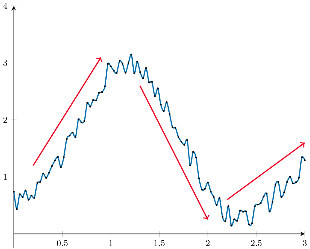
Trend
A trend refers to the tendency of data values to increase or decrease over a significant time period. Trends may change over time, and different trends may appear in different time periods within a time series plot. One way to identify trends in a time series plot is by drawing a trend line that smooths out fluctuations while highlighting the overall increasing or decreasing trend.
| Increasing trend | Decreasing trend | Different trends within a plot |
|---|---|---|
 | 
| 
|
Worked Example
The time series plot shows the population (in millions) in Ireland from 1740 to around 2010. Describe the trend of the plot.
 The population (in millions) in Ireland increased steadily from 1740 until approximately 1855. It then dropped suddenly from 1855 to 1935, before increasing slowly again until 2010.
Seasonality
Seasonality occurs when there is a periodic movement related to a calendar-based period , such as a year, month, or week. Seasonal movements are generally more predictable than other time series features and often arise due to factors like weather change (e.g., higher electricity consumption in winter) or institutional influences (e.g., increased retail sales during the holiday season).
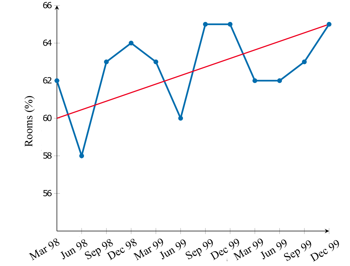
The time series plot reveals consistent peaks and troughs at the same intervals each year, suggesting seasonality. In this case, room occupancy (%) is at its lowest during the June quarter and reaches its highest point in the December quarter.
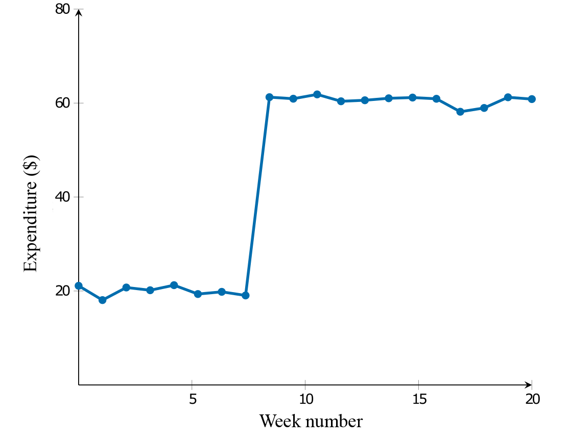
Structural change
A structural change occurs when the established pattern of a time series plot is suddenly altered.
Outliers
Outliers are present when there are individual values that stand out from the general body of data.
Irregular (random) fluctuations
Irregular fluctuations are random fluctuations in a time series plot that cannot be explained by systematic patterns such as trends, cycles, seasonality, structural change, or outliers. These fluctuations are present in any real-world time series data. There can be multiple sources for these irregular fluctuations, many of which are unknown. These irregular fluctuations cannot be predicted.
Check your understanding
View

Smoothing Techniques
When time series data shows significant irregular fluctuations, it can be difficult to identify the underlying trends. In order to reveal the trend, it may be necessary to reduce some of these fluctuations before fitting a trend line. This process is known as smoothing.
There are two basic techniques for smoothing: moving mean and moving median smoothing.
Moving Mean Smoothing
Moving mean smoothing is a technique where individual data points in the time series are replaced with the mean of the data point and its adjacent points. The most straightforward approach is to smooth over a small odd number of data points, such as three or five, although any number of points can be used.
When smoothing data, it is important to decide the number of points to average. Here are some key guidelines:
- For small data sets, the number of points to average (\(p\)) should be smaller than the total number of points (\(n\)). For example, if \(n = 7\), \(p\) should be about 4.
- For cyclic or seasonal variations, \(p\) should match the cycle length or the number of seasons. For quarterly data, use \(p = 4\).
- Common choices for \(p\) include 12 points for monthly sales, 7 for daily sales with daily operation, 5 for stores open only on weekdays, and 4 for quarterly data.
- Always prefer an odd value for p to avoid symmetry issues. Larger p values smooth the data more but can result in losing more data points.
Three-Moving Mean Smoothing
Three-mean smoothing involves replacing each data value with the mean of itself and the value directly on either side of it. To find the smoothed value of \(y_2\):
\[\frac{Y-1 + y_2 + y_3}{3}\]
The first and last points in the time series are excluded as they do not have values on both sides.
The number of babies born in a particular hospital over a particular year are given below:
| Month | Jan | Feb | Mar | Apr | May | Jun | Jul | Aug | Sep | Oct | Nov | Dec |
|---|---|---|---|---|---|---|---|---|---|---|---|---|
| Number of births | 11 | 13 | 7 | 6 | 23 | 18 | 14 | 8 | 10 | 11 | 9 | 16 |
Calculate the three-moving mean smoothed number of births for each month except January and December.
| Time | Births | Three-moving mean |
|---|---|---|
| Jan | 11 | The first point is excluded. |
| Feb | 13 | \(\dfrac{11 + 13 + 7}{3} = 10.33\) |
| Amt | 7 | \(\dfrac{13 + 6+ 7}{3} = 8.67\) |
| Apr | 6 | \(\dfrac{7 + 6 + 23}{3} = 12\) |
| May | 23 | \(\dfrac{6 + 23 + 18}{3} = 15.67\) |
| Jun | 18 | \(\dfrac{18 + 14 + 8}{3} = 18.33\) |
| Jul | 14 | \(\dfrac{23 + 18 + 14}{3} = 13.33\) |
| Aug | 8 | \(\dfrac{14 + 8 + 10}{3} = 10.67\) |
| Sep | 10 | \(\dfrac{8 + 10 + 11}{3} = 9.67\) |
| Oct | 11 | \(\dfrac{10 + 11 + 16}{3} = 10\) |
| Nov | 9 | \(\dfrac{11 + 9 + 16}{3} = 12\) |
| Dec | 16 | The last point is excluded. |
As shown in the time series plot below, the three-mean smoothing plot reduces the irregular fluctuations. However, note that data points are lost at the beginning and end of the time series during the smoothing process.

Check your understanding
View
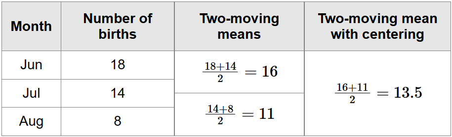
Moving Mean Smoothing with Centring
Smoothing with centring is used when applying smoothing with an even number of data points, such as 2- moving or 4-moving mean smoothing. It involves averaging the already smoothed values, however, the final smoothed value may not align with a specific data point from the original dataset but instead lie between data points.
Worked Example
The number of babies born in a particular hospital over a particular year are given below:
| Month | Jan | Feb | Mar | Apr | May | Jun | Jul | Aug | Sep | Oct | Nov | Dec |
|---|---|---|---|---|---|---|---|---|---|---|---|---|
| Number of births | 11 | 13 | 7 | 6 | 23 | 18 | 14 | 8 | 10 | 11 | 9 | 16 |
Using the two-moving mean with centring, the smoothed value for the number of births in July is 13.5.
Check your understanding
View
Moving Median Smoothing
Moving median smoothing is a technique where individual data points in the time series are replaced with the median of the data point and its adjacent points. The median point is found by finding the median of the group’s \(x\)-value, and the median of the group’s y-value. It is similar to moving mean smoothing but can be done directly on a graph without calculations.
Median smoothing uses groups of three for three-median smoothing, groups of five for five-median smoothing, and so on.
Worked Example
The time series plot below shows the amount that Sarah saved each month (in dollars) over a 12 month period.
 By reading from the raw data on the time series plot, the median of the first three points (January, February, and March) is 250. This process is then repeated by moving to the next set of three points, working out their median, and marking it on the graph, until no further groups of three remain. Finally, the median points are connected using line segments.
The median can also be calculated manually. For example, for January (180), February (280), and March (250), the median is 250, so the smoothed value for February is 250.
Check your understanding
View
Deseasonalisation and Seasonal Indices
Deseasonalisation/Seasonal adjustment removes the seasonal components from data to reveal underlying trends. This process involves calculating seasonal indices, which show how a particular season (e.g., day, month, or quarter) compares to the average season. For example, the seasonal index for retail sales for the month of December is 1.5 or 150%, indicating that sales tend to be 50% higher than the monthly average.
Seasonal indices are calculated so that their average is 1, meaning the sum of indices equals the number of seasons (e.g., for monthly data: seasonal indices sum to 12; for quarterly data: seasonal indices sum to 4). A seasonal index is calculated using the following formula:
\[\text{Seasonal index} = \frac{\text{value for the season}}{\text{seasonal average}}\]
Worked Example
Alex operates a cake shop and wants to calculate quarterly seasonal indices for the number of customers to his shop based on last year’s figure. Use the data to calculate seasonal indices, rounded to 2 decimal places.
| Season | Summer | Autumn | Winter | Spring |
|---|---|---|---|---|
| Number of customers | 1012 | 985 | 1375 | 840 |
Calculate the quarterly seasonal average for the year first:
\[\begin{align}\text{Quarterly average} &= \frac{1020 + 985 + 1375 + 840}{4} \\ &=1055\end{align}\]
Calculate the seasonal index for each quarter separately:
\[\begin{align}&\text{Seasonal Index}_{\ \text{Summer}} = \frac{1020}{1055} = 0.97 \\ &\text{Seasonal Index}_{\ \text{Autumn}} = \frac{985}{1055} = 0.93 \\ &\text{Seasonal Index}_{\ \text{Winter}} = \frac{1375}{1055} = 1.30 \\ &\text{Seasonal Index}_{\ \text{Spring}} = \frac{840}{1055} = 0.80\end{align}\]
The seasonal indices should sum to the number of seasons, which is 4.
\[0.97 + 0.93 + 1.30 + 0.80 = 4\]
The table with seasonal indices:
| Season | Summer | Autumn | Winter | Spring |
|---|---|---|---|---|
| Number of customers | 0.97 | 0.93 | 1.30 | 0.80 |
Check your understanding
View
Seasonally Adjustment of a Time Series
Seasonal indices can be used to either deseasonalise (remove) or reseasonalise (restore) seasonal components in a time series, this process is called seasonally adjusting the data.
- Deseasonalising Data: Divide each actual figure by its seasonal index.
\[\text{Deaseasonalised figure} = \frac{\text{Actual figure}}{\text{Seasonal index}}\] - Reasonalising Data: convert a deseasonalised value into an actual data value
\[\text{Actual figure} = \text{Deseasonalised figure}\ \times\ \text{Seasonal index}\]
Worked Example
The seasonal indices for ice cream sales at Bob’s cafe are shown in the table below:
| Summer | Autumn | Winter | Spring |
|---|---|---|---|
| 1.89 | 0.72 | 0.35 | 1.04 |
- If the actual ice cream sales last summer was $18724, what is the deseasonalised sale figure for that time period, correct to 2 decimal places?
- If the deseasonalised ice cream sales last winter was $10203, what was the actual sales figure for that time period?
\[\begin{align}\text{Deseasonlised figure} &= 187241.89 \\ &= $9906.88\end{align}\]
\[\text{Actual figure} = 102030.35 = $3571.05\]
 Check your understanding
View
Check your understanding
View
Interpretation of Seasonal Indices
When an event or occurrence is more frequent during a specific time period, the seasonal index is greater than 1. Conversely, when it is less frequent, the seasonal index is positive but less than 1. A seasonal index is always compared to an average of 1 (or 100%).
For example, the quarterly seasonal indices for sales in the shop are shown in the table below.
| Quarter | 1 | 2 | 3 | 4 |
|---|---|---|---|---|
| Seaonal Index | 1.37 | 0.85 | 0.74 | 1.04 |
A seasonal index of 0.85 (or 85%) for Quarter 2 means that sales in Quarter 2 are typically 15% below the yearly average.
A seasonal index of 1.04 (or 104%) for Quarter 4 means that sales in Quarter 4 are typically 4% above the yearly average.
Check your understanding
View
Trend Line Forecasting and Predictions
If a linear trend is identified in a time series plot, the least squares method is used to model the trend and make predictions about future values. This process is called trend line forecasting. Note that extrapolation (which occurs when predictions are made beyond the observed range of the explanatory variable) can be unreliable.
For time series data with seasonal components, that data is usually deseasonalised before fitting the trend line, and predictions must then be reseasonlised by multiplying by the appropriate seasonal index for proper interpretation:
\[\text{Actual figure} = \text{average seasonal index}\ \times\ \text{deseasonalised figure}\]
Worked Example
The table shows the seasonal indices for the monthly unemployment numbers for workers in a town for the year.
| Month | Jan | Feb | Mar | Apr | May | Jun | Jul | Aug | Sep | Oct | Nov | Dec |
|---|---|---|---|---|---|---|---|---|---|---|---|---|
| Seasonal index | 1.45 | 1.23 | 1.01 | 0.96 | 0.98 | 0.84 | 0.89 | 0.95 | 1.02 | 0.99 | 0.78 | 0.9 |
A trend line that can be used to forecast the deseasonalised number of unemployed workers in a town for the first ten months of the year is given by:
\[\text{deseasonalised number of unemployed} = 373.3 - 3,38\ \times\ \text{month number}\]
where month 1 is January, month 2 is February, and so on.
What is the predicted actual number of unemployed workers for April, rounded to the nearest whole number?
Substitute \(\text{month number} = 4\) into the equation for the given trend line:
\[\begin{align}\text{deseasonalised number of unemployed} &= 373.3 - 3.38\ \times\ 4 \\ &= 359.78\end{align}\]
Calculate the actual predicted sale figure by reseasonalising the predicted value:
\[\begin{align}\text{actual number of unemployed workers} &= 359.78\ \times\ 0.96 \\ &= 345\end{align}\]