Modelling and transforming data
Data transformation plays an important role in transforming a non-linear association into a linear one, making patterns easier to interpret and analyse. Methods such as squared, logarithmic, and reciprocal transformations can be applied to either the \(x\)- or \(y\)-axis to linearise scatterplots and improve model accuracy. Selecting the most suitable transformation involves using the coefficient of determination (\(r^2\)) to evaluate effectiveness, comparing its values across different transformations, and choosing the one that produces the best linear model. These methods enhance data analysis, improve predictions, and support informed decision-making across various fields.
Use this page to revise the following concepts of modelling and data transformation:
- Data Transformation
- The Squared Transformation
- The Logarithmic Transformation
- The Reciprocal Transformation
- Coefficient of Determination
Data Transformation
A non-linear association can often be transformed into a linear association using data transformation techniques. Applying squared, logarithmic, or reciprocal transformations to a single axis (either \(x\) or \(y\)) can help linearise scatterplots and make patterns more interpretable.
The Squared Transformation
The squared transformation is a stretching transformation, meaning it spreads out or expands the large values on either the \(x\)- or \(y\)-axis.
The \(x\)-squared transformation spreads out the larger \(x\)-values relative to the smaller \(x\)-values while keeping the \(y\)-values unchanged.
 The \(y\)-squared transformation spreads out the larger \(y\)-values relative to the smaller \(y\)-values while keeping the \(x\)-values unchanged.

The Application of the \(x\)-squared Transformation
The scatterplot was created from the data in the table below, which shows the time the object has been falling (\(t\) in seconds) and the distance fallen (\(s\) in metres).
| \(t\) (seconds) | 0 | 1 | 2 | 3 | 4 |
|---|---|---|---|---|---|
| \(s\) (metres) | 16 | 15 | 12 | 7 | 0 |
 By applying a \(x\)-squared transformation, we square all the \(t\) values, and then plot the graph \(d\) against t2. Now the graph has been linearised with the \(x\)-squared transformation, and the equation is:
\(s = 16 - t^2\) or \(\text{distance} = 16 - {time}^2\)
| \(t\) (seconds) | 0 | 1 | 2 | 3 | 4 |
|---|---|---|---|---|---|
| \(t^2\) | 0 | 1 | 4 | 9 | 16 |
| \(s\) (metres) | 16 | 15 | 12 | 7 | 0 |
 Like any regression line, its equation can be used to make predictions. For example, after 2.5 seconds, the distance fallen is predicted to be:
\[\text{distance} = 16 - 2.5^2 = 9.75 m\]
The Application of the \(y\)-squared Transformation
A scatterplot shows that there is a strong positive association between the amount of sunlight (in hours) and plant growth (in cm).
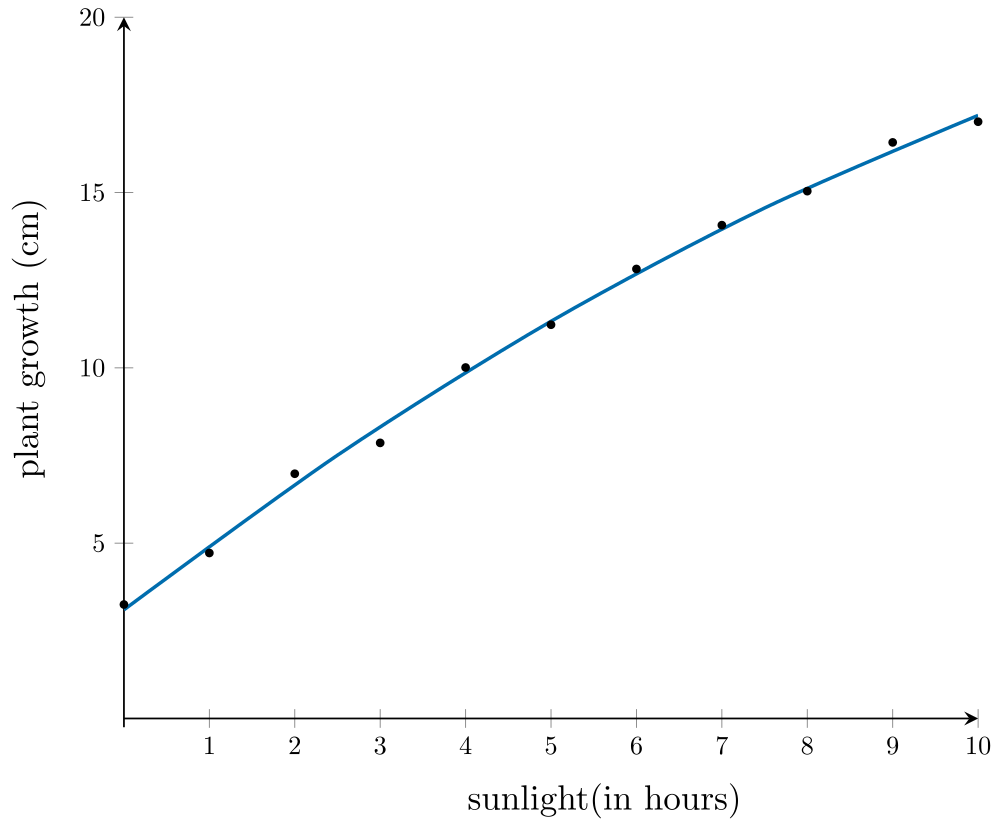 Applying the \(y\)-squared transformation involves changing the scale on the \(y\)-axis to \(\text{plant growth}^2\).
 From the plot above, it can be seen that the association between \(\text{plant growth}^2\) and \(\text{sunlight} is now linear. A least squares line then can be used to model this association, with the equation of the line:
\[\text{plant growth}^2 = 29.58\ \times\ \text{sunlight} - 9.98\]
This equation can be used to predict future values. For example, to predict the plant growth of a plant given 2.5 hours of sunlight:
\[\begin{align}\text{plant growth}^{2} &= 29.58\ \times\ \text{sunlight} - 9.98 \\ &= 64.06 \\ \text{plant growth} &= \sqrt{64.06} \\ &= \pm 8.00\text{cm}\end{align}\]
Since only the positive value of the square root is meaningful in this context, the predicted plant growth is 8 cm.
 Check your understanding
View
Check your understanding
View

The Logarithmic Transformation
The logarithmic transformation is a compressing transformation that reduces the impact of large values. It works by applying a logarithmic scale (\(\log_{10}x\) or \(log_{10}y\)) to either the \(x\)- or \(y\)-axis.
The \(\log_{10}x\) transformation compresses the larger \(x\)-values relative to the smaller \(x\)-values while keeping the \(y\)-values unchanged.
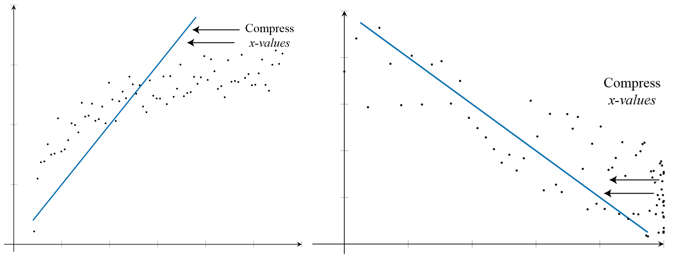
The \(\log_{10}y\) transformation compresses the larger \(y\)-values relative to the smaller \(y\)-values while keeping the \(x\)-values unchanged.
The application of the \(\log_{10}x\) transformation
Kathy tracks the number of points scored by her students in a quiz, along with the amount of time (in minutes) spent preparing for the quiz. In this case, time is the explanatory variable. The association between points scored and preparation time is non-linear, as observed in the scatterplot.
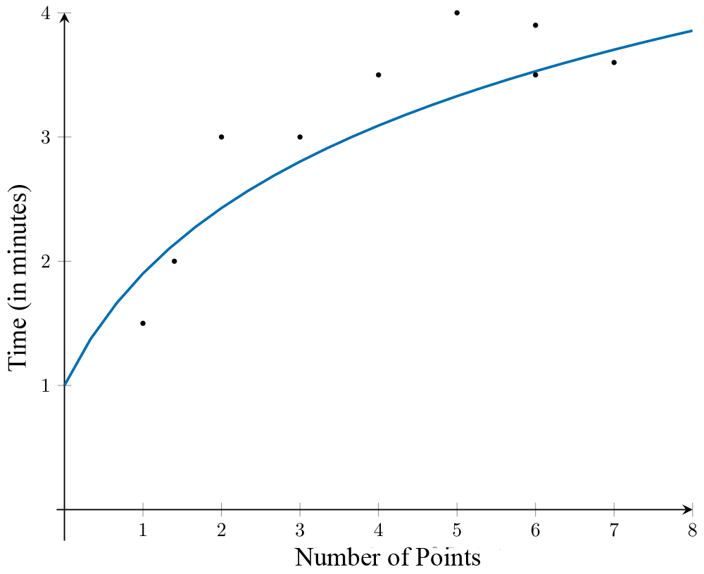 A \(\log_{10}x\) transformation is applied to the variable the number of points to linearise the scatterplot.
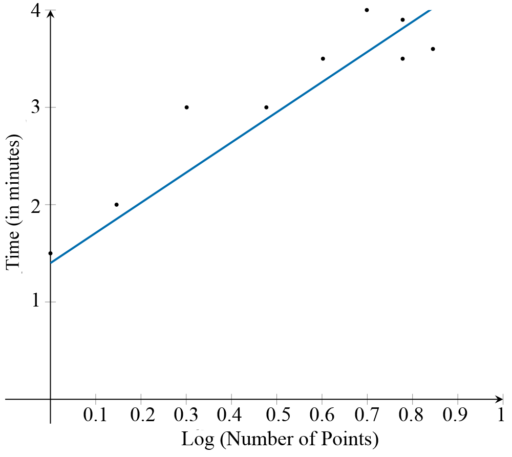
From the scatterplot with the transformed data, it can be seen that the association between \(\log_{10}\text{(number of points}\) and \(\text{Time}\) is now linear. A least squares line can then be used to model this association, with the equation of the line:
\[\text{Time} = 1.76 + 2.63\ \times\ \log_{10}\text{(number of points)}\]
Using this equation, if a student scores 4.5 points on the quiz, the predicted preparation time is
\[\text{Time} = 2.76 + 2.63\ \times\ \log_{10}\left(4.5\right) = 3.5\ \text{minutes}\ \textsf{(correct to two decimal places)}\]
The application of \(\log_{10}y\) transformation
Rebecca opened a new café and recorded the number of customers visiting each month during its first nine months of operation. The scatterplot suggests that the association between the number of customers and the month is non-linear.
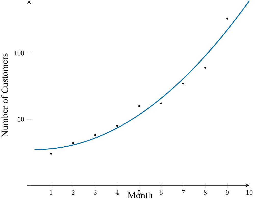
A \(\log_{10}y\) transformation is applied to the variable number of customers to linearise the scatterplot.
 From the transformed scatterplot, it can be seen that the association between month and \(\log_{10}\text{(number of customers)}\) is now linear. A least squares line can then be used to model this association, with the equation of the line:
\[\log_{10}\text{(number of customers)} = 1.32 + 0.082\ \times\ \text{month}\]
Using this equation, the number of customers after 10 months is predicted to be
\[
\begin{align}
\log_{10}(\text{number of customers}) &= 1.32 + 0.082 \times 10 \\
\log_{10}(\text{number of customers}) &= 2.14 \\
\text{number of customers} &= 10^{2.14} \\
&= 138 \quad \textsf{(rounded to the nearest whole number)}
\end{align}
\]
Check your understanding
View
The Reciprocal Transformation
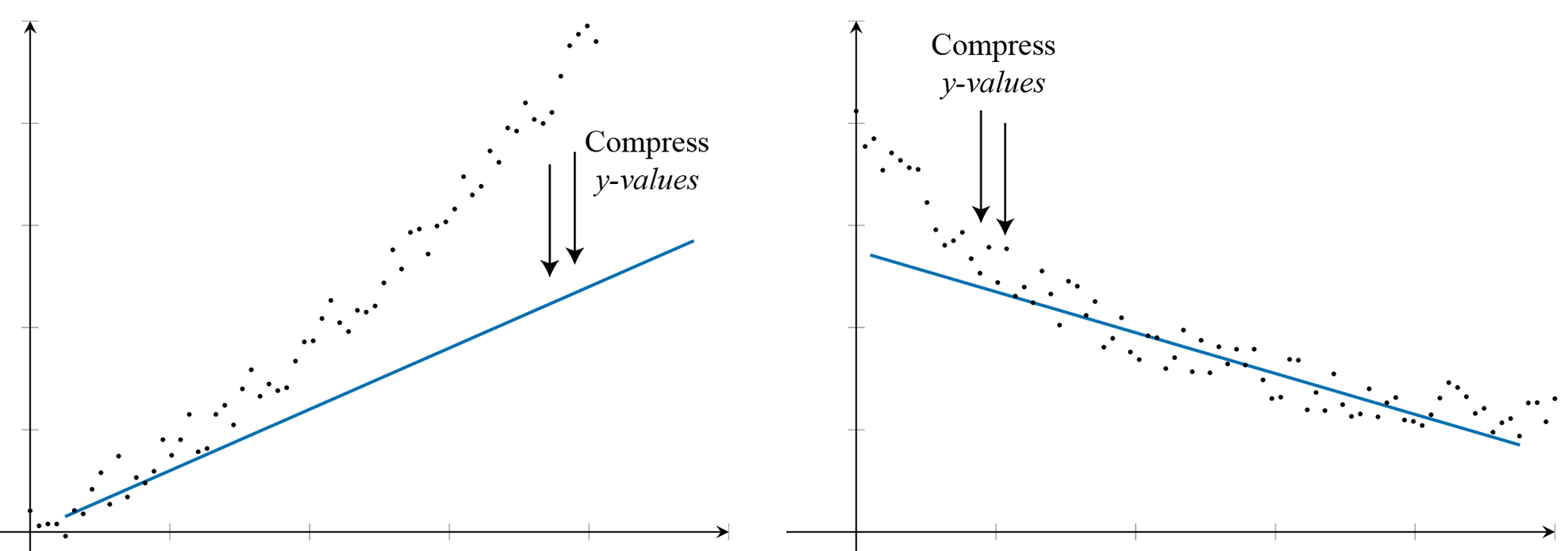
The reciprocal transformation is a stretching transformation that compresses the large values and expands smaller values along either the \(x\)- or \(y\)-axis.
The reciprocal \(\left(\frac{1}{x}\right)\) transformation compresses the larger \(x\)-values relative to the smaller \(x\)-values while keeping the \(y\)-values unchanged. This effect is stronger than that of the logarithmic transformation. It also reverses the order of data values: value of \(x\) less than 1 become greater than 1, and values of \(x\) greater than 1 become smaller than 1. The reciprocal \(\left(\frac{1}{x}\right)\) transformation is not applicable when \(x = 0\), as \(\frac{1}{0}\) is undefined.

The reciprocal \(\left(\frac{1}{y}\right)\) transformation compresses the larger \(y\)-values relative to the smaller \(y\)-values while keeping the \(x\)-values unchanged. Similarly, the order of the data values is reversed. It is also not applicable when \(y = 0\), as \(\frac{1}{0}\)is undefined.
The application of the reciprocal \(\left(\frac{1}{x}\right)\) transformation
After conducting an experiment to investigate the relationship between the amount of chemical and reaction rate, Sarah recorded the reaction rate over a series of trials with varying amounts of the chemical. The association is not linear, as shown in the scatterplot below, which plots the amount of chemical (in grams) against reaction rate (%).
The scatterplot shows that there is a strong positive association between the amount of chemical and reaction rate.
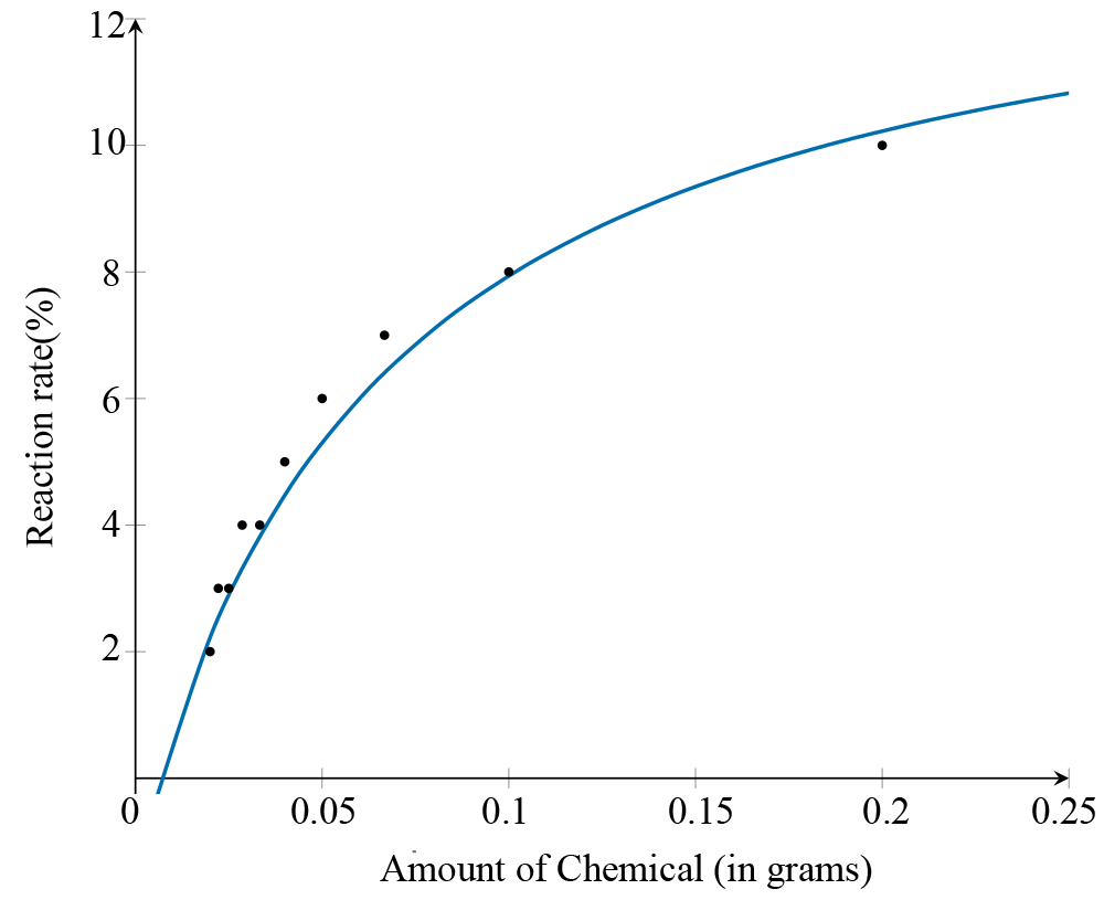 Applying the reciprocal \(\left(\frac{1}{x}\right)\) transformation involves changing the scale on the \(x\)-axis to
\(\frac{1}{\text{amount of chemical}}\)
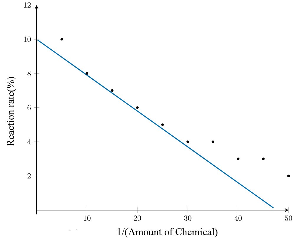 After applying the transformation, it can be seen from the plot that the association between the variables reaction rate and \(\dfrac{1}{\text{amount of chemical}}\) becomes linear. A least squares regression line is used to model their relationship, with the equation:
\[\text{Reaction rate} = 12 - 0.2\ \times\ \frac{1}{\text{amount of chemical}}\]
Using this equation, with an amount of 0.035 g of the chemical , it is predicted that the reaction rate will be
\[12 - 0.2\ \times\ \frac{1}{0.035} = 6.29\%\ \textsf{(correct to 2 decimal places).}\]
The application of the reciprocal \(\left(\frac{1}{y}\right)\) transformation
A productivity analysis company tracks the relationship between the time taken to complete a task (in minutes) and the number of errors made. The scatterplot demonstrates a strong negative association between the time spent completing tasks and the number of errors made, and this association is non-linear.
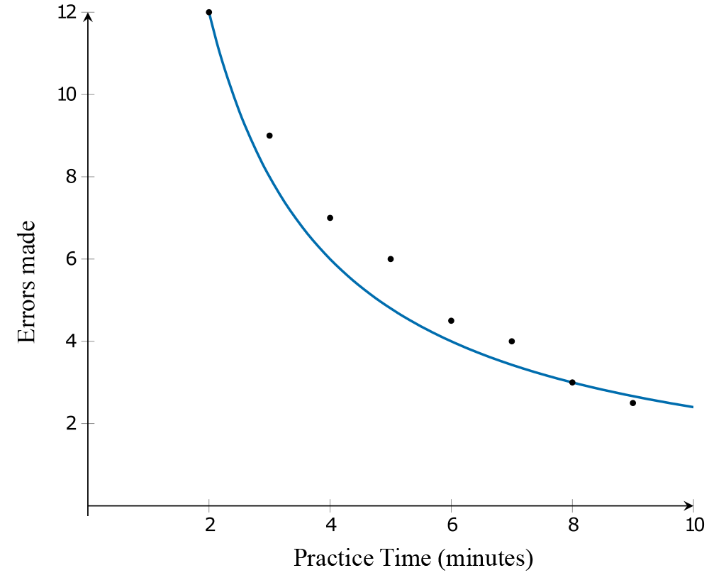 Applying the reciprocal \(\left(\frac{1}{y}\right)\) transformation involves changing the scale on the \(y\)-axis from ‘\(\text{Errors Made}\)’ to '\(\dfrac{1}{\text{Errors Made}}\)'. After the transformation, it can be seen from the scatterplot that the association between \(\dfrac{1}{\text{Errors Made}}\) and practice time is linear.
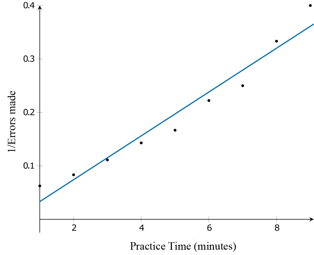
A least squares regression line can be used to model the association between \(\dfrac{1}{\text{Errors Made}}\) and practice time. The equation of the line is:
\[\frac{1}{\text{Errors Made}} = -0.00787 + 0.041\ \times\ \text{Practice time}\]
For a practice time of 3.5 minutes, we could predict that:
\[\begin{align}\frac{1}{\text{Errors Made}} &= -0.00787 + 0.041\ \times\ 3.5 \\ \frac{1}{\text{Errors Made}} &= 0.13563 \\ \text{Errors Made} &= \frac{1}{0.13563} \\ &= 7\ \textsf{(rounded to the nearest whole number)}\end{align}\]
Check your understanding
View
Coefficient of Determination
The coefficient of determination is a statistical measure that indicates the degree to which one variable can be predicted from another linearly related variable.
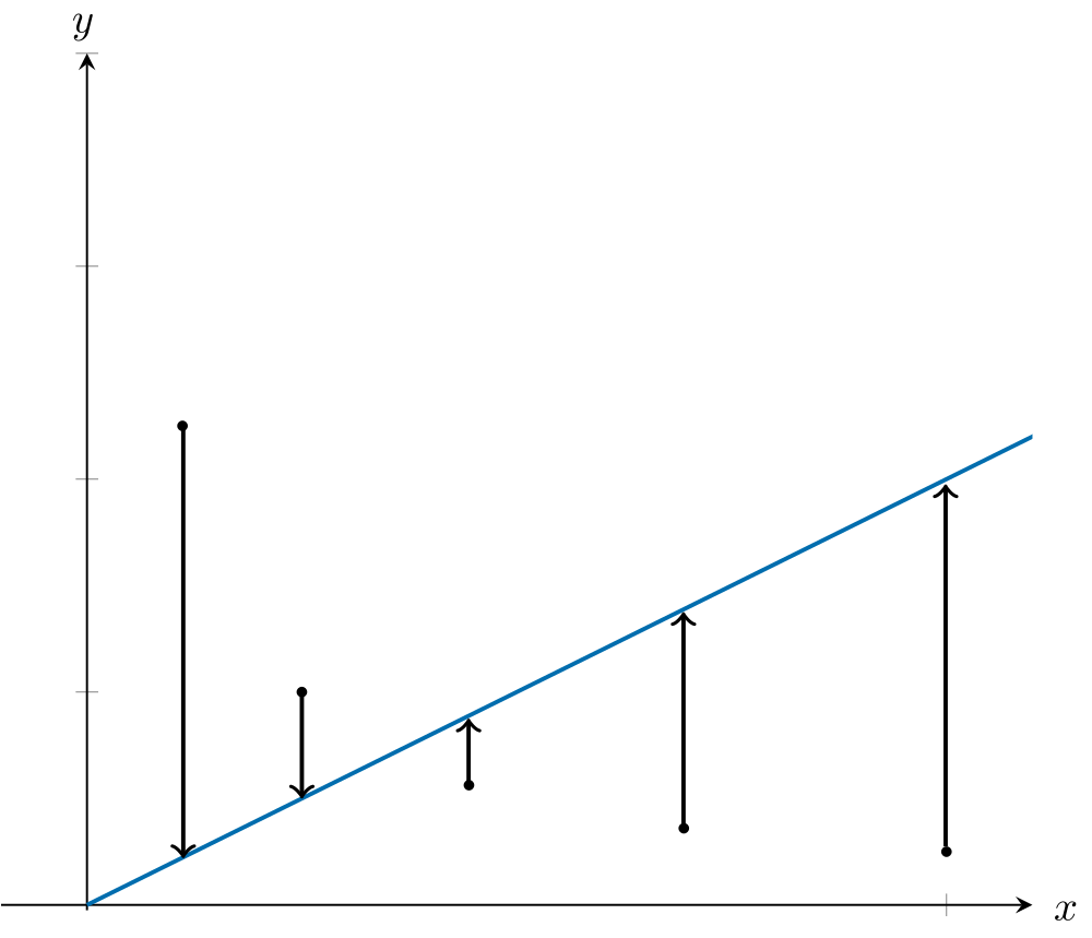
It is calculated by squaring the correlation coefficient \(r\) (a numerical measure of how closely data points in the scatterplot tend to cluster around a straight line):
\[\text{coefficient of determination} = r^{2}\]
For information about the correlation coefficient r, refer to Correlation and least squares regression line.
The coefficient of determination (expressed as a percentage) indicates the variation in the response variable (\(y\)) that is explained by the variation in the explanatory variable (\(x\)). Note that it does not suggest that the variation in \(y\) is caused by the variation in \(x\).
For example, if the correlation between the sales of a product and its advertising budget is \(r = 0.9\), the coefficient of determination is \(r^{2} = 0.9^{2} = 0.81 = 81\%\). This means 81% of the variation in the sales of the product can be explained by the variation in its advertising budget. The remaining 19% of the variation in sales will be explained by other factors, such as customer demand, market trends, and product quality. Therefore, 19% of the variation in product sales is not explained by the advertising budget.
Check your understanding
View
Choosing the appropriate transformation using the coefficient of determination
Choosing the appropriate data transformation can significantly improve the linearity of the relationship between two variables, making predictions more accurate. One effective way to determine the most appropriate transformation is by using the coefficient of determination, \(r^{2}.\) A higher value of \(r^{2}\) indicates a better fit between the variables, meaning the transformed data aligns more closely with the linear model. Therefore, the transformation with the highest coefficient of determination should be used.