Response and explanatory variables and association
Understanding the association between two variables is essential for effective data analysis and decision-making. Distinguishing between explanatory and response variables and identifying whether data is categorical or numerical helps determine appropriate analytical methods. For two numerical data, scatterplots provide a visual display, with key features such as direction, form, and strength of association aiding interpretation. These concepts support trend identification, reliable predictions, and practical applications in fields like science, economics, and social research.
Use this page to revise the following concepts within response and explanatory variables and association:
Bivariate Data and Types of Data
Bivariate data consists of two variables recorded from the same subject, often used to examine associations between them (e.g., “Is there a relationship between study time and exam scores?”). Categorical data represents distinct groups that cannot be measured numerically (e.g., eye colour; preferred mode of transport), while numerical data involves measurable or countable values (for example, height, or number of siblings).
For a more detailed explanation of bivariate, categorical, and numerical data, refer to Types of Data.
Explanatory and Response Variables
Before exploring the association between two variables, it is important to identify the explanatory and response variables. The explanatory variable is the variable that is expected to influence or predict changes in the response variable.
Summary Table with Explanatory and Response Variables Examples
| Question | Explanatory Variable | Response Variable |
|---|---|---|
| Do older people watch TV for a longer duration? | Age | Hours of TV watched |
| Can we predict a person’s holiday expenditure based on their annual income? | Annual Income | Holiday expenditure |
| Does a student’s test result depend on the number of hours they sleep? | Hours of sleep | Test result |
 Check your understanding
View
Check your understanding
View

Scatterplot
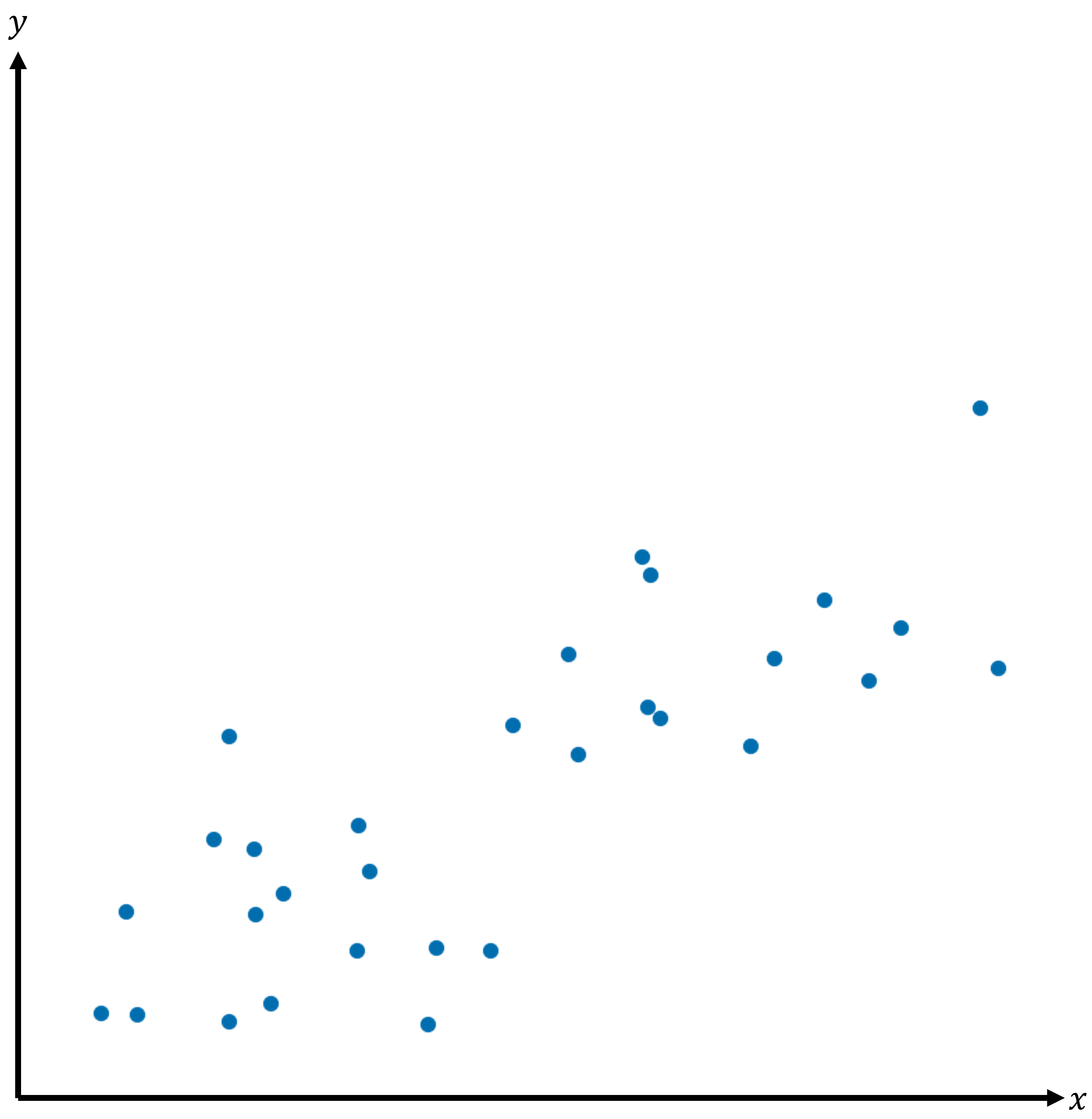
A scatterplot is a graphical representation of bivariate data when both variables are numerical. Each data point on the plot represents an individual observation. The response variable is plotted on the vertical \(y\)-axis, while the explanatory variable is plotted on the horizontal \(x\)-axis. Scatterplots are useful for visualising relationships and identifying trends between two numerical variables.
Check your understanding
View
Clear Pattern and Association
Scatterplots can be used to determine whether there is an association between the two variables. If the data points are randomly scattered across the plots, no clear pattern is present, indicating there is no association between the two variables. However, if the data points follow a noticeable trend rather than being randomly distributed, a clear pattern exists.
When a clear pattern is observed, the association can be described using three key features: direction, form, and strength.
| No clear pattern | Clear pattern |
|---|---|
|
|

Direction and Outliers
The direction of a scatterplot describes the overall trend of the data points.
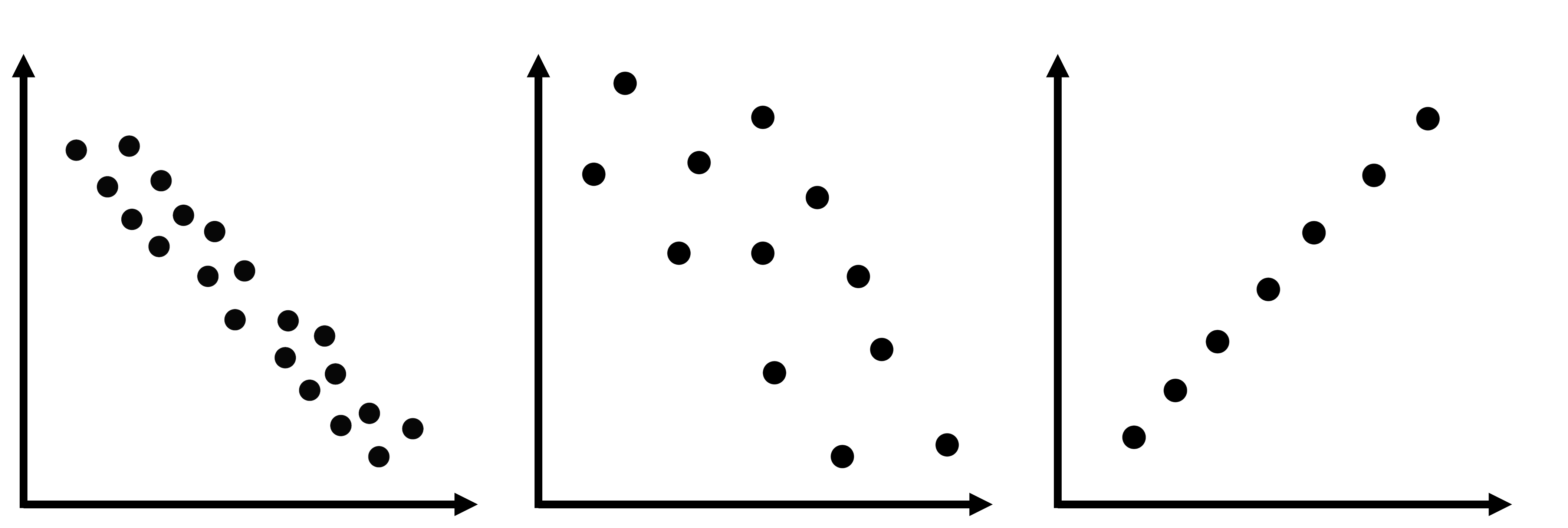
- Positive association between variables: the points in the scatterplot trend upwards from left to right, indicating that as the value of the explanatory variable increases, the value of the response variable tends to increase.
- Negative association between variables: the points in the scatterplot trend downwards from left to right, indicating that as the value of the explanatory variable increases, the value of the response variable tends to decrease.
- No association between variables: the points are randomly scattered across the plot, showing no consistent change in the value of the response variable when the value of the explanatory variable changes.
Outliers are the points that do not follow the overall pattern of the scatterplot and are clearly separated from the other data points. Identifying outliers is important, as outliers may indicate potential errors in data collections and unusual observations that require further investigation.
| Positive association | Negative association | No association | Outliers |
|---|---|---|---|
|
|
|
|




Form
The form of a scatterplot describes the overall pattern of the data points and can be classified as linear or non-linear.
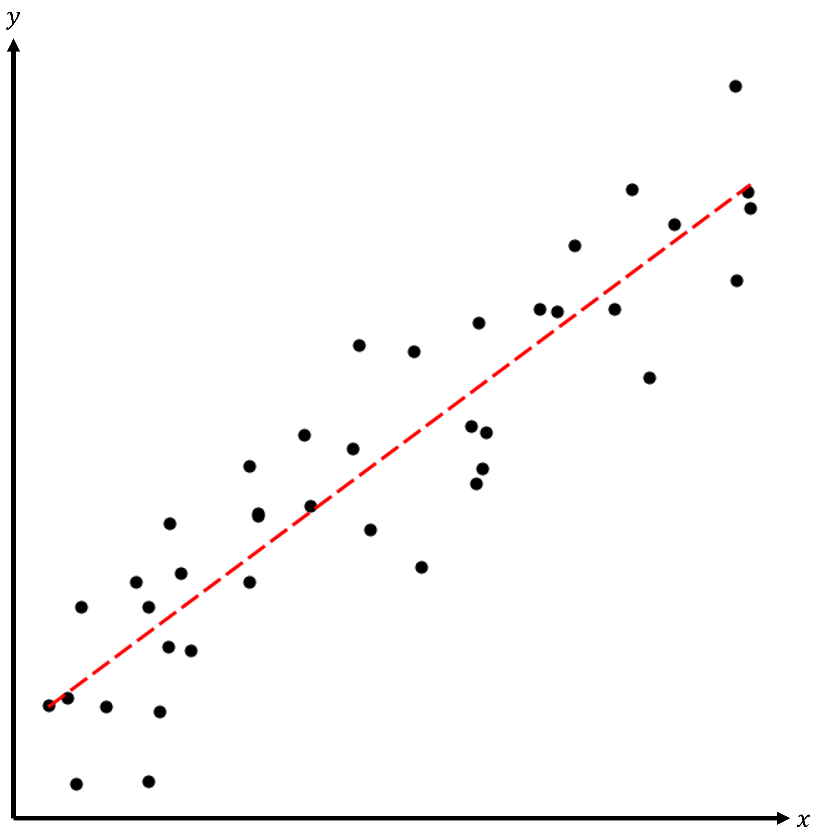
- Linear form: the points are scattered around a straight line, following a linear pattern.
- Non-linear form: the points scattered around a curved line, following a non-linear pattern.
Dotted lines are sometimes added to highlight the pattern of data points.
| Linear Form | Non-linear Form |
|---|---|
|
|

Strength
The strength of an association measures how closely the data points follow a specific pattern and can be classified as strong, moderate, and weak.
- Strong association: data points are tightly clustered around a trend line, forming a clear pattern.
- Moderate association: data points are more broadly spread around a trend line.
- Weak association: data points are loosely scattered around a trend line.
| Strong Positive Association | Moderate Negative Association | Weak Positive Association |
|---|---|---|
|
|
|