
How Good News From Indonesia (GNFI) turns data into stories: A masterclass for communications students
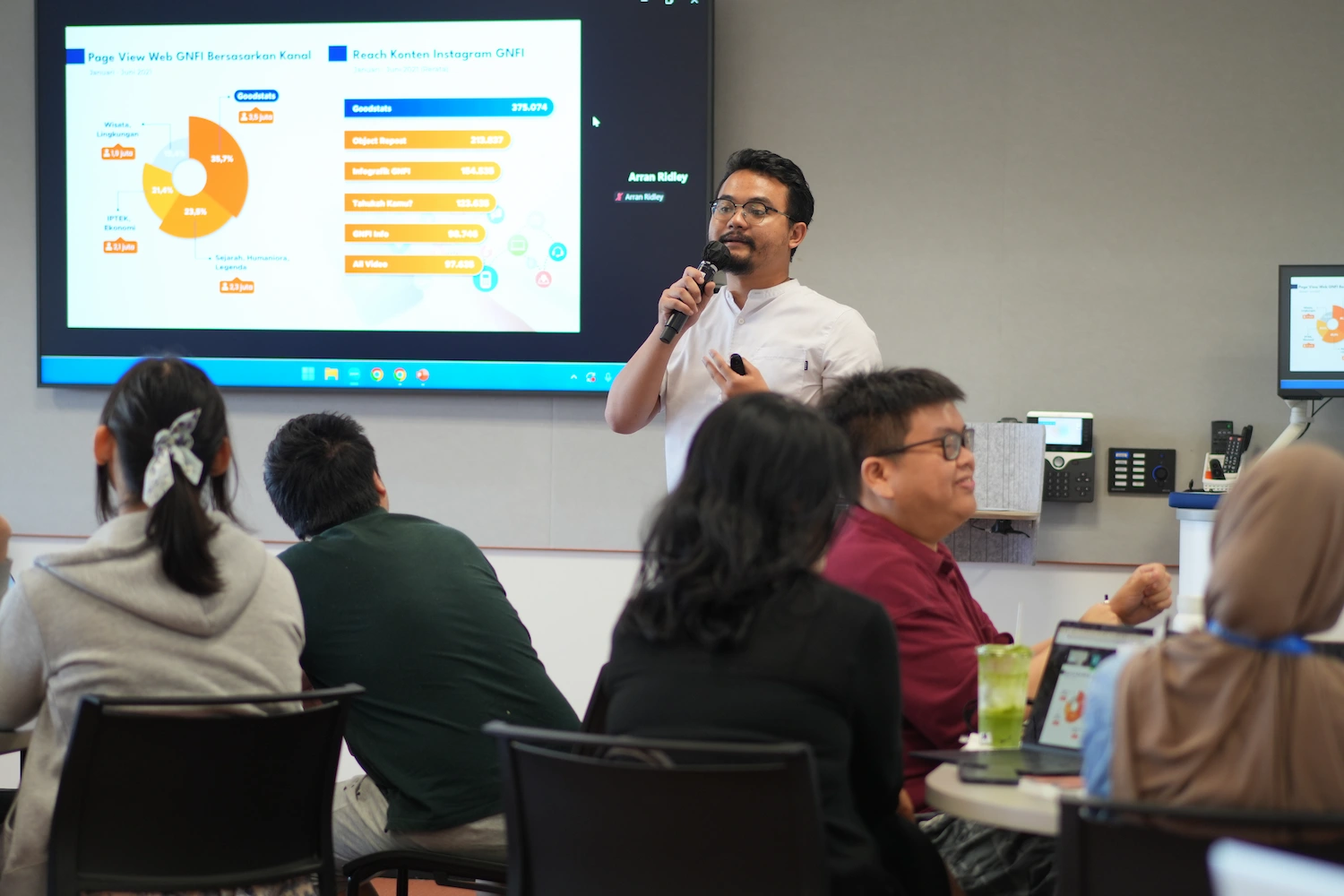
Iip M. Aditya delivering masterclass on data visualisation and storytelling
BSD City, Tangerang – Students in the Master of Marketing and Digital Communications program at Monash University, Indonesia recently had the chance to hear directly from one of the country's leading data storytelling practitioners — gaining a rare window into how professional organisations transform raw numbers into compelling, shareable content.
Data storytelling has become one of the most in-demand skills in contemporary communications. As audiences increasingly consume information through social media — where, according to data from Komdigi cited by GoodStats, over 73% of the population now gets their news— the ability to present complex data in ways that are visually engaging and easy to understand has never been more important. News organisations such as Tempo and Jakarta Post regularly use data visualisations and infographics to support their reporting, and the practice is now standard across corporate communications, public affairs, and journalism alike.
For students in Data Analytics in Communications, a unit offered in Term 2 as part of Monash Univeristy, Indonesia's Master of Marketing and Digital Communications program (and available as an elective across other master's programs), these are not abstract skills. The unit explores how digital data can be gathered, analysed, and visualised to understand audience behaviour and inform communication strategy — skills that sit at the intersection of research, design, and storytelling. Unit lecturer Dr Arran Ridley, who has experience working with social media data and has produced data stories for Singaporean data journalism outlet Kontinentalist, designed the unit around a hands-on challenge: students analyse comments collected from a YouTube video and translate their findings into an Instagram carousel targeted at a general audience.
A data story, in this context, means combining data, visuals, and a narrative to communicate complex insights in a compelling and accessible way. It is a form that demands both analytical rigour and creative judgment — and one that is easier to describe than to do well.
The guest session
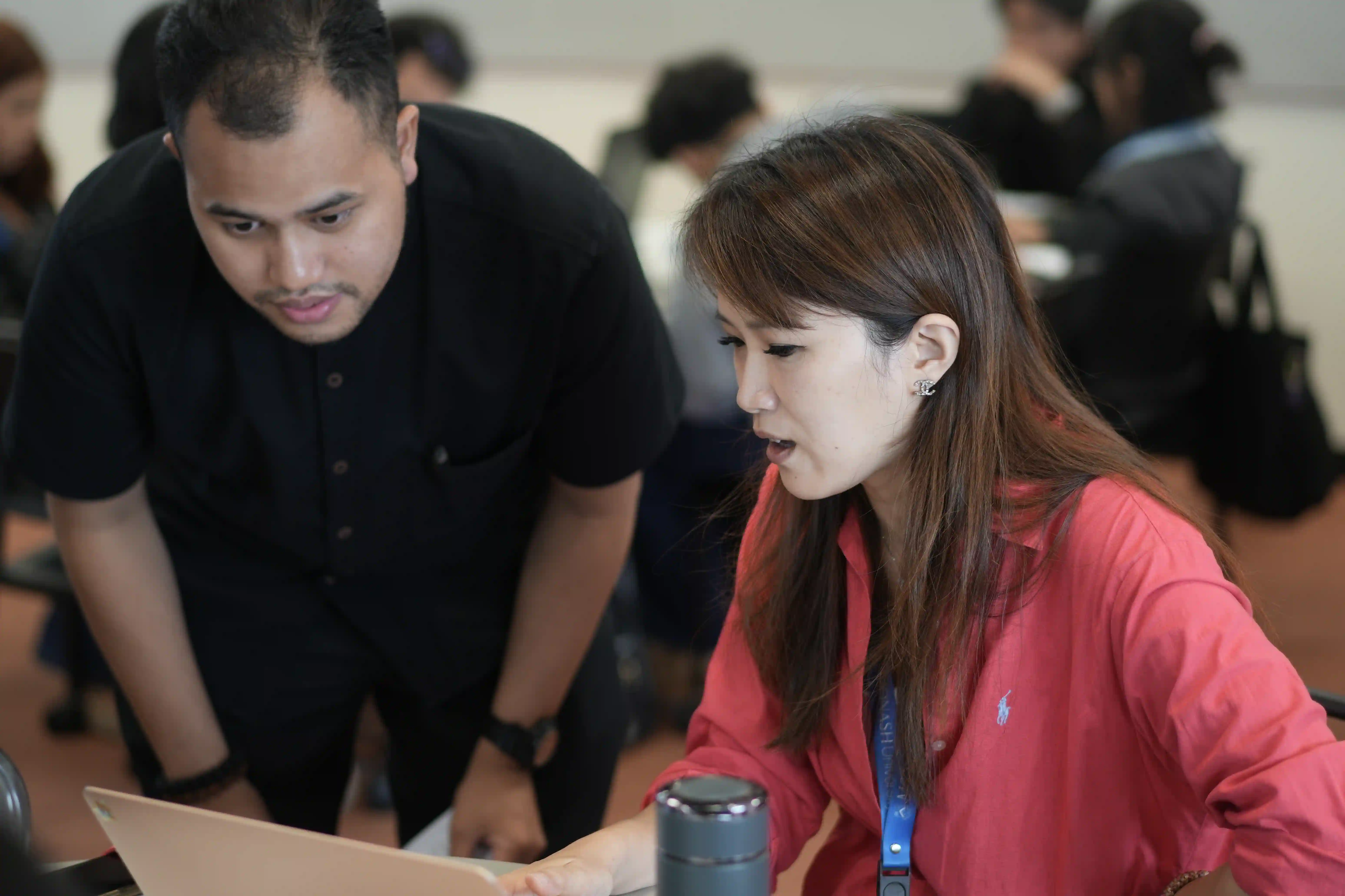
GNFI team facilitating the workshop session
To give students a grounded sense of how data storytelling actually works in practice, Good News From Indonesia (GNFI) were invited to share insights from their own organisation. On Wednesday 13 May, Agus Kustiawa, Iip M. Aditiya, and Rafa Sukoco joined the class for a session on data visualisation and storytelling.
The talk was delivered by Iip M. Aditiya, S.E., M.E., Founder and Head of GoodStats — GNFI's dedicated data and statistics division. Iip brings extensive experience as a design and data visualisation specialist, having worked with clients ranging from major Indonesian corporates including Telkom Indonesia, Gojek, ASTRA, and Samsung, to government ministries and international events including the G20 Bali Summit 2022 and the KTT ASEAN Summit Jakarta 2023. GoodStats itself has grown to over 505,000 Instagram followers and reaches 15 million accounts per month, with its data-driven content consistently outperforming other content formats on the platform.
What the talk covered
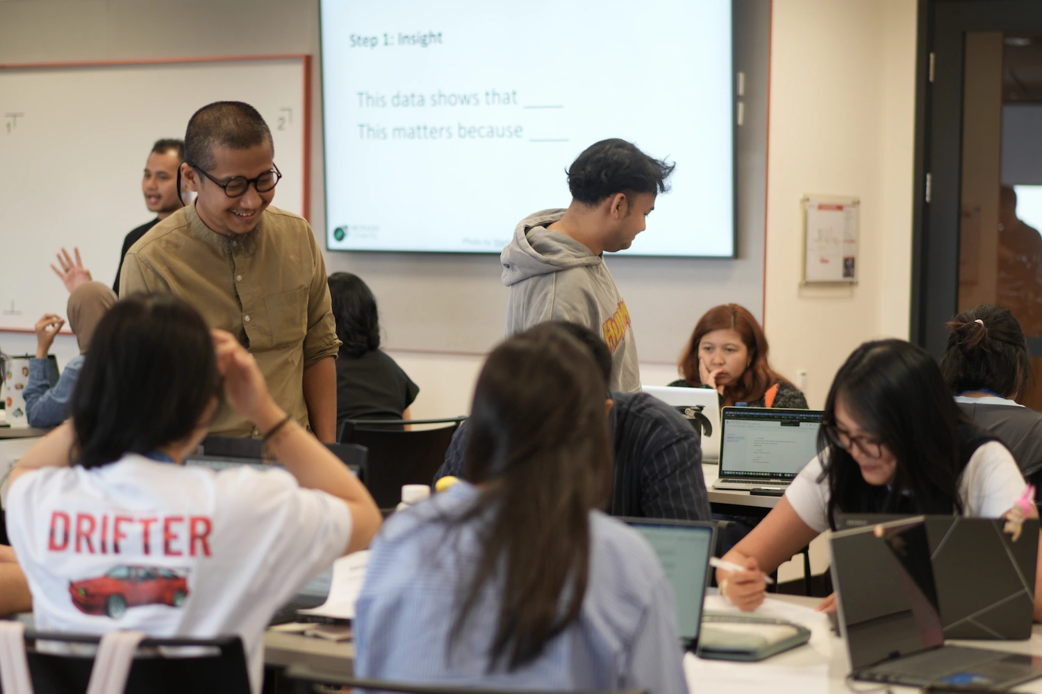 MDC students participating in the masterclass
Iip titled his presentation Menata Data, Menstimulasi Pembaca — roughly, "Organising Data, Stimulating the Reader" — a framing that neatly captures the dual challenge at the heart of data storytelling: getting the data right, and making the reader want to engage with it.
He opened with a conceptual framework that moved from raw data through information, knowledge, and insight, to wisdom — showing how the same data points can tell very different stories depending on the analytical work done to organise and contextualise them. This wasn't presented as a static ladder but as an active process: what distinguishes a good data story is the quality of the interpretive work that links raw numbers to meaningful conclusions about the world.
From there, Iip walked through GoodStats' approach to what he described as the three tests that effective social media data visualisation must pass: does it strengthen the context and narrative of the information? Does it make the reader's time more efficient — communicating quickly rather than demanding labour? And does it stimulate the imagination rather than just report a fact?
He illustrated these principles with examples drawn from GoodStats' own published work — carousels and infographics produced for editorial and commercial clients alike — demonstrating the difference between visuals that merely display data and those that invite the reader into a story. Alongside bar charts and pie charts, GoodStats makes use of geographic visualisations, graphic illustrations, and interactive dashboards depending on the nature of the data and the intended platform.
A substantial portion of the session addressed the craft decisions that shape how a finished data story feels to a reader: choices around headline framing (matematika kata, or "word mathematics" — trimming language to its most precise and effective form), colour selection tied to the emotional register of the topic (green for finance, warmer tones for human interest stories), typography, and the visual character of a design in relation to current trends. These aren't decorative considerations, Iip emphasised — they are strategic ones, each shaping whether a reader pauses to engage or scrolls past.
He also covered the practical workflow behind each GoodStats piece: sourcing data from both primary research and secondary sources such as BPS (Statistics Indonesia), government ministries, and international bodies; verifying and cleaning that data; developing a narrative angle; designing the visual; and refining based on performance feedback. The closing slide — a quote reading "Banyak hal yang akhirnya mati karena minim inovasi" ("Many things ultimately die because of a lack of innovation") — was both a reflection on the media industry and an implicit challenge to the students: the tools and platforms available today make it possible to tell stories with data in ways that weren't possible a decade ago. The question is whether communicators are willing to develop those skills.
Why it matters
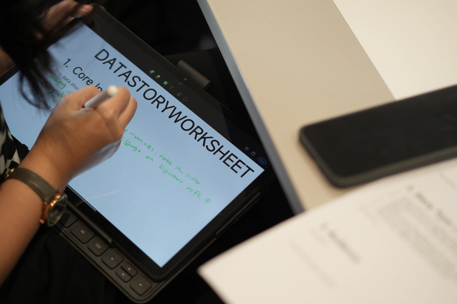 Students taking notes and working on tasks during the masterclass
Bringing practitioners into the classroom does something that case studies and readings alone cannot: it makes the professional stakes of the work more visible and more apparent. Students working on their own data stories — analysing real YouTube comments and designing for a real platform — could see directly how the decisions they were making in their projects map onto the decisions made daily in a professional newsroom and content studio.
For a cohort training for careers in marketing communications, public relations, journalism, and digital media, the session offered more than technical knowledge. It offered a sense of what the field actually looks like when data literacy, design thinking, and editorial judgment are integrated into a single practice.
Data storytelling in Indonesia is a growing space. As platforms evolve and audiences become more visually literate, the demand for communicators who can move fluently between data and narrative will only increase. Sessions like this one — connecting the analytical frameworks of the classroom to the lived practice of working organisations — are part of how that next generation is being prepared.
The Data Analytics in Communications unit is offered as part of the Master of Marketing and Digital Communications at Monash University, Indonesia, and is available as an elective across other master's programs. Good News From Indonesia (GNFI) is a digital media platform focused on factual, data-driven content about Indonesia. GoodStats, its data journalism and visualisation division, is based in Jakarta.